
Note: This body-only HTML article is written for web publishing, with SEO-friendly structure, natural keyword use, and no source links inside the publishable content.
House numbers are the tiny design detail that most homeowners ignore until a pizza driver circles the block like a confused satellite. Yet the right address sign can do more than tell people where you live. It can sharpen curb appeal, make deliveries smoother, help guests arrive without texting “I think I’m outside?”, and give your entryway the kind of polished finish that says, “Yes, someone here owns a level.”
Engelhardt House Numbers stand out because they are not just another set of digits slapped beside a doorbell. Inspired by Danish designer Knud V. Engelhardt, the collection brings together modern black signage, classic enamel-sign character, and a graphic style rooted in early 20th-century functional design. The result is simple, bold, slightly nostalgic, and surprisingly versatile. In other words: address numbers with manners.
Whether you own a midcentury ranch, a compact city townhouse, a Craftsman bungalow, or a modern farmhouse that takes its porch lighting very seriously, Engelhardt-style house numbers can add a crisp visual signature to your exterior. They look intentional without shouting. They are decorative, but they remember their day job: being readable.
What Are Engelhardt House Numbers?
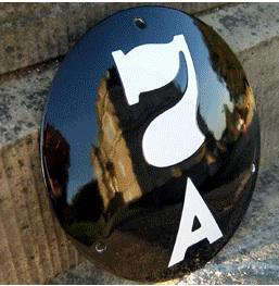
Engelhardt House Numbers are address signs associated with the Ramsign Engelhardt collection, a line of modern black house numbers and nameplates inspired by the work of Danish architect, graphic designer, and industrial designer Knud V. Engelhardt. Engelhardt’s original signage work was known for clear lettering, functional beauty, and a design language that felt both practical and charming.
The best-known Engelhardt-style numbers often feature circular or oval forms, black backgrounds, clean white lettering, and a restrained graphic personality. Some related nameplates include a tiny red heart motif, a playful nod to Engelhardt’s signature typographic touch. That small detail matters because it proves good design does not have to be cold. Even a house number can have a wink.
A Little Danish Design History
Knud V. Engelhardt worked during a period when industrial design was becoming more systematic and modern. Instead of treating public signs, transportation details, and typography as afterthoughts, he viewed them as part of everyday life. A sign had to be useful first, but that did not mean it had to be boring.
This philosophy is exactly why Engelhardt House Numbers still feel fresh. They are not overloaded with flourishes. They do not rely on trendy gimmicks. They use proportion, contrast, shape, and lettering to create a look that is easy to read and pleasing to see. That is the quiet genius of Danish design: it does not burst into the room wearing sequins. It arrives on time, looks great, and probably brought a beautifully wrapped loaf of rye bread.
Why Engelhardt House Numbers Work for Modern Curb Appeal
Curb appeal is often discussed in big-ticket terms: paint colors, landscaping, doors, shutters, lighting, and hardscaping. But small exterior details can have an outsized effect. House numbers sit right at the intersection of function and style. They are one of the first things visitors, delivery drivers, neighbors, and potential buyers noticeeven if they do not consciously realize it.
Engelhardt House Numbers work because they deliver three benefits at once: visual contrast, architectural character, and timeless simplicity. Black-and-white signage pairs well with many exterior palettes, from white stucco and red brick to cedar siding, gray stone, green doors, and matte black hardware. The round or oval format softens hard architectural lines, while the typography keeps the overall look neat and confident.
They Look Designed, Not Random
A common mistake with house numbers is choosing digits that look disconnected from the home. Shiny chrome numbers on a weathered cottage can feel awkward. Rustic wood numbers on a sleek modern facade can look like they wandered in from a different neighborhood. Engelhardt-style numbers avoid that problem by being classic enough for traditional homes and minimal enough for contemporary ones.
They also create a finished focal point. Instead of four separate numbers floating beside the door like they missed a group meeting, an Engelhardt plaque frames the address as one complete design element. This makes the entry feel considered, even if the rest of the porch is still pretending that one half-dead plant is “seasonal texture.”
Best Exterior Styles for Engelhardt House Numbers
One reason Engelhardt House Numbers are appealing is their flexibility. Their clean design can adapt to several architectural styles without looking forced. Here are some of the best pairings.
Midcentury Modern Homes
Midcentury homes often feature horizontal lines, flat or low-pitched roofs, large windows, and a mix of wood, brick, and painted surfaces. Engelhardt House Numbers complement this style beautifully because they bring a graphic, period-friendly quality without becoming cartoonishly retro. Place them near a warm wood door, on a masonry column, or beside a modern mailbox for a crisp entry moment.
Craftsman and Bungalow Homes
Craftsman homes tend to love handcrafted details, natural materials, and substantial porches. A black enamel-inspired number plaque can contrast nicely against wood shingles, brick piers, or painted trim. The circular shape adds softness to the strong lines of exposed beams and tapered columns.
Modern Farmhouse Exteriors
Modern farmhouse design often leans on white siding, black windows, simple lighting, and natural wood accents. Engelhardt House Numbers fit right into that black-and-white language. They can make the front door area feel more curated without adding another overly cute sign that says “Gather,” “Welcome,” or “The Wi-Fi Password Is Ask Mom.”
Urban Row Houses and Townhomes
For narrow city facades, a compact and legible address plaque is especially useful. Engelhardt-style house numbers can be mounted beside the door, above a mailbox slot, or on a gatepost. Because the design is strong but not bulky, it works well when space is limited.
How to Choose the Right Engelhardt House Number Design
Choosing house numbers sounds easy until you realize there are more options than anyone emotionally prepared you for. Size, placement, color, material, contrast, lighting, and mounting surface all matter. The goal is simple: your address should look good and be readable from where people actually need to see it.
1. Prioritize Readability
A beautiful sign that nobody can read is basically exterior jewelry with commitment issues. Before choosing a size, stand at the curb or across the street and look at your entry. Consider distance, shadows, landscaping, parked cars, porch depth, and nighttime visibility. If your home sits far back from the road, choose larger numbers or place a second address marker near the driveway or mailbox.
2. Match Contrast to the Background
Engelhardt House Numbers usually rely on strong light-and-dark contrast, which is one of their biggest advantages. A black plaque with white lettering works well on pale siding, brick, stone, or wood. If your exterior is already very dark, mount the plaque on a lighter trim board, post, or entry panel so it does not disappear like a dramatic actor in a black turtleneck.
3. Consider the Shape
Circular and oval signs bring a softer graphic rhythm to a home exterior. Round plaques are especially effective near rectangular doors, square columns, and linear siding because they break up all those straight lines. Oval nameplates or larger address plaques can be better if you want to include a street name, family name, or apartment identifier.
4. Think About Hardware and Lighting
For a pulled-together look, coordinate your Engelhardt House Numbers with nearby exterior elements. Matte black door hardware, black lanterns, steel railings, or dark-framed windows can make the number plaque feel intentional. If the porch light is weak or off to the side, consider adding a small fixture or positioning the sign where existing light naturally reaches it.
Where to Place Engelhardt House Numbers
Placement is where design meets real life. Your house numbers should be beautiful, but they should also help people find you before they have aged three years in your driveway.
Near the Front Door
The classic location is beside the front door, usually on the latch side or near the doorbell. This works best when the door is visible from the street. Mount the sign at a comfortable viewing height and keep it clear of wreaths, tall planters, climbing vines, and seasonal decorations. A Christmas garland should not be powerful enough to defeat emergency response.
Above the Door
Placing house numbers above the door can look elegant, especially on traditional or symmetrical facades. However, make sure the numbers are large enough to read from the sidewalk. If the entry is recessed or shaded, this placement may need extra lighting.
On a Mailbox or Mailbox Post
If your mailbox is close to the street, adding numbers there can improve visibility for mail carriers, delivery drivers, and guests. A mailbox number should not always replace numbers on the house itself, especially if local rules require the address to appear on the building. But as a second marker, it can be extremely practical.
On a Gate, Fence, or Driveway Post
Homes with long driveways, fences, or landscaped front yards often benefit from an address sign closer to the street. An Engelhardt-style plaque mounted on a gatepost can look refined and prevent visitors from wondering whether they are entering your driveway or accidentally joining a private hiking trail.
Installation Tips for a Clean, Lasting Look
Installing house numbers is usually a manageable project, but precision matters. A slightly crooked address plaque will bother you forever. It will not ruin your life, but it will whisper from the porch every time you come home.
Measure Twice, Drill Once
Use painter’s tape to mark the placement before drilling. Step back from the house, view it from the street, and check alignment with the door, trim, siding lines, or mailbox. A level is your friend. Your eyeballs may be charming, but they are not certified measuring instruments.
Use the Right Anchors
Mounting hardware depends on the surface. Wood siding, brick, stucco, concrete, and metal posts all require different fasteners. For masonry, use appropriate anchors and a masonry bit. For siding, avoid crushing or warping panels. If you are unsure, ask a hardware professional or hire a handyman for a small installation job.
Protect the Surface
Outdoor signage faces sun, wind, rain, humidity, pollen, and the occasional bird with questionable timing. Choose hardware rated for exterior use. If mounting on wood, seal exposed holes. If mounting near irrigation, avoid constant water spray. Even durable signs appreciate not being treated like a car wash subscription.
Maintenance: Keeping Engelhardt House Numbers Looking Sharp
One advantage of enamel-inspired and metal house numbers is that they are generally easy to maintain. A simple wipe with a damp cloth can remove dust, pollen, and road grime. Avoid abrasive scrubbers that could scratch the surface. If the sign is near salty coastal air, inspect hardware periodically for corrosion.
Also check visibility once or twice a year. Landscaping grows, porch decor changes, and lighting shifts with the seasons. A number plaque that was easy to see in spring may be hidden by July if your shrubbery has developed personal ambitions.
Engelhardt House Numbers vs. Standard Address Numbers
Standard address numbers are usually individual digits made from metal, plastic, ceramic, or wood. They can be excellent when chosen carefully. However, Engelhardt House Numbers offer a more complete graphic presentation. Instead of relying on separate digits, the plaque format creates a unified sign.
This can be especially useful for homeowners who want a European-inspired detail, a vintage-modern accent, or a high-contrast number display without designing a custom plaque from scratch. The look is distinctive but not loud. It says “design-conscious homeowner,” not “I spent three weekends arguing with fonts.”
Common Mistakes to Avoid
Choosing Style Over Visibility
Thin, tiny, low-contrast numbers may look elegant in a close-up photo, but real people need to read them from a distance. Choose size and contrast before obsessing over decorative details.
Mounting Numbers Too Low
Low placement can be blocked by cars, plants, snow, porch furniture, or that one delivery box you meant to recycle last Tuesday. Keep the sign high enough to remain visible.
Ignoring Nighttime Conditions
Look at your address after dark. If the sign disappears, improve lighting or add a second marker near the mailbox or driveway. Good design should not clock out at sunset.
Forgetting Local Rules
Some cities, counties, fire departments, or homeowner associations have requirements for address number size, placement, contrast, or mailbox labeling. Before installing a new sign, check local guidelines so your stylish upgrade does not become a tiny bureaucratic adventure.
Buying Guide: Who Should Choose Engelhardt House Numbers?
Engelhardt House Numbers are a strong choice for homeowners who want an address sign with heritage, personality, and clean readability. They are especially appealing if you like Scandinavian design, enamel signage, black-and-white contrast, or exterior details that feel timeless rather than trendy.
They may not be the best fit if you want oversized illuminated numbers, ultra-rustic reclaimed wood, ornate Victorian brass, or a fully custom art piece. But if your goal is a handsome, durable, design-forward address marker, Engelhardt-style signage deserves a serious look.
Real-Life Experience: Living With Engelhardt House Numbers
After working with exterior design ideas for years, I have learned that house numbers are one of those upgrades homeowners underestimate. People will debate paint colors for months, compare porch lights like they are choosing a college major, and then grab the cheapest address numbers from a hardware aisle five minutes before checkout. The result is often fine, but rarely memorable.
Engelhardt House Numbers feel different because they behave like a small architectural feature. Imagine a white cottage with black window trim. Add a round black Engelhardt-style plaque beside the front door and suddenly the entry has focus. It does not need a giant wreath, a complicated sign, or twelve planters arranged like a garden center hostage situation. The number plaque gives the eye a place to land.
On a brick home, the effect can be even better. Red brick has texture and warmth, but individual numbers sometimes get visually lost. A black plaque creates a defined field, allowing the white digits to stand out clearly. It feels classic, almost European, but still practical for an American neighborhood where delivery drivers are carrying three coffees, two boxes, and the emotional weight of a wrong turn.
One homeowner experience that comes up often with better house numbers is the surprising convenience factor. Guests stop calling from the curb. Food deliveries arrive hotter. Contractors find the right house without knocking on the neighbor’s door and asking awkward questions. Even holiday visitors appreciate it, especially when every porch on the block has lights, wreaths, and a suspicious number of identical SUVs.
The installation experience is also satisfying because it is a small project with a visible payoff. Unlike repainting an entire exterior, replacing house numbers can usually be done in an afternoon. The key is patience. Tape the plaque in position first. Walk to the street. Look from both directions. Check how it lines up with the doorbell, trim, and porch light. Then drill. This five-minute pause can save you from a lifetime of noticing that the sign is one-quarter inch too far left.
Another practical lesson: lighting matters more than people think. A beautiful Engelhardt number plaque under a weak porch light may look wonderful at noon and invisible at 9 p.m. If the sign is not naturally lit, consider moving it closer to a fixture or adding a subtle exterior light. You do not need to turn your house into an airport runway. A gentle, well-placed light is enough.
Maintenance is refreshingly simple. A quick wipe now and then keeps the surface crisp. The bigger task is controlling the environment around it. Trim plants, remove cobwebs, and make sure seasonal decor does not block the numbers. A tasteful fall wreath is lovely. A tasteful fall wreath that hides your address is just a pumpkin-flavored navigation problem.
From a design perspective, Engelhardt House Numbers are best for people who appreciate restraint. They are not flashy. They do not beg for attention. They simply make the entry look more complete. That is often what good curb appeal needs: not more stuff, but better details. When the address sign, door hardware, mailbox, lighting, and exterior palette quietly agree with one another, the whole home feels more intentional.
In my experience, that is the real charm of Engelhardt House Numbers. They combine the usefulness of a clear address marker with the soul of a design object. They help people find your home, but they also give your home a small signature. And for something as humble as a house number, that is a pretty impressive résumé.
Conclusion
Engelhardt House Numbers prove that practical exterior details can still have personality. Inspired by Danish design history and shaped by a “function first” mindset, they offer a clean, graphic, and timeless way to display your address. Their strong contrast supports readability, while their classic forms add curb appeal without clutter.
For homeowners, the smartest approach is to treat address numbers as both a design choice and a safety feature. Choose a visible location, use proper lighting, coordinate the sign with your exterior materials, and keep it clear of plants or decorations. Done well, Engelhardt House Numbers can make your home easier to find, better looking, and more memorable from the curb.