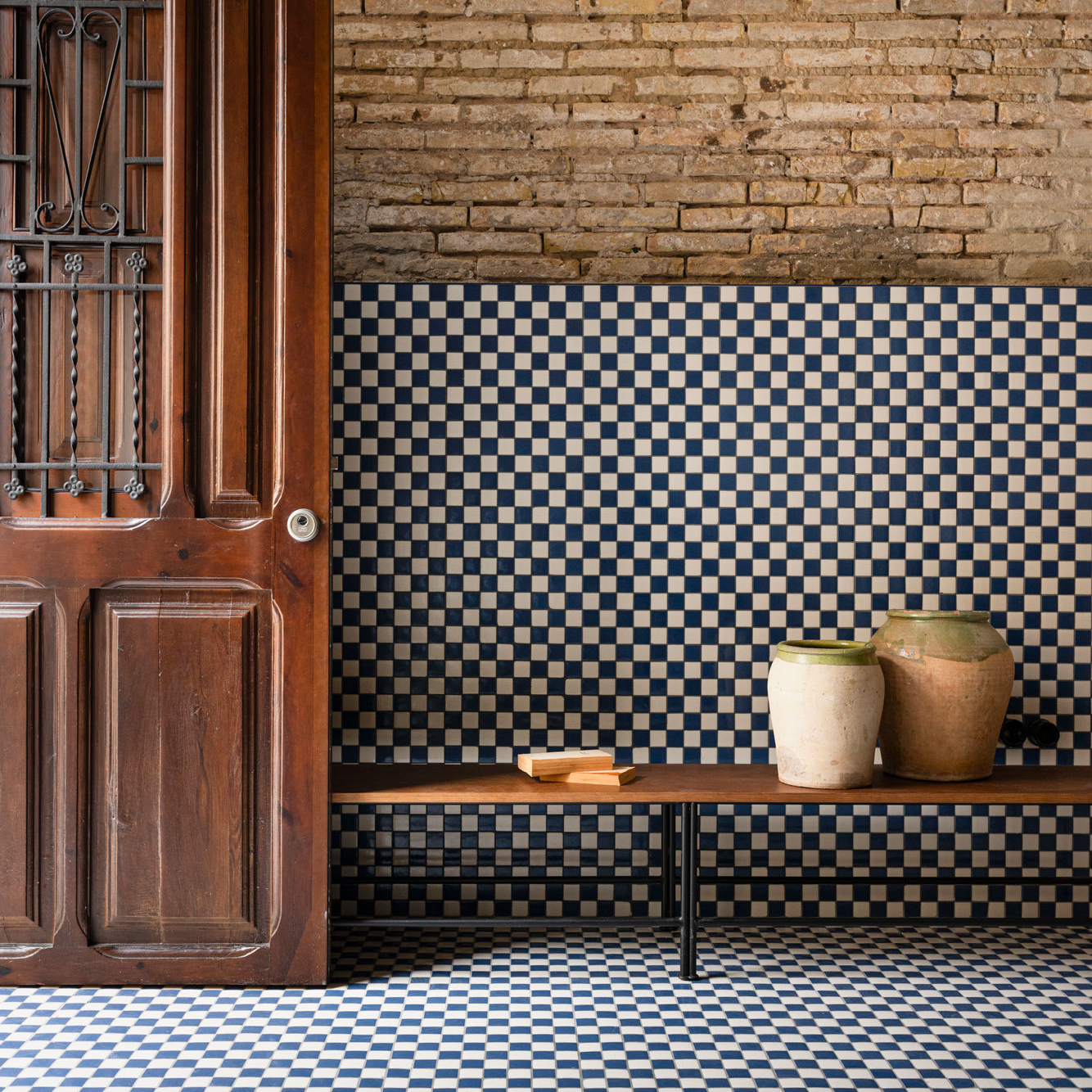

Checkerboard tiles have a funny way of looking both delightfully old-school and suspiciously fresh. One minute they remind you of a charming European entryway, a 1950s diner, or your grandmother’s perfectly waxed kitchen floor. The next minute they are popping up in stylish bathrooms, modern mudrooms, boutique hotels, coffee bars, and design magazines as if they just invented personality. That is the magic of checkerboard tile: it is simple enough to understand instantly, but flexible enough to reinvent itself in almost every room of the house.
At its core, a checkerboard tile pattern is just alternating squares. But that humble grid can completely change the mood of a space. Black and white checkerboard tiles feel crisp, classic, and graphic. Cream and terracotta feel warm and Mediterranean. Sage and ivory feel soft and cottage-inspired. Marble checkerboard floors can look elegant and historic, while porcelain checkerboard tiles can be practical, durable, and easier to live with when real life includes pets, kids, muddy shoes, dropped coffee, and at least one person who refuses to use a coaster.
The best part? Checkerboard tiles are not limited to kitchens and bathrooms. They can work in entryways, laundry rooms, patios, powder rooms, sunrooms, pantries, stair landings, fireplaces, and even small backsplash areas. Used thoughtfully, they add movement without chaos, contrast without clutter, and charm without needing a room full of expensive furniture doing interpretive dance.
Why Checkerboard Tiles Still Work
Some patterns come and go quickly. Checkerboard is different because it has a built-in design rhythm. The alternating squares create order, while the color contrast creates energy. That balance makes checkerboard tile easy to adapt to many interior styles, from traditional homes to modern apartments.
In a minimalist room, checkerboard flooring can be the one bold visual move that keeps the space from feeling flat. In a maximalist room, it becomes a confident background that can handle color, art, and patterned textiles. In a vintage-inspired home, it feels natural. In a new build, it can add the kind of character that builders sometimes forget to include while they are busy painting everything “agreeable something.”
Checkerboard tiles also give homeowners control over drama. Large black-and-white squares create a strong statement. Smaller tiles feel more delicate. Low-contrast pairings, such as beige and cream or charcoal and soft gray, deliver the same pattern in a quieter voice. The pattern can be installed straight for a clean grid or turned diagonally for a diamond effect that feels more dynamic.
Choosing the Right Checkerboard Tile Material
Before falling in love with a pattern, think about the room’s daily workload. A guest powder room and a family mudroom do not live the same life. One handles polite handwashing. The other handles wet boots, sports gear, dog paws, and mystery crumbs that nobody admits creating.
Porcelain Tile
Porcelain is one of the most practical choices for checkerboard floors. It is dense, durable, and highly water-resistant, making it a strong option for kitchens, bathrooms, laundry rooms, and entryways. Porcelain also comes in many finishes, including marble-look, stone-look, matte, and textured surfaces. If you want the elegance of stone without the maintenance demands, porcelain is often the grown-up answer.
Ceramic Tile
Ceramic tile is usually more budget-friendly and works beautifully on walls, backsplashes, powder rooms, and lower-traffic floors. It is available in endless colors, from classic white and black to soft pink, green, blue, and warm neutrals. For checkerboard walls or a kitchen backsplash, ceramic can deliver charm without making your renovation budget quietly leave the room.
Natural Stone
Marble, limestone, slate, and travertine checkerboard floors can look stunning, especially in foyers, bathrooms, and formal kitchens. Natural stone brings variation, depth, and a sense of age that manufactured tile tries very hard to imitate. However, stone usually requires sealing and more careful cleaning. If you love patina and do not panic over tiny imperfections, stone may be worth it. If one water ring ruins your day, porcelain might be better for your peace of mind.
Vinyl and Peel-and-Stick Options
For renters or quick makeovers, peel-and-stick checkerboard tiles can create a dramatic change with less commitment. They are especially useful in small bathrooms, laundry closets, pantries, or temporary kitchen updates. The key is surface preparation: clean, dry, smooth floors produce better results. Think of peel-and-stick tile as makeup for your floor. It can look fantastic, but it needs a clean face.
Checkerboard Tiles in the Kitchen
The kitchen may be the most natural home for checkerboard tiles. The pattern has a long connection with diners, farmhouse kitchens, European cafés, and classic American interiors. But today’s checkerboard kitchen does not have to feel like a retro movie set unless that is exactly what you want.
For a timeless look, black and white checkerboard floor tiles pair well with white cabinets, butcher block counters, chrome fixtures, and simple lighting. For a warmer look, try cream and terracotta, taupe and ivory, or brown and beige. These softer combinations still provide pattern, but they feel more relaxed and modern.
Checkerboard tile can also help define zones in open-plan kitchens. A tiled checkerboard area under the kitchen work zone can separate it visually from adjacent wood flooring in the dining or living area. This is especially useful in apartments and open homes where walls are scarce and everyone expects the floor to do some architectural heavy lifting.
Backsplashes are another smart place to use the pattern. A small checkerboard backsplash behind a range or coffee station adds personality without overwhelming the entire kitchen. Smaller tiles usually work better here because they create detail at eye level. For a fresh approach, use low-contrast colors like white and pale gray or cream and sage.
Checkerboard Tiles in the Bathroom
Bathrooms and checkerboard tiles are practically old friends. The pattern works in powder rooms, guest baths, vintage bathrooms, and sleek modern spaces. The trick is choosing the right scale and contrast.
In a small bathroom, high-contrast black-and-white floors can look bold and beautiful, but they can also feel busy if everything else competes for attention. To keep the room balanced, pair the floor with simple wall tile, clean paint colors, and streamlined fixtures. If the bathroom is tiny, consider smaller squares or a muted palette such as gray and white, beige and cream, or green and ivory.
For a classic bathroom, checkerboard floors with subway tile walls, a pedestal sink, and polished nickel fixtures create a look that feels familiar in the best possible way. For a more modern bathroom, use larger-format tiles, matte finishes, floating vanities, and warm wood accents. The checkerboard pattern provides structure, while the other materials soften the look.
Safety matters in wet areas. Floor tiles should be rated for floor use, and bathrooms benefit from slip-resistant finishes. Wall tiles are not automatically suitable for floors, even if they look perfect online at 1 a.m. when your judgment is being powered by renovation optimism. Always check the manufacturer’s specifications before buying.
Checkerboard Tiles in the Entryway
An entryway is the perfect place for checkerboard tile because it gives guests an immediate design moment. It says, “Welcome, this home has opinions,” but in a polite and stylish way.
Black and white marble checkerboard tile is a classic choice for foyers, especially in traditional homes. Porcelain versions can achieve a similar effect with less maintenance. For a softer entry, try limestone-look porcelain in beige and cream or slate-look tiles in charcoal and gray.
Entryways also need durability. This is where shoes, umbrellas, backpacks, grocery bags, and seasonal debris arrive first. Choose a tile that can handle traffic and is easy to clean. A darker grout can be useful because entryway grout lives a hardworking life and deserves realistic expectations.
Checkerboard Tiles in the Laundry Room
The laundry room is often treated like the house’s backstage area, but checkerboard tile can make it feel intentional. A patterned floor brings cheer to a room where the main activity is discovering that someone left a tissue in their pocket again.
Because laundry rooms deal with water, detergent, and heavy appliances, porcelain tile is a strong option. A checkerboard pattern in blue and white, green and cream, or charcoal and ivory can make the space feel polished without being too precious. If the room is narrow, a diagonal layout can create a sense of movement. If it is already visually busy with shelves, baskets, and hanging rods, keep the color contrast gentle.
Checkerboard Tiles in the Mudroom
Mudrooms are built for mess, and checkerboard tiles can handle the job with style. This is a room where practical flooring is non-negotiable. Wet coats, muddy boots, pet bowls, and sports bags demand surfaces that are easy to mop and hard to offend.
A medium-scale checkerboard floor is ideal here. Too small, and the grout lines multiply like rabbits. Too large, and the pattern may feel oversized in a compact room. Porcelain tile in earthy tones works especially well because it hides dirt better than pure white and softens the graphic pattern.
For a mudroom with built-in benches and cabinets, coordinate tile colors with cabinet paint. Olive cabinets with cream and charcoal tile feel grounded. Navy cabinets with white and gray tile feel crisp. Natural wood with tan and ivory checkerboard tile feels warm and casual.
Checkerboard Tiles in Living Areas
Checkerboard tiles are less common in living rooms, but that is exactly why they can feel special. Tile can work beautifully in sunrooms, enclosed porches, fireplace surrounds, and indoor-outdoor spaces. The key is comfort. Tile is hard underfoot, so rugs, soft furniture, and warm materials help balance it.
A sunroom with checkerboard tile feels instantly charming, especially when paired with wicker furniture, plants, linen curtains, and a few pillows that look relaxed but somehow cost more than expected. In a living room, checkerboard tile may work best around a fireplace or as a defined hearth area. This brings pattern into the room without turning the entire floor into a chess tournament.
Checkerboard Tiles on Patios and Outdoor Spaces
Outdoor checkerboard tile can look fantastic on patios, covered porches, and garden paths. The pattern adds structure to outdoor furniture arrangements and can make a patio feel like an outdoor room rather than a slab that chairs happen to visit.
Outdoor tile must be rated for exterior use. It should handle moisture, temperature changes, and foot traffic. Textured porcelain pavers are often a practical choice. For color, consider black and white for a crisp courtyard look, terracotta and cream for Mediterranean warmth, or gray and ivory for a softer modern patio.
Color Ideas Beyond Black and White
Black and white checkerboard tile will always be iconic, but it is not the only option. Color can completely change the emotional temperature of the pattern.
Soft Neutrals
Cream and beige checkerboard tile feels calm, elegant, and easy to live with. It works beautifully in bathrooms, kitchens, and laundry rooms where you want pattern without visual shouting.
Earthy Tones
Terracotta and ivory bring warmth and a handmade feeling. This palette is excellent for kitchens, patios, and sunrooms, especially when paired with wood, brass, and woven textures.
Green and White
Sage or olive with white creates a fresh cottage-inspired look. It works in mudrooms, bathrooms, pantries, and garden rooms.
Blue and Cream
Blue checkerboard tile can feel coastal, classic, or playful depending on the shade. Navy and white is crisp. Powder blue and cream is sweet. Dusty blue and beige feels relaxed and grown-up.
Marble Pairings
White marble with black, green, red, or gray stone creates a luxurious checkerboard floor. This is especially effective in foyers and bathrooms where a smaller footprint makes higher-end materials more manageable.
Layout Tips That Make Checkerboard Tile Look Better
A checkerboard pattern is simple, but installation planning matters. Poor layout can make the pattern look awkward, especially near walls, doorways, and cabinets.
Start by deciding whether the tiles should run parallel to the walls or diagonally. A straight layout feels cleaner and more modern. A diagonal layout creates movement and can help disguise slightly imperfect room dimensions. In traditional foyers, diagonal checkerboard floors often feel grand. In modern kitchens, straight layouts can feel calmer.
Pay attention to tile size. Large tiles make a bold statement and reduce grout lines. Smaller tiles feel more vintage and detailed. In compact rooms, medium or small squares usually feel more proportional. In large rooms, bigger tiles can prevent the pattern from looking too busy.
Grout color matters more than people expect. Matching grout makes the pattern feel smoother and less segmented. Contrasting grout emphasizes every square. For checkerboard floors, many designers choose a grout color that sits between the two tile colors, such as soft gray with black and white tile. This keeps the floor readable without turning the grout into the loudest person at brunch.
Maintenance: Keeping Checkerboard Tiles Fresh
Checkerboard tile is generally easy to maintain, especially in porcelain or glazed ceramic. Regular sweeping or vacuuming prevents grit from scratching surfaces. Damp mopping with a suitable cleaner keeps floors looking bright. For kitchen backsplashes, grease should be cleaned regularly before it becomes a tiny museum exhibit behind the stove.
Grout deserves special attention because it is porous and can collect dirt. Sealing grout, when recommended, helps reduce staining. In busy rooms, darker grout can be more forgiving. Natural stone tiles require stone-safe cleaners and periodic sealing. Avoid harsh acidic products on marble, limestone, and other sensitive stone surfaces.
The easiest maintenance strategy is prevention. Use mats at entrances, wipe spills quickly, and choose tile finishes based on the room’s actual use. A polished marble checkerboard floor may look breathtaking, but in a wet mudroom full of children and Labradors, it may also become a slapstick comedy set.
Common Checkerboard Tile Mistakes to Avoid
Choosing Too Much Contrast in a Tiny Room
Bold black and white can be stunning, but in very small rooms it may feel intense. If the room already has patterned wallpaper, colorful cabinets, or ornate fixtures, consider a softer tile palette.
Ignoring Tile Ratings
Not every tile belongs on the floor. Some tiles are designed only for walls. For bathrooms, kitchens, and exterior areas, check water resistance, slip resistance, and suitability for the location.
Forgetting About Transitions
Checkerboard tile often meets wood, carpet, concrete, or another tile. Plan the transition carefully so the floor looks intentional instead of patched together after a long weekend and three hardware store trips.
Using the Wrong Scale
Tile size should match the room. Oversized squares can overwhelm a powder room, while tiny tiles can make a large kitchen feel too busy. When in doubt, order samples and lay them out on the floor before committing.
Best Rooms for Checkerboard Tiles
Kitchen: Durable, nostalgic, and easy to clean. Use classic black and white for retro charm or warm neutrals for a modern update.
Bathroom: Perfect for vintage, classic, or contemporary spaces. Choose slip-resistant floor tile and keep walls simple if the floor is bold.
Entryway: A strong first impression with practical benefits. Porcelain or stone-look tile works well for heavy traffic.
Laundry Room: A cheerful pattern for a hardworking space. Soft colors can make the room feel brighter and more designed.
Mudroom: Practical and stylish. Choose durable porcelain and forgiving grout colors.
Patio: Great for outdoor personality. Use exterior-rated tile with texture for safety.
Backsplash: A lower-commitment way to use the pattern. Smaller squares and subtle colors work especially well.
Personal Experiences and Real-Life Lessons with Checkerboard Tiles
Checkerboard tiles look simple in photos, but the real-life experience is all about proportion, lighting, and daily habits. The first time many homeowners consider checkerboard flooring, they imagine a perfect black-and-white kitchen from a magazine. Then the samples arrive, and suddenly the “white” tile looks cream, the “black” tile looks charcoal, and the kitchen lighting turns everything slightly yellow after sunset. This is why samples are not optional. They are tiny squares of truth.
One practical lesson is that checkerboard tile changes personality throughout the day. In morning light, a black-and-white floor may look crisp and cheerful. Under warm evening bulbs, it can feel softer and more vintage. In rooms with little natural light, high contrast may appear heavier. That does not mean you should avoid it, but it does mean the rest of the room should help. Light walls, reflective fixtures, mirrors, and warm wood can keep a bold checkerboard floor from feeling too severe.
Another real-life experience: grout color can make or break the project. Many people spend weeks choosing tile and about seven seconds choosing grout, which is unfair because grout is basically the punctuation of the floor. Bright white grout can look beautiful on day one, then slowly collect evidence of every shoe, spill, and pet in the house. A pale gray, warm gray, or taupe grout often ages more gracefully. In kitchens and entryways, forgiving grout is not a compromise. It is wisdom wearing work boots.
Checkerboard tiles also teach you that pattern does not always need more decoration. A room with a graphic floor often looks better when the furniture and walls calm down a little. In a kitchen, simple cabinet hardware, plain countertops, and clean lighting can let the floor shine. In a bathroom, a checkerboard floor may need only a classic vanity, a beautiful mirror, and good towels. Add too many competing patterns and the room starts to look like it is arguing with itself.
For families, porcelain checkerboard tile tends to be the easiest long-term choice. It handles spills, cleaning, and regular traffic better than many delicate materials. Natural stone is gorgeous, but it asks for a more careful relationship. It wants sealing, proper cleaners, and a homeowner who can accept patina. Porcelain is less dramatic emotionally. You mop it, it cooperates, and nobody has to have a family meeting about lemon juice.
Small checkerboard projects are also surprisingly satisfying. A pantry floor, powder room, laundry nook, or coffee bar backsplash can deliver the joy of the pattern without the cost of tiling an entire kitchen. These smaller applications are great for people who love the look but worry it may be too bold. In many homes, the powder room is the ideal place to experiment because guests expect a little personality there. Nobody walks into a powder room and says, “This should have been more beige.”
The final lesson is that checkerboard tiles reward confidence. The pattern is classic, but it is not invisible. It announces itself. That is the point. Whether you choose black and white marble for a foyer, sage and ivory porcelain for a mudroom, or terracotta and cream ceramic for a sunroom, checkerboard tile gives the room a backbone. It makes ordinary spaces feel designed, and it does so with a pattern that has survived centuries of changing taste. Trends may come and go, but the checkerboard remains, quietly saying, “I was stylish before your algorithm found me.”
Conclusion
Checkerboard tiles are one of the rare design choices that can feel historic, playful, elegant, and practical all at once. They work because the pattern is easy to understand but endlessly adaptable. A bold black-and-white floor can energize a kitchen. A soft beige-and-cream checkerboard can warm up a bathroom. A durable porcelain pattern can make a mudroom look polished even when life is busy and the dog has opinions about puddles.
The secret is choosing the right material, scale, color, layout, and grout for the room. Think about how the space is used, how much maintenance you are willing to handle, and how much visual drama you want. Checkerboard tile does not have to shout. It can whisper, wink, or make a grand entrance. Used well, it brings rhythm, charm, and personality to every room.