
Revere Pewter HC-172 paint by Benjamin Moore is one of those colors that refuses to quietly retire, even after trends have sprinted from cool gray to warm white to earthy beige and back again. It is the paint equivalent of a well-tailored blazer: not flashy, not boring, and somehow appropriate in more rooms than it has any right to be.
Officially, Revere Pewter is part of Benjamin Moore’s Historical Colors collection. Unofficially, it is part of the “I just want one neutral that will not make my house look like a dentist’s waiting room” collection. It sits in the greige family, meaning it blends gray and beige, with enough warmth to feel inviting and enough gray to avoid looking too yellow or dated.
Its official Light Reflectance Value, or LRV, is 55.05, which places it in the light-to-medium range. In real-life terms, Revere Pewter is not a bright, airy off-white. It has presence. It can soften a room, connect different finishes, and create a grounded backdrop for furniture, wood tones, stone, brass, black accents, and colorful decor. But like every famous neutral, it has opinions. Ignore its undertones, and it may politely turn greenish in the corner while you wonder what happened.
What Color Is Revere Pewter HC-172?
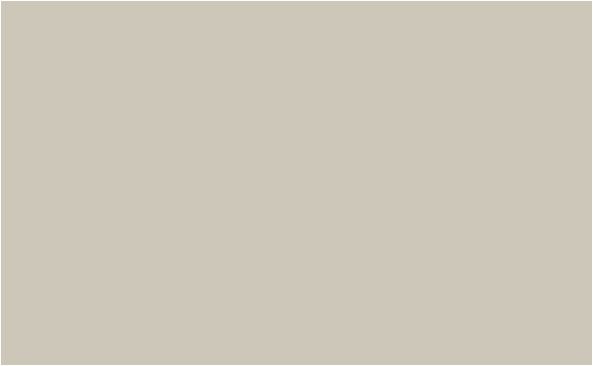
Revere Pewter HC-172 is best described as a warm greige: a balanced mix of gray and beige with subtle earthy undertones. It is not a crisp gray, not a creamy beige, and not a taupe in the dramatic sense. Instead, it lands in the middle, which is why so many homeowners use it for living rooms, hallways, bedrooms, kitchens, cabinets, and open-concept spaces.
Benjamin Moore describes Revere Pewter as an iconic neutral that bridges warm and cool tones. That description is accurate because the color can shift depending on lighting, surrounding finishes, and the colors placed beside it. In a bright room with warm natural light, it may read softer and beige-gray. In a north-facing room or a space with cool LED bulbs, it can lean more gray and sometimes reveal a muted green undertone.
This shifting quality is not a flaw. It is the entire personality of greige paint. Revere Pewter behaves like a neutral chameleon wearing tasteful shoes. It adapts, but it does not disappear.
Revere Pewter LRV: Why 55.05 Matters
LRV measures how much light a paint color reflects on a scale from 0 to 100. Zero is black, 100 is pure white, and Revere Pewter’s LRV of 55.05 means it reflects a moderate amount of light without feeling pale or washed out.
In a sunny room, this LRV gives Revere Pewter enough body to avoid looking flat. In a dim room, however, it may feel heavier than expected. If your space has limited windows, dark flooring, or deep wood furniture, Revere Pewter can become cozy, moody, or slightly muddy. That may be beautiful in a library or dining room, but less ideal if your goal is “fresh cloud with curtains.”
Best lighting conditions for Revere Pewter
Revere Pewter usually performs best in rooms with moderate to strong natural light. South-facing rooms often bring out its warmth. East-facing rooms may show a balanced soft greige in the morning and a quieter tone later in the day. West-facing rooms can make it feel warmer in the afternoon. North-facing rooms are the trickiest because cool light can emphasize its gray-green side.
The rule is simple: test before committing. Paint a large sample or use a peel-and-stick sample, then move it around the room. Look at it in morning light, afternoon light, evening light, and under your actual bulbs. Paint is sneaky. It will behave beautifully in the store and then reveal its true personality once it meets your sofa.
Revere Pewter Undertones
The most common undertone people notice in Revere Pewter is green. Not bright green, not “kitchen from 1978 avocado appliance” green, but a muted, earthy green-gray cast. In some spaces, that undertone is barely visible. In others, especially rooms with cool lighting or green outdoor reflections from trees and landscaping, it can become more noticeable.
Revere Pewter also has beige warmth, which keeps it from feeling icy. That warmth is why it pairs nicely with natural wood, creamy whites, stone, linen, leather, woven textures, and aged metals. It looks especially good in interiors that lean traditional, transitional, organic modern, farmhouse, coastal, or classic.
Where it can struggle is beside very cool blue-gray finishes, stark white trim, pink-beige tile, or overly yellow cream paint. The contrast can make the undertone look awkward. In color language, this is called a mismatch. In homeowner language, it is called “Why does my wall look weird next to the backsplash?”
Best Rooms for Revere Pewter HC-172
Living rooms
Revere Pewter is a strong living room color because it supports many decorating styles. It can handle a navy sofa, tan leather chairs, warm wood coffee tables, black picture frames, brass lamps, and patterned rugs without demanding attention. It creates a calm background while still giving the walls enough depth to feel finished.
Open-concept spaces
One reason Revere Pewter became so popular is its ability to connect spaces. In open floor plans, where the kitchen, dining area, hallway, and living room all visually overlap, choosing one neutral can be stressful. Revere Pewter works well when you need a single color that transitions across multiple zones without turning every wall into a blank white canvas.
Bedrooms
In bedrooms, Revere Pewter feels soft and restful. Pair it with white bedding, warm wood nightstands, linen curtains, and muted blue, sage, or charcoal accents. For a cozier look, add textured throws and darker metal finishes. The result is calm without looking sleepy in the “forgot to decorate” sense.
Kitchens and cabinets
Revere Pewter is also a beautiful cabinet color. On kitchen cabinets, it can look refined, warm, and timeless, especially when paired with white walls, marble or quartz countertops, brass hardware, black accents, or natural wood floors. It is a smart choice when white cabinets feel too predictable and dark cabinets feel too dramatic.
Bathrooms
Bathrooms can be trickier because lighting is often artificial and tile undertones matter. Revere Pewter can look lovely with warm white tile, stone, brushed nickel, aged brass, or natural wood vanities. But if the bathroom has cool blue-gray tile or pink-beige flooring, test carefully. Small bathrooms are basically paint laboratories with towels.
Best Trim Colors for Revere Pewter
Revere Pewter usually looks best with soft white trim rather than harsh, ultra-bright white. Benjamin Moore lists White Dove OC-17 as one of its coordinating colors, and that pairing is popular for good reason. White Dove is warm, balanced, and not too yellow, which helps Revere Pewter look polished rather than muddy.
Other trim options include Simply White OC-117 for a cleaner but still warm look, Cloud White OC-130 for a slightly creamier effect, and Chantilly Lace OC-65 if you want sharper contrast. However, Chantilly Lace is very crisp, so use it carefully in cool rooms where Revere Pewter already leans gray-green.
If you prefer a tone-on-tone look, Revere Pewter can also be used on walls with trim painted in the same color but a different sheen. For example, matte or eggshell walls with satin or semi-gloss trim can create a subtle, designer-like finish. It is quiet luxury without requiring anyone to whisper near the baseboards.
Coordinating Colors That Work Well
Benjamin Moore’s expert-picked coordinating colors for Revere Pewter include Chelsea Gray HC-168, White Dove OC-17, Sparrow AF-720, and Fog Mist OC-31. These choices make sense because they create a flexible palette: a soft white, a deeper gray, a rich neutral, and a misty companion shade.
For a classic palette, pair Revere Pewter walls with White Dove trim, Chelsea Gray doors, and black hardware. For a warmer organic look, combine it with cream textiles, oak floors, woven baskets, and muted olive or clay accents. For a coastal interpretation, use soft blues, warm whites, natural fibers, and weathered wood.
Color pairings to consider
- White Dove OC-17: soft white trim, ceilings, cabinets, or built-ins.
- Chelsea Gray HC-168: interior doors, fireplace surrounds, vanities, or accent walls.
- Hale Navy HC-154: dramatic front doors, islands, or furniture pieces.
- Soft sage green: relaxed, natural, and quietly elegant with Revere Pewter’s earthy undertone.
- Warm black: modern contrast for lighting, hardware, mirrors, and stair railings.
- Natural oak: a friendly wood tone that keeps the palette warm and livable.
Where Revere Pewter May Not Work
Revere Pewter is versatile, but it is not magic in a can. It may not be the best choice for very dark rooms where you want a bright, airy effect. It can also feel dated if paired with old yellow-beige finishes, heavy brown furniture, and warm lighting without enough contrast.
It may also clash with certain fixed elements. Flooring, countertops, tile, stone, and brick all have undertones. If your home has strong pink beige, orange oak, blue-gray tile, or very cool white marble, Revere Pewter needs to be tested next to those surfaces. The wall color cannot be judged alone. Paint chips are tiny liars unless you introduce them to the rest of the family.
Revere Pewter vs. Agreeable Gray
Revere Pewter is often compared with Sherwin-Williams Agreeable Gray because both are famous greige paint colors. Agreeable Gray is generally lighter and can feel a bit more beige-gray depending on the room. Revere Pewter has more depth and can appear slightly cleaner, stronger, or more grounded. If you want a neutral with more weight on the wall, Revere Pewter may be the better choice. If you want a softer, lighter, more broadly airy greige, Agreeable Gray may be easier.
The better color depends on the room. Revere Pewter can look more sophisticated in bright spaces and on cabinetry. Agreeable Gray can be more forgiving in darker rooms. Neither one should be chosen from a tiny chip under store lighting, unless you enjoy repainting as a cardio routine.
Using Revere Pewter on Exteriors
Revere Pewter can also work on home exteriors, particularly when you want a neutral that is warmer than gray but cooler than beige. Outside, paint colors usually look lighter because of natural daylight, so Revere Pewter may appear softer and more understated than it does indoors.
It pairs well with warm white trim, charcoal shutters, black windows, stonework, brick, and natural landscaping. On exterior siding, it can create a classic, approachable look that avoids the starkness of white. For front doors, consider deep charcoal, black, navy, forest green, or warm wood tones. Always test large exterior samples on different sides of the house because sunlight, shade, roof color, and landscaping can dramatically shift the final look.
Paint Finish Recommendations
The right sheen matters almost as much as the color. For most interior walls, eggshell or matte works well. Matte gives a softer, more modern look and can hide minor wall imperfections. Eggshell is slightly more washable, making it practical for busy living areas, hallways, and family rooms.
For trim, doors, cabinets, and built-ins, use satin, semi-gloss, or a cabinet-grade finish depending on the product line and durability needs. Revere Pewter on cabinets benefits from a smoother, more durable finish because cabinets get touched, bumped, cleaned, and occasionally attacked by spaghetti sauce.
How to Sample Revere Pewter Correctly
Sampling is not optional with Revere Pewter. Because of its undertones and medium depth, it should be tested in the actual room before buying gallons. Use a large painted board or peel-and-stick sample. Place it near trim, flooring, countertops, upholstery, and windows. Then observe it over at least a full day.
Do not judge the color while holding the sample flat on a table. Walls are vertical, and paint responds differently to vertical light. Also, avoid comparing it against a bright white wall without context, because any greige will look darker and warmer by comparison. Give the sample enough space to speak for itself.
Design Examples and Practical Ideas
For a transitional living room, paint the walls Revere Pewter, use White Dove on the trim, add a cream sofa, a medium wood coffee table, black metal lamps, and navy pillows. The result feels tailored and comfortable.
For a kitchen, use Revere Pewter on lower cabinets, White Dove on upper cabinets or walls, brass hardware, and a white quartz countertop with subtle veining. This creates a warm but fresh kitchen that does not scream “trend of the week.”
For a bedroom, pair Revere Pewter walls with linen bedding, warm white curtains, oak furniture, and muted sage accents. Add one charcoal throw or black-framed mirror to keep the room from becoming too soft.
For an exterior, use Revere Pewter siding with warm white trim, charcoal shutters, and a deep green or black front door. The look is traditional but current, friendly but not plain.
Is Revere Pewter Still Popular?
Yes, Revere Pewter remains popular because it solves a common design problem: homeowners want neutral walls that feel warm, flexible, and finished without becoming yellow beige or cold gray. While the all-gray era has cooled down, warm neutrals and greige shades still have a strong place in American interiors.
That said, Revere Pewter is no longer the automatic answer for every home. Today’s best uses are more intentional. It shines in well-lit rooms, on cabinets, in open-concept spaces, and in homes with natural textures. It is less successful when used blindly in dark rooms or paired with finishes that fight its undertones.
Final Verdict: Should You Choose Revere Pewter HC-172?
Choose Revere Pewter if you want a warm greige with depth, flexibility, and a proven track record. It is especially appealing if your home has warm wood floors, white trim, stone accents, soft textiles, or a mix of traditional and modern furnishings. It can make a room feel calm, grounded, and pulled together.
Skip it or sample extra carefully if your room is very dark, your finishes are strongly cool-toned, or you want a bright off-white effect. Revere Pewter is not a light white pretending to be neutral. It is a real color with enough substance to change the mood of a room.
When used well, Revere Pewter HC-172 is timeless for a reason. It is warm but not too warm, gray but not too gray, classic but not dusty. In a world of paint names that sound like spa treatments, weather reports, and expensive candles, Revere Pewter simply does its job beautifully.
Experiences With Revere Pewter HC-172 Paint
Many homeowners describe their first experience with Revere Pewter as a surprise. On the paint chip, it can look modest, almost too safe. But once it goes on the wall, especially in a room with decent natural light, it becomes much richer. It has that “finished home” quality that makes furniture, curtains, art, and flooring look more intentional. The room may not shout, but it suddenly clears its throat politely and says, “Yes, I have a design plan.”
One common experience is using Revere Pewter in an open living and dining area. Before painting, the space may feel chopped up by different wall colors or overwhelmed by plain builder white. After painting everything in Revere Pewter, the rooms often feel more connected. The color creates flow without making the space feel sterile. It is especially helpful when one area has wood furniture, another has upholstered seating, and the kitchen has stone or tile. Revere Pewter acts like a mediator at a family dinner: calm, balanced, and very useful when things could get visually chaotic.
Another frequent experience happens in kitchens. Homeowners who are nervous about painting cabinets a color often find Revere Pewter to be a gentle first step away from white. On cabinets, it can feel custom and expensive without being loud. It pairs beautifully with brushed brass pulls, black hardware, white counters, and warm wood floors. The only caution is that cabinet paint needs excellent preparation. Revere Pewter may be forgiving as a color, but cabinet surfaces are not forgiving as a project. Sanding, priming, and using the right durable paint finish matter more than enthusiasm and a playlist.
In bedrooms, Revere Pewter tends to create a relaxed, grown-up atmosphere. It works well for people who want calm walls but do not want the room to feel washed out. With white bedding, it looks clean. With beige linen, it looks warm. With navy, charcoal, or olive accents, it looks more tailored. The best bedroom results usually include layered textures: woven shades, soft rugs, wood furniture, and warm lighting. Without texture, the room can feel a little flat, because Revere Pewter prefers company.
Some experiences are less perfect, and they are just as important. In dark hallways or north-facing rooms, Revere Pewter can look heavier than expected. A homeowner may choose it after seeing bright online photos, only to find that their own hallway looks more gray-green. This does not mean the color is bad. It means lighting is bossy. In those cases, a lighter greige, warm off-white, or creamier neutral may be better.
The most successful Revere Pewter projects usually have three things in common: large samples were tested first, trim color was chosen carefully, and the room had enough contrast. White trim, dark accents, wood texture, and layered decor help the paint look intentional. Without contrast, Revere Pewter can blend into a beige-gray fog. With contrast, it becomes elegant, warm, and quietly confident.
Overall, living with Revere Pewter is often easy. It does not demand constant redecorating. It can handle seasonal decor, changing furniture, colorful art, and different metal finishes. It is not the newest neutral on the shelf, but that may be its greatest strength. Trends come and go. Revere Pewter keeps showing up, looking composed, and making rooms feel like someone with good taste was involved.
SEO Tags