
Pastels are having a very good year. Not the chalky, candy-coated pastels that make a room feel like an Easter basket had a minor incident. Today’s pastel appeal is softer, smarter, and surprisingly grown-up. Think milky blue, butter yellow, blush pink, mint green, lilac, powder peach, cloud white, and those frosted, almost-neutral tones that look expensive even when they came from a clearance shelf and a brave afternoon with a paint roller.
The current obsession with pastel colors makes sense. After years of sharp minimalism, all-white interiors, heavy grays, and moody dark palettes, people are craving color that feels gentle without being boring. Pastels offer calm, but they also bring personality. They can make a bedroom feel peaceful, a kitchen feel cheerful, an outfit feel polished, and a table setting feel like someone actually remembered joy exists. In 2026, pastel appeal is less about being cute and more about being emotionally intelligent design.
Across American home decor, fashion, beauty, lifestyle, and digital design, pastel tones are showing up as a flexible answer to modern taste. They can be nostalgic or futuristic, romantic or sporty, playful or elegant. Their secret power is balance: pastels give us color without shouting, softness without becoming sleepy, and charm without needing tiny porcelain rabbits on every surface.
Why Pastel Appeal Is Everywhere Right Now
The rise of pastels is not random. Color trends usually reflect how people feel, and right now many people want spaces and wardrobes that lower the emotional volume. Pastel colors naturally suggest ease, optimism, cleanliness, and comfort. A pale blue wall feels cooler and calmer than stark white. A butter yellow sweater feels happier than beige but still wearable. A blush pink vase can make a room look fresh without demanding its own press conference.
Another reason pastels are trending is the larger move toward personalization. Design experts have been noting a shift away from cold, anonymous minimalism and toward interiors with warmth, texture, and identity. Pastels fit that shift beautifully because they are expressive but not overwhelming. They allow homeowners and style lovers to experiment with color while keeping the overall look polished.
Pastels also photograph well, which matters more than many people admit. From Instagram interiors to Pinterest mood boards and online shops, soft colors create visual breathing room. They make objects look touchable, rooms look airy, and outfits look intentional. In other words, pastel appeal is very camera-friendlybut unlike some trends, it also works in real life, where people spill coffee, forget to fluff pillows, and own at least one charging cable that refuses to hide.
The New Pastel Palette: Sophisticated, Not Sugary
The modern pastel palette has grown up. Instead of flat baby pink and nursery blue, today’s favorite shades are muted, milky, dusty, and layered. Designers are leaning into colors with depth: lavender with gray undertones, green softened by sage, pink warmed with beige, yellow mellowed into buttercream, and blue cooled into a frosted sky shade.
Blush Pink
Blush pink remains one of the most wearable pastel colors because it behaves almost like a neutral. In fashion, it pairs with denim, cream, chocolate brown, navy, red, and black. In interiors, blush can soften angular furniture, warm up white walls, or add a romantic note to modern spaces. The trick is to avoid pairing it only with white and gold, unless the goal is “bridal shower hosted inside a macaron.” Instead, try blush with walnut wood, olive green, charcoal, or terracotta.
Butter Yellow
Butter yellow is cheerful without being loud. It has become popular in clothing, kitchen accents, bedding, table decor, and small appliances because it adds warmth instantly. Unlike bright lemon yellow, butter yellow feels relaxed and nostalgic. It looks especially good with pale blue, cream, natural wood, soft gray, and even tomato red for a more daring combination.
Powder Blue
Powder blue is one of the most versatile pastels of the moment. It can feel coastal, classic, sporty, or futuristic depending on how it is styled. In a home, it works well in bathrooms, bedrooms, laundry rooms, and kitchens. In fashion, it pairs beautifully with brown, white, burgundy, baby pink, silver, and dark denim. It is calm, clean, and quietly confidentthe color equivalent of someone who owns matching luggage.
Mint and Sage Green
Mint green and soft sage are popular because they bring nature indoors without feeling rustic. Mint has a fresh, retro energy, while sage is more grounded and organic. Both work well with rattan, linen, warm woods, matte black, cream, and clay tones. These greens are especially useful for people who want a pastel look but do not want anything too sweet.
Lilac and Lavender
Lilac is the pastel with the most attitude. It can be dreamy, artistic, vintage, or a little eccentric in the best way. In home decor, lilac works beautifully in pillows, painted ceilings, wallpaper, art, and floral arrangements. In fashion, it looks modern with gray, chocolate brown, pale yellow, and icy blue. The key is contrast. Pair lilac with richer textures or deeper tones so it feels elevated rather than like a scented eraser from 1998.
Pastel Appeal in Home Decor
Pastels are especially powerful in interiors because they change the mood of a room without requiring a full renovation. A pastel room feels lighter, more open, and often more restful. But the best pastel interiors are not one-note. They mix soft color with texture, contrast, and natural materials.
One of the easiest ways to use pastel home decor is through accents. Try a powder blue lamp, a butter yellow throw, a mint green planter, a blush ceramic bowl, or lilac linen napkins. These pieces add color without locking you into a long-term commitment. Paint is another high-impact option. A pale blue ceiling, a soft green bathroom vanity, or a blush laundry room can make everyday spaces feel more designed.
Pastel kitchens are also gaining attention. Instead of all-white cabinets, homeowners are exploring soft blue islands, mint backsplashes, cream-and-yellow dishware, and vintage-inspired appliances. The look feels warm and welcoming, especially when paired with brass, brushed nickel, butcher block, or marble. A pastel kitchen says, “Yes, I bake,” even if the oven is mainly used for frozen pizza and emotional support.
Bathrooms are another natural home for pastels. Soft 1950s-inspired tile, pale green walls, baby blue cabinetry, and pink sinks can look fresh when balanced with modern fixtures. The goal is not to recreate your grandmother’s bathroom exactly, though honestly, she had taste. The goal is to keep the nostalgic charm while adding clean lines, updated lighting, and quality materials.
Pastel Appeal in Fashion
Pastel fashion is no longer limited to spring dresses and wedding guest outfits. In 2026, pastels are being styled with more confidence. Blush pink trousers, powder blue tailoring, butter yellow knits, mint accessories, and lavender skirts are all part of the modern pastel wardrobe. These colors can look soft, but the styling does not have to be delicate.
The most current way to wear pastels is with structure. A pastel blazer, crisp button-down shirt, wide-leg pants, or sculptural bag keeps the look sharp. Pastels also look fresh when paired with unexpected colors. Powder blue with burgundy feels elegant. Butter yellow with chocolate brown feels cozy. Blush pink with tomato red feels bold and modern. Mint green with navy feels polished. Lilac with gray feels quiet and artistic.
For people who are nervous about looking too sweet, accessories are the easiest starting point. A pastel sneaker, scarf, handbag, nail color, or pair of sunglasses can brighten a neutral outfit instantly. Pastel fashion works best when there is a little tension: soft color plus strong shape, romantic tone plus practical fabric, delicate shade plus confident styling.
Pastels in Beauty, Branding, and Everyday Design
Pastel appeal has also moved into beauty and branding. Soft pink nails, lavender eyeshadow, peachy blush, and mint packaging all communicate freshness and approachability. Beauty brands use pastels because they suggest clean formulas, gentle routines, and sensory pleasure. Whether the product actually transforms your life is another story, but at least it looks charming on the bathroom shelf.
In digital design, pastel colors are used to make websites and apps feel friendly. A soft color palette can reduce visual fatigue and create a more inviting user experience. Pastels work especially well for wellness brands, creative portfolios, lifestyle blogs, stationery shops, bakeries, beauty businesses, and family-focused services. They make a brand feel human, warm, and easy to approach.
However, pastel branding needs contrast. Pale text on a pale background is not elegant; it is a vision test. Designers should pair pastels with readable dark text, clear buttons, and enough white space. Used correctly, pastels can create a beautiful and accessible design. Used carelessly, they can make users squint like they are trying to read a menu in candlelight.
How to Decorate With Pastels Without Overdoing It
The biggest mistake people make with pastels is using too many at once without structure. A room filled with pink, mint, lavender, blue, and yellow can become visually noisy, even if each color is soft. The solution is to choose a lead pastel, one supporting color, and a grounding neutral.
For example, a living room could use powder blue as the main pastel, cream as the neutral, and walnut wood as the grounding element. Add one or two accents in blush or butter yellow, and the room feels layered instead of chaotic. A bedroom could use sage walls, white bedding, natural linen curtains, and lilac flowers. A dining table could use pale yellow napkins, blue plates, clear glassware, and a simple floral centerpiece.
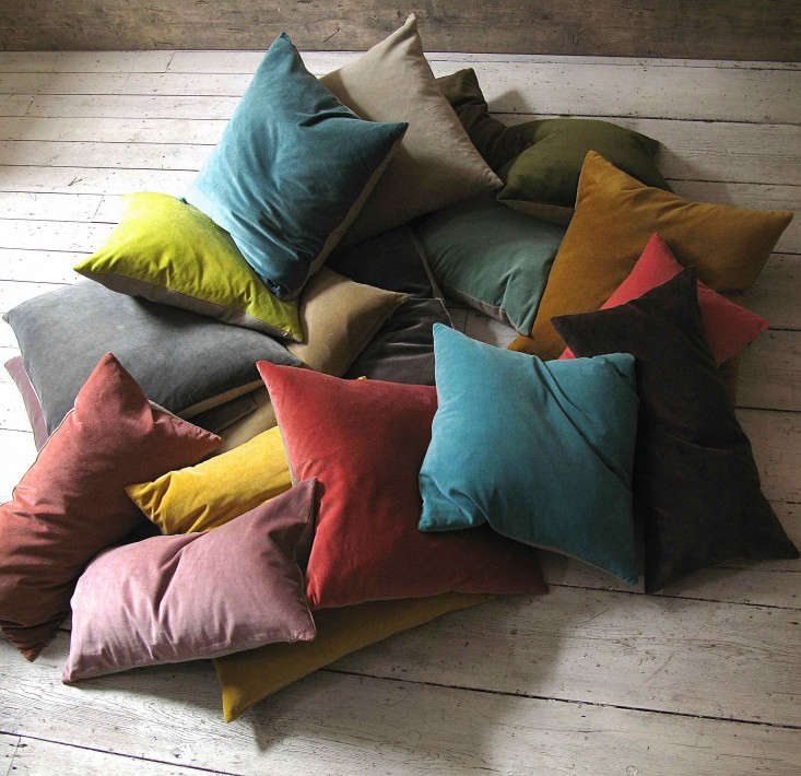
Texture is also essential. Pastels look richer when they appear in linen, velvet, ceramic, wool, glass, plaster, or natural stone. A flat pastel wall can be pretty, but a pastel wall with woven shades, wood furniture, and layered textiles becomes memorable. Contrast keeps pastel rooms from feeling childish. Add black picture frames, bronze lighting, dark wood, stone counters, or deep green plants to create depth.
Best Pastel Color Combinations to Try
Blush Pink + Chocolate Brown
This pairing feels warm, mature, and stylish. Use it in bedrooms, living rooms, or outfits where you want softness with depth.
Powder Blue + Butter Yellow
This combination is fresh, sunny, and optimistic. It works beautifully in kitchens, breakfast nooks, casual outfits, and spring table settings.
Mint Green + Cream + Natural Wood
This palette feels clean and organic. It is perfect for bathrooms, kitchens, nurseries, home offices, and small apartments.
Lilac + Charcoal Gray
Lilac becomes sophisticated when paired with gray. This mix is excellent for bedrooms, fashion styling, and modern branding.
Peach + Soft White + Brass
Peach adds warmth without becoming too bright. Brass accents make it feel polished and slightly glamorous.
Why Pastels Feel So Emotionally Appealing
Pastels have emotional range. They remind us of spring, childhood, flowers, vintage kitchens, beach cottages, gelato shops, stationery stores, and clean sheets. That sounds like a lot for a color family to carry, but pastels are overachievers. Their lower saturation makes them easier on the eyes, while their colorfulness keeps them from feeling empty.
In a world full of alerts, deadlines, economic worries, and screens, pastels offer a small visual exhale. They do not solve life’s problems, but they can make the room where you face those problems feel more pleasant. That matters. A soft yellow mug can make morning coffee more cheerful. A pale blue wall can make a bedroom feel cooler. A blush sweater can make Monday look less like a personal attack.
Experience: Living With the Pastel Appeal Obsession
Spending time with pastel appeal in everyday life reveals something interesting: these colors are not just decorative; they change how objects and spaces behave emotionally. A neutral room may look clean, but a room with carefully chosen pastels often feels cared for. The difference is subtle but powerful. It is like the room learned manners and started offering tea.
One of the easiest experiments is starting with a desk or workspace. Replace a black pen cup with a soft blue ceramic one. Add a pale yellow notebook, a blush mouse pad, or a mint green lamp. Suddenly, the desk feels less like a tax preparation station and more like a place where ideas might actually enjoy visiting. Pastels help reduce the harshness of office supplies, especially when paired with warm lighting and natural textures.
Another experience worth trying is using pastels in the kitchen. A butter yellow dish towel, pastel glass tumblers, or a powder blue mixing bowl can make basic routines feel brighter. Cooking dinner after a long day is still cooking dinner after a long day, but reaching for a cheerful bowl somehow makes chopping vegetables feel less like unpaid labor. Pastels are small mood lifters. They do not demand attention; they quietly improve the atmosphere.
Pastel clothing offers the same effect. Wearing a pale blue shirt or blush cardigan can soften an outfit without making it look weak. The experience is especially satisfying when pastels are mixed with practical pieces: denim, loafers, linen trousers, leather belts, or structured jackets. That contrast makes the color feel intentional. A lavender sweater with gray trousers feels creative. A mint shirt under a navy blazer feels crisp. Butter yellow sneakers with jeans feel happy but not ridiculous, which is honestly the dream.
The most surprising part of embracing pastel appeal is how flexible it becomes over time. At first, many people think pastels require a specific style: romantic, feminine, vintage, or cottage-inspired. But after using them, it becomes clear that pastels can bend. They can look Scandinavian with pale wood and white walls. They can look coastal with stripes and rattan. They can look modern with chrome and sculptural furniture. They can look maximalist when layered with pattern and art. They can even look moody when paired with dark brown, forest green, plum, or charcoal.
There is also a practical lesson: pastels work best when they are not treated like precious little decorations. They should be lived with. Use the pastel plates. Wear the blush jacket. Paint the laundry room. Put the lilac pillow on the sofa even if the dog believes all pillows are emotional support islands. Pastels become more beautiful when they are part of daily life rather than saved for perfect moments.
Current pastel obsession is really about permission. Permission to choose softness without losing style. Permission to bring color back without repainting the entire house hot pink. Permission to enjoy beauty in small, usable ways. In a culture that often rewards speed, sharpness, and constant productivity, pastel appeal offers something gentler: a reminder that calm can be colorful, and that subtle joy still counts.
Conclusion: Pastel Appeal Is Soft Power for Modern Style
Pastel appeal is more than a seasonal color crush. It is a response to the way people want to live now: with comfort, personality, optimism, and visual ease. From frosted paint colors and retro-inspired bathrooms to blush fashion, butter yellow accessories, lilac decor, and mint green kitchens, pastels are proving they can be both beautiful and practical.
The best way to enjoy this trend is to use pastels with intention. Choose muted shades, add grounding neutrals, include texture, and create contrast with deeper tones or clean modern shapes. When styled thoughtfully, pastels do not feel childish or overly sweet. They feel fresh, personal, and quietly luxurious.
So yes, the current obsession with pastel appeal is understandable. Pastels make the world feel a little lighter without pretending everything is perfect. They are gentle, but not bland. Pretty, but not powerless. And in the right room, outfit, or daily ritual, they can turn ordinary life into something just a little more charming. Honestly, that is a trend worth keeping.
Note: This article synthesizes current U.S. design, fashion, color, decor, and lifestyle trend information from reputable industry sources. Source links are intentionally excluded from the article body as requested.