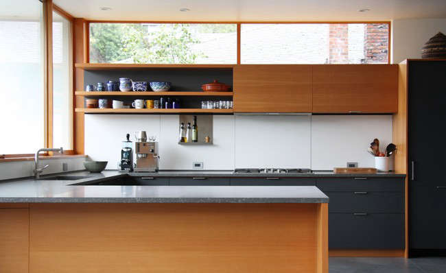
Remodelista Considered Design Awards: Vote for the Best Kitchen – Professional Category

A beautiful kitchen can stop a design lover mid-scroll, but a truly considered kitchen does something harder: it keeps working after the photographs are taken, the flowers wilt, and somebody drops a spoonful of tomato sauce on the pristine counter. That practical-meets-poetic standard was at the heart of the inaugural Remodelista Considered Design Awards and its Best Kitchen Space–Professional Category.
Published on July 2, 2013, the original professional kitchen ballot invited readers to compare five very different projects and vote once per day through July 15. The finalists were Jessica Helgerson Interior Design, Studio Schicketanz, Mark Reilly Architecture, David Rose Interior Architecture and Design, and Henrybuilt. The voting period has long since closed, but the kitchens remain useful case studies in material selection, spatial planning, architectural preservation, custom storage, and the subtle art of making appliances behave themselves.
The contest was more than a beauty parade for fancy cabinets. Remodelista’s first annual awards drew more than 500 project entries, while readers cast more than 40,000 votes across the home and garden categories. Mark Reilly Architecture ultimately won the professionally designed kitchen award for a Victorian renovation in Belvedere, California.
Why the Professional Kitchen Category Still Matters
Kitchen design dates quickly when it is built around a passing look rather than a lasting idea. Glossy trend colors, oversized fixtures, and open shelves staged with twelve identical bowls may photograph beautifully, but real kitchens must accommodate groceries, dishes, morning traffic, late-night snacks, and the occasional household member who leaves every cabinet door open.
The Remodelista professional finalists approached those demands from five distinct directions. One kitchen celebrated handmade surfaces and reclaimed materials. Another refreshed a midcentury room with accessible cabinetry and a burst of green. The winning project solved a preservation problem by suspending modern work surfaces in front of historic windows. A French barn conversion combined limestone with stainless steel, while a Seattle kitchen treated storage as a carefully engineered system.
Together, the projects demonstrate that the best professional kitchen design is not defined by one style. It is defined by coherence. The layout, cabinetry, materials, lighting, storage, architecture, and homeowner routines should feel as though they attended the same planning meeting.
Meet the Five Professional Kitchen Finalists
Jessica Helgerson Interior Design: Graphic Farmhouse Character
Jessica Helgerson Interior Design entered a Portland, Oregon, kitchen described as graphic and whimsical. Its personality came from a layered material palette rather than decorative clutter. Encaustic concrete floor tiles created a strong pattern underfoot, while locally handmade ceramic tiles added texture to the walls. Thick walnut counters were produced from locally felled trees, giving the work surfaces warmth and a substantial, furniture-like presence.
The design also used reclaimed iron bases discovered at a salvage yard. A marble slab was added to create a tall table that doubled as extra counter space. That move is especially clever because it avoids the visual bulk of another built-in cabinet while providing a useful place for serving, prep work, or casual conversation.
This finalist represents the expressive side of considered kitchen design. The room was not afraid of pattern, age, grain, or visible craftsmanship. Yet every strong material had a supporting role. The tile energized the room, the walnut softened it, the iron grounded it, and the marble introduced a cooler, polished surface. It is a reminder that mixing materials works best when each one has a job beyond simply looking expensive.
Studio Schicketanz: A Green Island in a Calm Midcentury Room
Studio Schicketanz approached a midcentury home in Carmel-by-the-Sea, California, with restraint. The existing house already had pleasing proportions and good circulation, but the kitchen needed an update. Instead of overwhelming the architecture, the designers used high-gloss white IKEA cabinetry, Caesarstone counters, energy-efficient appliances, and a handmade Heath Ceramics backsplash.
The memorable feature was a green island placed within the otherwise creamy, serene composition. That concentrated use of color gave the room an identity without turning every cabinet into a fashion statement. The island became both a functional center and a visual anchor.
This project offers an encouraging lesson for homeowners without an unlimited custom-cabinetry budget. Professional design is not automatically synonymous with commissioning every hinge from a remote workshop reachable only by mule. Standard cabinet components can produce a sophisticated result when they are selected carefully, integrated cleanly, and combined with distinctive surfaces.
The handmade backsplash also prevented the glossy cabinetry from feeling too clinical. Its slight variations introduced the human touch that streamlined kitchens often need. Studio Schicketanz’s wider design philosophy emphasizes responding to client needs, site conditions, and sustainability, values that can be seen in this quiet balance of efficiency and character.
Mark Reilly Architecture: Floating Over the Bay
Mark Reilly Architecture’s winning kitchen addressed the most complicated architectural problem in the group. The vintage Victorian house had tremendous charm and views, but its original kitchen and dining room occupied small, dark spaces on the lower level. The firm reversed the expected plan by moving the kitchen upstairs, where it could connect to natural light, the landscape, and the main living areas.
The upper-floor conversion introduced an immediate obstacle: the historic windows had low sills that fell below standard counter height, and preservation requirements meant they could not simply be removed or raised. Rather than fighting the windows, the architects floated sinks, counters, and shelves in front of them.
The solution preserved the old openings while allowing daylight and views to pass around the new work surfaces. Pantry storage and appliances were consolidated along the rear wall, leaving the window side visually open. Honed Caesarstone counters, Carrara marble backsplash tile, modern shelving, industrial fixtures, and carefully exposed plumbing created a dialogue between contemporary utility and Victorian detail.
The firm also widened connections between rooms and matched new oak flooring to the original floorboards. These decisions helped the renovated kitchen feel integrated with the house instead of looking like a sleek appliance showroom that had landed by helicopter.
Readers selected this project as the category winner, and the result remains persuasive because the most memorable feature was born from a constraint. The floating counter was not a decorative trick applied at the end. It was the architectural answer to preservation, light, storage, and view requirements.
David Rose Interior Architecture and Design: Modern Utility in a French Stone Barn
David Rose Interior Architecture and Design entered a kitchen occupying half of a renovated barn in southwest France. The design retained the simplicity and strength of the agricultural structure through a compact palette of limestone walls, Douglas fir planking, and stainless steel.
Behind that tailored material composition was a practical surprise: the designers used stainless steel and architectural detailing to disguise an IKEA kitchen. The project therefore combined accessible components with site-specific craftsmanship, allowing the cabinetry to recede while the barn’s stonework remained dominant.
Even the dining chairs carried a history, having begun their working lives in a cinema in India. That choice reinforced the adaptive-reuse spirit of the renovation. Instead of furnishing the room with pieces that looked artificially rustic, the project used objects and materials that already possessed age, wear, and provenance.
The barn kitchen shows how modern interventions can respect historic fabric without pretending to be historic themselves. Stainless steel does not imitate limestone, and Douglas fir does not disguise its newness. The materials are clearly different, but they share a straightforward, workmanlike quality. That honesty allows old and new elements to coexist comfortably.
Henrybuilt: Black, Wood, and Extremely Organized
Henrybuilt’s finalist kitchen was part of a vertical residence designed by SHED Architecture & Design on a steep site near Seattle’s Lake Washington. The kitchen and adjoining living area occupied the third floor of the four-level house, where the cabinetry system was customized to align with the building’s proportions and detailing.
The visual palette was sleek and restrained, combining dark surfaces with warm wood. However, the more important achievement was internal organization. The design team planned storage around the homeowners’ actual habits. The dishwasher was positioned near the sink, spices and cooking tools were stored beside the range, and dishes were placed in island drawers facing the dining area.
Specialized elements included removable plate holders, pullout corner storage, concealed appliances, paneled pantry sections, and backsplash panels mounted on a rail for easier replacement. Slim open shelves balanced the enclosed storage and prevented the kitchen from becoming one large, impeccably organized wall of mystery.
The result was an open kitchen that could remain visible from the dining room without displaying every toaster, package, and mixing bowl owned by the household. Seattle Magazine later highlighted the project’s precise storage planning and user-friendly details, reinforcing the idea that minimal visual design often requires maximum planning behind the doors.
How to Evaluate an Award-Worthy Professional Kitchen
Start With the Layout, Not the Backsplash
A kitchen can survive an unfashionable tile more easily than it can survive a dysfunctional floor plan. Before choosing a favorite design, consider how each project handles movement between food storage, preparation, cooking, cleaning, serving, and dining.
Mark Reilly Architecture transformed the entire household experience by relocating the kitchen. Henrybuilt refined the smaller movements within the room by placing storage according to task. Jessica Helgerson’s tall marble table added flexible preparation space without blocking circulation. These are layout decisions, not styling decisions, and they influence every day of a kitchen’s life.
Examine the Relationship to the House
The strongest kitchen should feel specific to its setting. In the Victorian winner, new elements responded to preserved windows. In the French barn, modern stainless steel allowed old limestone walls to remain visually dominant. In Carmel, the green-and-white kitchen refreshed a midcentury home without erasing its calm proportions.
A room can be beautiful and still feel wrong for the building. Professional design avoids that awkwardness by treating the kitchen as part of the architecture rather than as an isolated shopping list of cabinets and appliances.
Look for Material Discipline
More materials do not automatically create more interest. Sometimes they create a kitchen that resembles a sample showroom during an earthquake. Each finalist used a relatively controlled palette.
Jessica Helgerson’s project was the most visually layered, but its tile, walnut, iron, and marble shared an artisanal quality. Studio Schicketanz balanced glossy white cabinetry with handmade tile. David Rose combined only a few robust materials suited to a barn. Henrybuilt relied on black, wood, and carefully integrated surfaces. The winner used stone, oak, redwood, and painted trim in ways that connected old and new rooms.
Consider What Will Still Work in Ten Years
Longevity depends partly on durable materials, but it also depends on whether the core idea remains useful. A green island can be repainted. Cabinet pulls can be replaced. A thoughtful relationship between counters, windows, storage, and circulation is much harder to retrofit.
When comparing professional kitchen designs, give extra credit to solutions that would remain intelligent even after the current color palette goes out of fashion. A kitchen should not require an identity crisis every time social media discovers a new shade of beige.
Design Lessons Homeowners Can Borrow
Use One Strong Focal Point
Studio Schicketanz concentrated color on the island, while the surrounding cabinetry remained calm. Homeowners can adapt this idea by painting only the island, using a distinctive pendant over the central workspace, or selecting one expressive backsplash area rather than demanding attention from every surface.
Mix Standard Components With Custom Details
Both the Carmel kitchen and the French barn project demonstrated that accessible cabinet systems can be elevated through thoughtful installation and material choices. Spending selectively on visible end panels, counters, hardware, lighting, or a handcrafted backsplash may deliver more character than allocating the entire budget to custom cabinet boxes.
Plan Storage Item by Item
The Henrybuilt project offers one of the least glamorous but most valuable exercises in kitchen remodeling: decide where things will live before ordering cabinets. Write down where plates, glasses, pots, knives, spices, food containers, small appliances, recycling, and cleaning products will go.
This process prevents the familiar post-renovation discovery that the expensive new kitchen has room for a wine refrigerator but nowhere sensible to store a colander.
Treat Constraints as Design Material
The winning kitchen’s preserved windows could have been viewed as an inconvenience. Instead, they generated the project’s signature floating counters and shelves. Homeowners facing an odd column, sloped ceiling, narrow doorway, or immovable window should first ask whether the limitation can inspire a distinctive solution.
Let Old and New Remain Legible
Historic renovations do not always benefit from making new work look artificially old. The French barn’s stainless steel and the Victorian kitchen’s modern shelving openly acknowledged that the rooms had evolved. Clear contrast can be more respectful than imitation, especially when the original structure is strong enough to speak for itself.
Which Professional Kitchen Deserves Your Vote?
Although the official 2013 ballot is closed, choosing a personal winner is still a useful design exercise. Each project represents a different priority.
- Choose Jessica Helgerson Interior Design for tactile materials, local craftsmanship, pattern, and farmhouse warmth.
- Choose Studio Schicketanz for restrained midcentury modernization, an accessible cabinet strategy, and confidently concentrated color.
- Choose Mark Reilly Architecture for architectural problem-solving, historic preservation, natural light, and an inventive floating counter system.
- Choose David Rose Interior Architecture and Design for adaptive reuse, honest materials, creative sourcing, and respect for an agricultural structure.
- Choose Henrybuilt for precision storage, visual calm, custom integration, and a kitchen organized around real household behavior.
Mark Reilly Architecture won the public vote, and the project’s combination of ingenuity and restraint explains why. Still, the other finalists are not lesser versions of the same idea. They are alternative definitions of excellence. The most useful “winner” for a homeowner is the project that best answers the needs of the home, budget, architecture, and people who will use the room.
Experience-Based Reflections: What These Kitchens Teach About Daily Life
Studying award-caliber kitchens becomes much more useful when the viewer stops imagining a photo shoot and starts imagining a Tuesday morning. Picture two people making coffee while someone unloads the dishwasher, a grocery delivery arriving, and a child searching urgently for a missing water bottle. Suddenly, cabinet symmetry is less important than whether doors collide and whether the mugs are stored near the coffee maker.
The Henrybuilt kitchen performs especially well under this kind of mental test. Its storage was planned according to use, allowing dishes, cooking tools, spices, and appliances to live near the tasks they support. The practical experience is one of reduced friction. You do not cross the room three times to set the table, and you do not kneel with a flashlight to investigate the darkest corner cabinet. That may not sound dramatic, but convenience repeated every day becomes a major form of luxury.
Jessica Helgerson’s kitchen offers a different experience. The walnut counters, handmade tiles, reclaimed metal, and marble table create a room that invites touch and casual gathering. It feels less like a sealed laboratory and more like a space that could absorb bread crumbs, flowers, cookbooks, and conversation without losing its composure. The lesson is that visual richness can make daily wear feel natural rather than disastrous.
Studio Schicketanz’s finalist demonstrates the emotional effect of restraint. White cabinetry and pale surfaces help the room feel bright and calm, while the green island gives users a clear center of gravity. In everyday experience, a strong island can become the place where groceries land, vegetables are chopped, guests lean, and mail mysteriously accumulates. The island is not merely a block of cabinetry; it is the kitchen’s town square, though hopefully with fewer pigeons.
The French barn kitchen encourages another kind of experience: awareness of place. Limestone walls and Douglas fir maintain the memory of the original building, while stainless steel provides the hygienic, durable surfaces required by modern cooking. The room would likely feel grounded and slightly imperfect in the best sense. Instead of hiding age, it allows old stone, reclaimed seating, and contemporary equipment to share the same scene.
Mark Reilly Architecture’s winning design may offer the most transformative daily experience because it changed where the household lives. Moving the kitchen upstairs connected cooking and dining with views, light, and the primary social rooms. The floating counters allowed the occupants to work near historic windows instead of facing a blank wall. This illustrates a powerful remodeling principle: improving the kitchen is sometimes less about replacing cabinets and more about reconsidering the location of the room itself.
For anyone planning a remodel, the most valuable experience is to rehearse daily routines before finalizing the design. Walk through an imaginary breakfast. Pretend to carry hot food from the oven to the serving area. Open the dishwasher and nearby drawers at the same time. Identify where guests will stand while you cook, because they will inevitably choose the exact spot you need most.
Then test the emotional experience. Does the kitchen feel connected to the architecture? Are the materials pleasant to touch? Is there enough visual warmth to make people want to stay? Can clutter be contained without making the room sterile? The Remodelista finalists show that practical performance and visual beauty do not have to compete. When carefully planned, each strengthens the other.
Conclusion
The Remodelista Considered Design Awards professional kitchen finalists remain relevant because their ideas are larger than their finishes. They demonstrate how to preserve historic windows, personalize standard cabinetry, organize storage around behavior, combine old buildings with modern equipment, and use materials to create atmosphere without sacrificing function.
Mark Reilly Architecture’s winning Victorian kitchen offered the most complete architectural solution, turning preservation restrictions into floating counters, open views, and a brighter household center. Yet every finalist contributes a valuable lesson. Good kitchen design is not a competition to install the most marble. It is the discipline of making space, materials, storage, light, and human habits work together gracefully.
Note: This article presents the Remodelista vote as a historical design retrospective. The original public voting period ended on July 15, 2013, and Mark Reilly Architecture was subsequently announced as the professional kitchen category winner.