
Some homes walk into your life like a jazz band. Others shuffle in like a cardboard box full of receipts and old extension cords. The pair of Barcelona flats at the center of this story clearly started in the second category: chopped up, visually heavy, and in serious need of a better relationship with daylight. But after a thoughtful transformation, the spaces emerged brighter, calmer, and far more generous than their square footage would suggest. It is the kind of renovation that makes you want to applaud politely, then go home and immediately tear down a suspiciously unnecessary wall.
The magic here is not just that the apartments look better. Plenty of renovations manage that. The real success is that these homes now feel better. Light travels farther. Rooms breathe. Privacy still exists, but it no longer arrives wearing combat boots. Instead of fighting the bones of the building, the redesign works with them, using openness, restraint, and material warmth to create homes that are both modern and unmistakably Barcelona.
That is why this transformation matters beyond one pair of flats in Spain. It taps into a bigger design truth that homeowners, renters, architects, and anyone who has ever muttered “why is this hallway so depressing?” can appreciate: when you redesign for light, you redesign for life. A brighter home often feels larger, calmer, more social, and more useful. And when the architecture is handled well, even modest spaces can start behaving like they own stock in luxury real estate.
From Compartmentalized to Calm
The original layout appears to have suffered from a classic old-apartment problem: too many divisions, not enough generosity. False ceilings weighed the rooms down, interior walls blocked views, and the plan likely worked harder at slicing up space than improving it. That kind of arrangement can make an apartment feel smaller than it is, even if the square footage is perfectly respectable on paper. On paper, after all, a lot of things sound great. So does “multifunctional entry alcove.” In real life, it is usually where shoes go to die.
What makes the Barcelona renovation so effective is the clarity of its first move: remove what is unnecessary. Once the false ceilings and dividing walls were stripped away, the apartments could finally do what urban homes should do bestcirculate light, movement, and everyday life with much less friction. Open-plan living in this case is not a trend for trend’s sake. It is a practical answer to darkness and visual clutter.
That approach mirrors what many successful small-space renovations get right. When sight lines open up, homes feel broader and more breathable. When daylight can move from one end of a flat to another, the entire mood changes. The apartment stops feeling like a sequence of obstacles and starts behaving like a connected environment. That is a design win, but it is also a quality-of-life win.
Why Light Became the Star of the Show
Natural light is one of those design features that people discuss in almost spiritual terms, and honestly, fair enough. It softens surfaces, reveals texture, improves atmosphere, and gives even simple materials a glow-up. But beyond aesthetics, light has practical value too. Brighter rooms can feel larger, and well-daylit homes can reduce dependence on artificial lighting during the day. In other words, sunlight is both a design asset and a useful household employee, and unlike most employees, it never asks for a standing desk.
In the Barcelona flats, light is not treated as a decorative bonus. It is the organizing principle. Once the layout became more open, the apartments could capitalize on whatever daylight they already had. That is the hidden lesson of many great renovations: the solution is not always “add more windows.” Sometimes the smarter answer is “stop blocking the ones you already have.”
There is also an emotional intelligence to designing with light in mind. Brighter interiors tend to feel more uplifting, more sociable, and more restorative. Morning routines feel gentler. Cooking feels less cave-like. Working from the dining table becomes slightly less tragic. A home that collects daylight well becomes a place that supports daily rhythms instead of draining them.
The Smart Design Moves Behind the Transformation
1. Opening the shared spaces
The living, dining, and kitchen zones benefit most from a more open layout. This makes perfect sense. These are the rooms where movement, conversation, and everyday mess overlap. By allowing them to flow together, the renovation creates a stronger social center. That center does not need to be huge to feel generous; it just needs to avoid visual interruptions that make the apartment feel chopped into pieces.
2. Protecting privacy without killing brightness
One of the most elegant details in the project is the use of a light translucent wall to separate the shower and toilet from the rest of the bathroom area. That move is brilliant because it solves a real problem without introducing unnecessary visual weight. Frosted or translucent dividers can preserve privacy while still allowing light to pass through, which is exactly the kind of grown-up compromise more renovations need. Privacy does not always require a solid fortress of drywall.
3. Orienting restful spaces toward quieter zones
The bedrooms are placed toward the quieter rear façade, which shows an understanding that not every room should perform the same way. The brightest, most open zones support gathering and daily activity. The calmer, more tucked-away zones support rest. A great apartment does not just look balanced; it behaves in a balanced way too.
4. Using simplicity as a visual amplifier
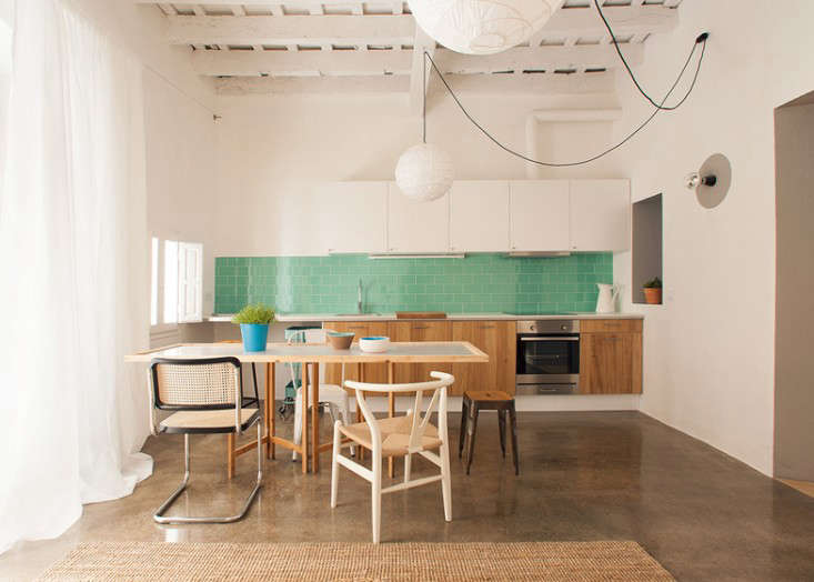
The furnishings are restrained: natural textures, simple silhouettes, and pieces that do not clutter the eye. A jute rug, minimalist dining table, and mismatched chairs create character without visual heaviness. This matters because furniture can either help light travel or stop it dead in its tracks. Bulky pieces, dark finishes, and fussy ornament often interrupt the calm that a renovation has worked so hard to build.
5. Letting one colorful note do the flirting
The glossy green kitchen backsplash is a particularly smart touch. In a largely pared-back interior, one cheerful, reflective surface can energize the room without tipping it into chaos. It is design restraint with personality, which is much harder to pull off than simply throwing 14 “statement” elements into one room and calling it eclectic.
Old Barcelona Charm, Minus the Dusty Drama
One reason Barcelona renovations are so compelling is that the city’s apartments often come with architectural gifts already built in: tile, moldings, vaulting, old doors, deep proportions, and enough character to embarrass a lot of new construction. The best renovations do not erase those features. They edit around them.
That is what makes light-first renovation especially powerful in older homes. Instead of sanding history into oblivion, designers can preserve original texture while adjusting the layout for contemporary life. In related Barcelona projects, architects have restored hydraulic tile floors, kept plaster moldings and Catalan vaulting, and opened kitchens to improve circulation and cross-views. The lesson is consistent: preservation and modernization are not enemies. They just need a good mediator and a decent floor plan.
In practice, that often means keeping the architectural elements that give a home identity while simplifying the things that make it feel cramped. Restore the good doors. Save the beautiful floors. Lose the fake ceiling. Open the kitchen. Allow the apartment to remember where it came from while also acknowledging that people in 2026 might want to cook, work, host friends, and charge five devices without feeling like they live inside a museum diorama.
How to Borrow This Look Without Moving to Barcelona
You do not need a Gothic Quarter address to steal the best ideas from this transformation. The first move is to audit what is blocking light in your home. That could be literal walls, but it could also be heavy window treatments, bulky furniture, dark paint, cluttered sills, or a layout that places tall storage where openness should be. Sometimes your room is not dark because it lacks potential. Sometimes it is dark because a giant cabinet is standing there like an overpaid bouncer.
Second, work with reflective and light-friendly materials. Mirrors placed strategically across from windows can amplify brightness and create the illusion of more space. Sheer curtains can soften privacy concerns without swallowing daylight. Glossy finishes, glass furniture, and pale walls can all help light move deeper into a room. Even something as simple as cleaning windows more regularly can make a surprising difference. Revolutionary? No. Effective? Extremely.
Third, think about partitions differently. Not every zone needs to be fully sealed off. Glass dividers, translucent panels, or open shelving can create separation while maintaining flow. This is especially useful in apartments where the challenge is not just limited square footage, but limited daylight. The goal is not to eliminate privacy or function. It is to stop treating every problem with the architectural equivalent of a brick sandwich.
Finally, keep the palette calm and let texture do some of the heavy lifting. Natural fiber shades, jute, pale woods, ceramic tile, linen, and simple upholstery can create warmth without visual noise. A light-filled home should not feel sterile. It should feel edited, grounded, and a little sun-struck in the best possible way.
What This Renovation Says About Modern Apartment Living
The Barcelona transformation works because it understands a modern contradiction: people want openness, but they also want comfort; they want brightness, but not glare; they want old-world character, but also a kitchen that makes sense. Great design does not force those desires into a duel. It choreographs them.
That choreography shows up in the balance between social and private spaces, between preserved charm and modern restraint, between daylight and the materials chosen to catch it. It is proof that apartments do not need endless square footage to feel luxurious. Often, what they need is better flow, fewer barriers, and a stronger sense of purpose.
There is also a lesson here for anyone tempted by maximal intervention. Not every successful renovation needs a dozen heroic gestures. Sometimes the smartest move is subtraction. Remove the false ceiling. Remove the awkward wall. Remove the bulky curtain. Remove the assumption that small homes have to feel closed-in. Once you do that, the architecture starts speaking more clearly. And in this case, what it says is: “Please stop blocking the sunlight. I was trying to help.”
Living With the Light: An Experience-Driven Reflection
Imagine waking up in one of these transformed flats on a mild Barcelona morning. The bedroom, set toward the quieter side of the building, feels tucked away from the city’s chatter. Light arrives gradually, not like an interrogation lamp, but like a polite guest who knows exactly when to knock. You step into the bathroom area and the translucent partition catches the morning glow, softening edges and making the room feel more generous than it technically is. That small design move changes the entire mood. Instead of walking into a cramped utility zone, you move through a space that feels calm, breathable, and considered.
Then you drift into the kitchen and suddenly understand why open sight lines matter so much. Coffee happens in a brighter room. Toast feels more optimistic. Even the backsplash, with its glossy green finish, seems to perk up before you do. The apartment does not just contain your routine; it improves it. That is the part people often miss when they talk about renovation. Good design is not only what a home looks like in photos. It is what the place gives back to you at 7:12 a.m. when your hair is chaotic and your patience is still loading.
By midday, the shared spaces earn their keep. An open living and dining area allows the apartment to shift roles without feeling frantic. Breakfast becomes work-from-home time. Work-from-home time becomes lunch. Lunch becomes reading by the window. The room adapts because the layout is not fighting every transition. There is a sense of ease in homes like this that is hard to fake. Light moves across the floor, changes the temperature of surfaces, and quietly marks the hours. It is architecture acting like a clock, but with better manners.
In the evening, the benefits become emotional as much as visual. A brighter apartment usually feels more social because people instinctively gather where rooms feel open and welcoming. Friends linger longer. Conversations stretch. A simple dinner at the table feels less like “we made pasta again” and more like an actual occasion. Even mismatched dining chairs can look charming when the room around them is well edited and full of glow. That is one of light’s sneakiest talents: it makes ordinary life look slightly cinematic.
And then there is the quieter experience, the one that arrives after everyone leaves. In a home designed like this, you notice absence differently. The apartment still feels full because daylight, air, texture, and proportion have become part of its personality. You do not need every corner packed with décor to make the place feel complete. The architecture carries more of the mood. The materials do more with less. The calm is not empty; it is intentional.
That is ultimately why this Barcelona transformation resonates. It offers more than a pretty before-and-after story. It suggests a better way to live in small or older urban homes: let the layout loosen up, let the light travel, let the original character stay visible, and let the apartment do a little more of the emotional heavy lifting. In a world where so many interiors are trying desperately to impress, this one succeeds by making daily life easier, brighter, and more human. Not bad for a couple of old flats that probably once felt like they were auditioning for the role of “gloomy maze” in a low-budget art film.
Conclusion
Let There Be Light: A Pair of Flats in Barcelona Transformed is more than a story about stylish interiors. It is a reminder that light is one of the most powerful renovation tools available, especially in older apartments with good bones and bad partitions. By opening shared spaces, preserving privacy with translucent elements, using simple natural materials, and allowing one or two expressive details to shine, this transformation turns constrained homes into luminous, livable sanctuaries. It is a persuasive case for designing less around square footage and more around experience. Because when a home feels brighter, calmer, and more connected, it does not just look transformed. It lives transformed too.
SEO Tags