
Choosing a soft gray for a living room sounds easy until you discover that gray paint has more personalities than a family group chat. One sample looks perfectly neutral at the paint store, turns blue beside your sofa, becomes green near the window, and somehow looks beige after sunset.
Benjamin Moore Moonshine is one of those beautifully complex colors that rewards careful planning. Also identified as Moonshine 2140-60 and Moonshine OC-56, it sits between a pale gray and an off-white, with enough color to give a room depth without making the walls feel heavy. It is especially appealing for homeowners who want an airy neutral but find plain white too stark or predictable.
Moonshine is not a color that shouts for attention. It quietly improves the background, allowing furniture, artwork, wood tones, and architectural details to do the talking. In other words, it is the well-dressed supporting character who never steals the microphone but somehow makes the entire show better.
What Color Is Benjamin Moore Moonshine?
Benjamin Moore officially describes Moonshine as an off-white enriched by muted blue, green, and gray undertones. Its light reflectance value, or LRV, is 66.53. That places it comfortably in the light paint-color range: bright enough to help a living room feel open, but pigmented enough to create a visible contrast with a cleaner white ceiling or trim.
The same color appears in two Benjamin Moore collections. The number 2140-60 identifies it within the Color Preview collection, while OC-56 identifies it within the Off White Collection. These are not two different Moonshine colors. They are two catalog references for the same shade.
Official Moonshine identifiers, undertones, LRV, collections, similar shades, and coordinating colors:
Is Moonshine Gray, Green, Blue, or Off-White?
The honest answer is “a little of each,” although gray usually leads the conversation. In balanced daylight, Moonshine generally reads as a pale, cool gray. When its green undertone becomes more noticeable, it can resemble an extremely diluted sage. In cooler conditions, the blue undertone may move forward and give the walls a misty, silvery appearance.
This flexibility is why Moonshine is often called a chameleon color. It does not change its actual formula, of course, but the surrounding light, flooring, furniture, and neighboring colors can change which part of the formula your eyes notice first.
Real-room reviews consistently identify blue and subtle green behavior in Moonshine:
Is Moonshine a Warm or Cool Gray?
Moonshine generally belongs on the cool side of the neutral spectrum because its most noticeable undertones are blue and green rather than beige, tan, pink, or violet. However, it is softer than many icy blue-grays. Warm sunlight, oak flooring, brass accents, woven textures, and cream upholstery can make it feel much more balanced.
Think of it as a cool neutral that is willing to negotiate. It will not suddenly become a buttery greige, but it can live comfortably with warm materials when the palette is thoughtfully layered.
Why Moonshine Works So Well in a Living Room
A living room must often perform several jobs. It may be a television room on Friday night, an entertaining space on Saturday, and a temporary office when someone discovers the kitchen table is covered in mail. A flexible background color is useful because it can support many activities and decorating styles without dominating them.
It Creates Depth Without Making the Room Dark
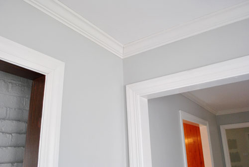
White walls can look clean and expansive, but they sometimes leave a living room feeling unfinished, particularly when the room has white trim, pale upholstery, and few architectural details. Moonshine adds a gentle layer of contrast. The difference may be subtle, but it gives crown molding, baseboards, door casings, fireplaces, and built-in shelving a clearer outline.
With an LRV of 66.53, Moonshine reflects a useful amount of available light. It will not rescue a windowless cave through paint-based wizardry, but in a moderately bright living room it can maintain an open feeling while adding more visual substance than a basic white.
It Gives Colorful Decor Room to Breathe
Moonshine works especially well behind artwork, patterned pillows, books, plants, and collected objects. Because the wall color is quiet, richer accents can stand out without making the room look chaotic.
Gray-green walls are also effective in rooms containing vintage art, weathered wood, antique brass, or distressed furniture. The muted background helps unite pieces from different periods. Your grandmother’s side table and your aggressively modern floor lamp may finally agree to coexist.
Gray and gray-green walls can provide a flexible backdrop for artwork, antiques, layered neutrals, and stronger accent colors:
It Fits Multiple Interior Styles
In a coastal living room, Moonshine can complement pale woods, white linen, sea-glass blue, and woven shades without turning the space into a souvenir shop. In a modern room, it works with black metal, walnut, sculptural furniture, and graphic artwork. In a farmhouse or cottage interior, it softens shiplap, aged wood, painted cabinetry, and vintage textiles.
Transitional spaces may benefit most. Moonshine can bridge traditional features, such as detailed molding or a stone fireplace, with cleaner contemporary furniture. Its blue-green undertones add character, but the overall effect remains restrained.
How Lighting Changes Benjamin Moore Moonshine
Lighting is the deciding factor with almost every paint color, but it is particularly important with a pale chameleon gray. Moonshine may look wonderfully neutral in one living room and noticeably blue-green in another. Neither result is wrong. The rooms are simply showing different sides of the color.
Gray paint is highly responsive to natural light, window direction, artificial bulbs, finish, and surrounding materials. A sample viewed at noon can look surprisingly different during an evening movie, which is why choosing paint from a small screen image is roughly as reliable as choosing a mattress by looking at its photograph.
Natural and artificial light can substantially alter the perceived temperature and undertones of gray paint:
North-Facing Living Rooms
North-facing rooms receive relatively cool, indirect light. In this setting, Moonshine is likely to appear cooler, grayer, or slightly bluer. Its softness may also become more muted, particularly if the room has small windows or deep overhangs.
Warm the room with medium-toned wood, camel leather, oatmeal fabric, aged brass, warm white lamps, or a rug containing tan and muted rust. Avoid filling every surface with cool gray furniture unless your design goal is “elegant cloud with excellent Wi-Fi.”
South-Facing Living Rooms
Strong southern light tends to make Moonshine feel softer and warmer. In a room with generous windows, the color may move closer to a luminous off-white during the brightest hours. The green undertone can become more noticeable, especially when the room looks toward grass, trees, or other outdoor greenery.
South-facing rooms can usually handle deeper accents. Navy, charcoal, dark olive, walnut, and black can anchor the brightness and prevent the pale walls from looking washed out.
East-Facing Living Rooms
East-facing rooms receive their strongest light in the morning. Moonshine may look bright, fresh, and gently green during breakfast hours, then become quieter and cooler later in the day. Consider when the living room is used most. A color that looks heavenly at 8 a.m. is not necessarily helpful if everyone enters the room after 6 p.m.
West-Facing Living Rooms
Western afternoon light can add warmth and soften Moonshine’s cooler undertones. Earlier in the day, however, the room may appear comparatively cool. This changing quality can be attractive, giving the walls more dimension as the day progresses.
If the late-afternoon light is extremely warm, compare Moonshine beside your flooring and upholstery. Some yellow-orange woods can exaggerate the green undertone, while balanced walnut or neutral oak may create a more natural transition.
Directional-light guidance and testing recommendations:
Best Colors to Pair With Moonshine
White Trim and Ceiling Colors
Benjamin Moore lists Distant Gray OC-68 and Winter White 2140-70 among its expert-selected coordinating colors for Moonshine. Distant Gray can create a clean trim contrast, while Winter White produces a softer, more closely related transition. Cloud Cover OC-25 is another official coordinating option and can help create a layered off-white palette.
Because Moonshine is a cooler gray-green, very creamy yellow whites should be tested carefully. A heavily warm trim color may make the walls appear greener or cause the trim to look dingy by comparison. A neutral or gently cool white is usually easier to coordinate.
Benjamin Moore’s official Moonshine combinations include Distant Gray, Winter White, Cloud Cover, and Caldwell Green:
Furniture and Accent Colors
- Navy blue: Adds depth while staying connected to Moonshine’s cool undertones.
- Camel and cognac: Warm leather introduces contrast and prevents the palette from feeling cold.
- Charcoal: Grounds the room without the sharpness of pure black.
- Cream and oatmeal: Soften the walls and create a comfortable, layered neutral scheme.
- Forest or Caldwell green: Builds on the subtle green undertone for a nature-inspired palette.
- Muted rust or ochre: Adds controlled warmth without overpowering the soft gray background.
- Dusty blue: Creates a quiet, coastal, or relaxed transitional appearance.
Materials That Bring Moonshine to Life
Texture is essential when decorating with pale gray. Use linen curtains, wool rugs, woven baskets, boucle upholstery, pottery, natural stone, and wood with visible grain. These materials keep a neutral living room from becoming visually flat.
Metal finishes also influence the mood. Polished nickel and chrome emphasize Moonshine’s clean, cooler side. Aged brass, bronze, and blackened metal add warmth and contrast. Mixing two finishes can look more collected than matching every metal in the room like a coordinated appliance package.
Designers commonly balance blue-gray and pale gray with white trim, warm wood, brass, textured neutrals, and stronger accent colors:
Choosing the Right Paint Finish
For most living room walls, eggshell is the practical choice. It has a subtle sheen, reflects a little more light than matte paint, and is easier to wipe clean. This matters when the wall is located behind a sofa, near a light switch, or within the mysterious splash radius of a child holding a juice cup.
Matte can create a soft, sophisticated appearance and may hide minor wall imperfections more effectively. Satin is more washable but has greater shine, so it may emphasize dents, patches, or uneven drywall. For trim and doors, satin or semi-gloss usually provides useful durability and contrast. A flat finish remains a reliable option for ceilings.
Living-room finish guidance favors eggshell for walls, with flatter sheens for ceilings and glossier finishes for trim:
How to Test Moonshine Before Painting the Entire Room
Never approve Moonshine from a phone, laptop, printed photograph, or tiny store chip alone. Screens and printers cannot reproduce paint perfectly, and a small sample does not reveal how an undertone behaves across an entire wall.
- Purchase a liquid sample or a movable peel-and-stick sample.
- If using liquid paint, apply two coats to a large white foam board or a section of wall.
- Leave a white border around the sample so the current wall color does not distort it.
- Move the board near the sofa, fireplace, television wall, windows, and darkest corner.
- Check it in morning light, afternoon light, evening lamplight, and with the television on.
- Place flooring, upholstery, curtain, and rug samples beside it before making the final decision.
Benjamin Moore recommends evaluating samples from morning through evening under both natural and artificial light. Its liquid color samples are intended for color representation, and two coats over a sufficiently large area provide a more accurate preview than a single hurried brush mark.
Benjamin Moore advises large samples, two coats, movable foam board, and observation throughout the day:
When Moonshine May Not Be the Best Choice
Moonshine is versatile, but no paint color is universally flattering. It may not be ideal in a very dark north-facing room filled with blue-gray flooring and cool LED lighting. In that environment, the result can feel flatter or colder than expected.
It may also conflict with fixed surfaces that contain strong pink, violet, orange, or yellow undertones. Granite, tile, wall-to-wall carpet, and stone fireplaces deserve special attention because they cannot be changed as easily as pillows or curtains.
If your living room already has a large cool-gray sectional, gray laminate flooring, silver curtains, and gray artwork, Moonshine may contribute to gray overload. The problem is not necessarily the paint. It is the absence of warmth, variation, and texture. Gray remains useful when it serves as a background rather than becoming the room’s walls, floors, furniture, personality, and emergency contact.
Design guidance warns against ignoring tonal temperature, room lighting, and excessive use of one-dimensional gray:
Moonshine Compared With Similar Benjamin Moore Colors
Benjamin Moore lists Gray Owl 2137-60, Titanium 2141-60, Oystershell 864, and Alaskan Husky 1479 as similar colors. They may occupy a related visual neighborhood, but they should not be treated as interchangeable.
Gray Owl is another popular light gray known for green-blue behavior, although its undertone balance can appear different beside fixed materials. Titanium may feel slightly earthier in some interiors. Oystershell and Alaskan Husky can offer alternative gray directions when Moonshine appears too cool, too light, or too green in a specific room.
The best comparison is not a collection of online photographs. Place actual samples beside one another in the intended space. A subtle distinction that seems meaningless on a screen can become obvious across four living room walls.
Similar colors identified on Benjamin Moore’s Moonshine page:
Practical Experience: Living With Moonshine in a Real-World Living Room
The most useful way to understand the experience of Moonshine is to imagine a typical living room test rather than a perfectly lit catalog photograph. Consider a room with one large window, medium oak flooring, a cream sofa, a dark television, and several lamps. On the first morning, the sample may look almost like an off-white. The reaction is often, “Did I choose enough color?” By late afternoon, a clearer gray-green character appears, and the wall suddenly feels more dimensional.
The next common experience occurs after the sample is placed beside furniture. Against a cool charcoal sofa, Moonshine can look cleaner and slightly greener. Beside a camel leather chair, it becomes softer and more neutral. This is an important reminder that undertones are relationships, not isolated paint facts. The wall and furniture are having a visual conversation, and occasionally the rug interrupts with an unexpectedly strong opinion.
During evening hours, bulb temperature becomes the star of the experiment. Very cool bulbs can push Moonshine toward a sharper blue-gray. Warm bulbs may calm the blue and make the room feel more welcoming, although extremely yellow bulbs can create an odd greenish contrast. Many living rooms benefit from warm-neutral lighting rather than bulbs positioned at either end of the temperature spectrum.
Another real-world lesson appears after the room is fully painted. A pale color usually looks more colorful across four walls than it did on one small board. Corners create shadow, opposite walls reflect color onto each other, and large surfaces make subtle undertones easier to see. Homeowners who worried that the sample was “basically white” may discover that the finished room has exactly the soft gray presence they wanted.
Decorating after painting is often easier than expected. Dark picture frames look crisp against Moonshine. Plants reinforce its quiet green side. Natural wood and woven shades add warmth. Blue pillows connect with the cooler undertone, while rust, ochre, or leather prevents the room from feeling too restrained. The paint does not demand one rigid palette; it provides a calm base that can evolve as accessories change.
The most successful experience with Moonshine usually comes from accepting its complexity rather than trying to force it to remain perfectly neutral at every hour. It may look cooler on a rainy morning, softer under afternoon sun, and slightly greener beside summer foliage. That movement gives the room life. A completely unchanging gray might be easier to describe, but it would also be less interesting to live with.
The least successful experience usually begins with skipping the sample stage. Someone sees Moonshine in a beautiful online room, buys several gallons, and later discovers that their flooring has a pink undertone or their north-facing windows make the color feel too blue. The lesson is refreshingly unglamorous: test first. A sample costs far less than repainting a living room while quietly blaming the sofa.
When the lighting, fixed materials, and furnishings cooperate, Moonshine creates a room that feels finished but not overdesigned. It can make white trim look intentional, give artwork a calm background, and allow warmer materials to stand out. The finished effect is not dramatic in the theatrical sense. It is the quieter satisfaction of walking into the living room and feeling that everything finally belongs together.
Final Verdict: Is Benjamin Moore Moonshine Right for Your Living Room?
Benjamin Moore Moonshine is an excellent option for a living room that needs more softness and dimension than white can provide. Its light gray body, moderate reflectivity, and muted blue-green undertones create an airy background with genuine character.
It is particularly successful with neutral or cool white trim, natural wood, cream upholstery, navy accents, greenery, aged brass, and layered textures. It can work in modern, coastal, farmhouse, cottage, and transitional interiors without feeling tied to a single decorating trend.
The deciding step is testing it in the actual room. Moonshine reacts to natural-light direction, artificial bulbs, floors, fabrics, and outdoor reflections. Give it several days, examine it from every wall, and let it experience at least one cloudy afternoon. Paint deserves a fair audition too.
Note: Paint appearance varies by lighting, surface texture, sheen, application method, and surrounding colors. Always confirm the current Moonshine formula and test a physical sample before purchasing paint for the full living room.