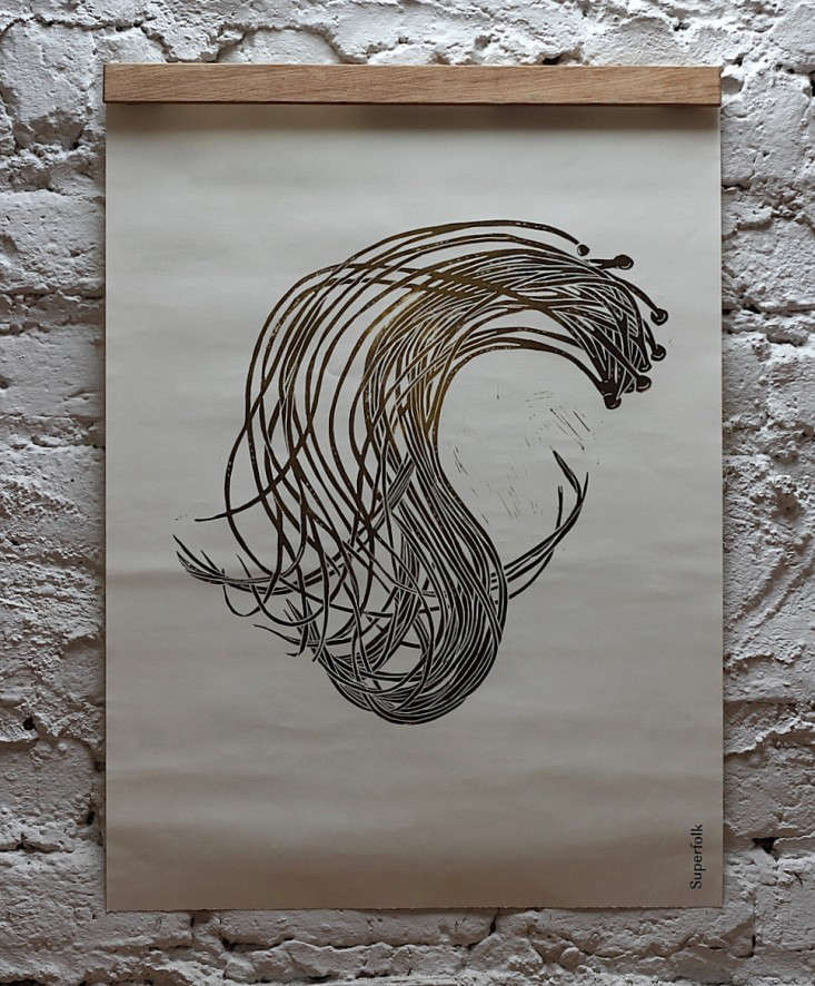

There is coastal wall art, and then there is wall art that appears to have walked out of the Atlantic, shaken the seawater from its sleeves, and enrolled in design school. Superfolk’s Sea Spaghetti Print belongs firmly in the second category.
Created on the west coast of Ireland, this handmade botanical print transforms an easily overlooked brown seaweed into a bold composition of earthy color, energetic lines, and wonderfully imperfect craftsmanship. It is neither a literal scientific diagram nor a predictable beach-house poster decorated with anchors and inspirational instructions to “live, laugh, lobster.” Instead, it treats seaweed as a serious natural form worthy of attention.
The result is a contemporary Irish linocut that feels graphic from across the room and quietly intricate when viewed up close. Its story connects Atlantic seaweed foraging, traditional relief printing, Japanese papermaking, botanical illustration, sustainable design, and the simple pleasure of bringing a small piece of the wild outdoors into the home.
What Is Superfolk’s Sea Spaghetti Print?
Superfolk’s Sea Spaghetti Print is a hand-carved linocut printed with water-based inks on lightweight handmade Japanese washi. The current version measures approximately 520 by 430 millimeters, or about 20.5 by 16.9 inches, and features a deckled paper edge. Its color palette combines warmed green ochre with dark raw umber, echoing the olive, brown, and golden tones commonly seen along a rocky Atlantic shoreline.
Every example is printed by hand in Superfolk’s Irish studio, signed and dated by the printmaker, and allowed to retain subtle variations in ink tone. At the time of research, the print was listed at €120, although price and availability may change.
Superfolk describes the wider seaweed collection as being inspired by clear mornings spent foraging in the cold Atlantic. That origin matters. The work is not merely using seaweed as a decorative motif because “coastal” happened to be trending on a mood board. It begins with observation of a specific landscape and the plants that inhabit it.
The Wild Atlantic Subject Behind the Artwork
Sea Spaghetti Is a Real Seaweed, Not a Chef’s Threat
Sea spaghetti, commonly identified as Himanthalia elongata, is a brown alga found along parts of the northeastern Atlantic coast. It begins with a small, button-like structure attached to rock, from which long, branching straps develop. Those strands can grow into loose, twisting masses that make the common name immediately understandable.
Superfolk’s own foraging guide recommends recognizing it by the long, thick strands emerging from a distinctive round holdfast. The plant’s linear growth creates an unusually graphic silhouette, almost as though the ocean decided to practice calligraphy during low tide.
Seaweed is a broad everyday term for many types of marine algae, ranging from tiny organisms to enormous kelps. Browns, reds, greens, and near-black species contribute varied textures and structures to coastal environments. This diversity helps explain why seaweed has supplied artists with such rich visual material: ribbons, fans, bubbles, branches, blades, lace-like networks, and unruly underwater hairdos are all available before lunch.
Why the Subject Works So Well as a Print
Sea spaghetti naturally balances order and chaos. Its strands divide according to a biological growth pattern, yet currents, rocks, tides, and neighboring plants pull those strands into unpredictable arrangements. A printmaker can simplify the form without making it lifeless.
That balance is central to Superfolk’s style. Jo Anne Butler, the studio’s head printmaker, has a background spanning fine art, architectural science, architecture, interior design, and curation. Her work emphasizes simplified natural forms and a highly considered understanding of color. The Sea Spaghetti Print therefore feels both spontaneous and architecturally controlled: wild enough to move, disciplined enough to hang above a very organized sideboard.
How the Hand-Carved Linocut Creates Its Character
A linocut is a relief-printing process. The artist cuts away portions of a linoleum block, leaving the intended printing areas raised. Ink is rolled across those raised surfaces and transferred to paper through pressure. The final image appears in reverse, and the carved marks become unprinted spaces.
The Museum of Modern Art describes linocut imagery as being associated with clearly defined, flat areas of color. Other museum resources emphasize the technique’s directness and its ability to produce strong, high-contrast forms without requiring the visual fussiness of more elaborate processes.
For the Sea Spaghetti Print, this process reinforces the subject. Long carved passages suggest gaps between strands, while the inked areas give the seaweed weight and rhythm. The artist must decide what to remove, what to preserve, and how much irregularity the image can carry. There is no convenient “undo” button hiding in the corner of a linoleum block.
Why Hand Printing Matters
Because the block is inked and printed by hand, no two impressions are mechanically identical. A slightly denser area of umber, a softer ochre edge, or a faint shift in pressure becomes part of the finished work rather than an error to be corrected.
This variation gives the print a physical presence that a mass-produced digital reproduction often lacks. The image records not only the design but also the sequence of rolling, positioning, pressing, lifting, drying, and inspecting. It contains evidence of labor without loudly announcing, “Attention, everyone, I am artisanal.”
Japanese Washi Gives the Print Its Delicate Side
The boldness of the linocut is balanced by an unexpectedly light support. Superfolk prints the piece on 50 gsm long-fiber handmade washi from Awagami Factory in Tokushima, Japan. The paper is thin, partially translucent, and finished with a deckled edge.
Awagami states that its fine-art papers draw on eight generations of papermaking knowledge in Tokushima. The company produces papers from carefully selected natural fibers for printmaking, drawing, book arts, photography, and other creative uses.
This combination of Irish imagery and Japanese paper is one of the print’s most distinctive qualities. The ink looks substantial, but the sheet remains airy. The artwork can therefore command a wall without feeling like a heavy rectangular slab. In natural light, the fibers and slight translucency may become more noticeable, allowing the paper itself to participate in the composition.
The Deckled Edge Is Part of the Design
A deckled edge is irregular rather than machine-straight. It can be hidden beneath a mat or left visible through float mounting. Showing it emphasizes the handmade paper and allows the full sheet to read as an object. Hiding it creates a more conventional presentation in which attention goes immediately to the printed image.
Neither choice is automatically superior. A visible edge suits relaxed, craft-focused, Scandinavian, Japanese-inspired, or contemporary rustic interiors. A mat can be effective in a more formal room or where the print needs extra breathing space inside a larger frame.
Seaweed Art Has a Surprisingly Important History
Superfolk’s work belongs to a much longer tradition of collecting and representing marine plants. One of the most significant figures in that history is British botanist and photographer Anna Atkins. Beginning in the 1840s, Atkins arranged algae specimens on sensitized paper to make cyanotype images. Her project, Photographs of British Algae: Cyanotype Impressions, is recognized as the first photographically illustrated book.
New York Public Library records indicate that Atkins produced photograms from more than 400 specimens. The Metropolitan Museum of Art notes that her compositions united scientific documentation with a strong sensitivity to the visual appeal of the “flowers of the sea.” Smithsonian Ocean likewise describes her work as a pioneering meeting of marine botany and emerging photographic technology.
Superfolk uses a very different medium, color system, and degree of abstraction, but the underlying fascination is related. Both approaches ask viewers to stop treating algae as anonymous shoreline clutter. Once isolated on paper, the plant’s structure becomes elegant, strange, and worthy of sustained looking.
Why the Print Feels Contemporary Rather Than Nautical
The Sea Spaghetti Print avoids most familiar signals of beach-themed decorating. There are no sailboats, rope borders, lighthouse silhouettes, or distressed signs claiming that life is better in flip-flops. Its connection to the coast is biological and material rather than symbolic.
The green ochre and raw umber palette also moves beyond standard ocean blue. These colors relate to wet rock, tidal pools, moss, dried kelp, peat, bark, and weathered timber. Consequently, the artwork can live comfortably in homes far from the sea.
Design Ireland describes Superfolk as a studio operating across art, architecture, craft, and design, with work shaped by the wildlife, wild food, geology, seasons, patterns, and colors surrounding Clew Bay on Ireland’s west coast. The designers first met at art college and have collaborated professionally since 2008.
That multidisciplinary background explains why the print is decorative without being merely decoration. It is concerned with proportion, negative space, material behavior, ecological observation, and how an object participates in a room.
How to Frame Superfolk’s Sea Spaghetti Print
Choose a Slim Natural-Wood Frame
A narrow oak, ash, maple, or beech frame is an easy companion for the earthy palette. Pale wood keeps the presentation light and reinforces the natural materials. Walnut or another darker finish can increase contrast and make the raw umber feel richer.
Superfolk’s framing guidance specifically suggests slim, natural-finish wood frames as a versatile option. The studio also notes that its prints are designed to hang either vertically or horizontally, so the signature should not be treated as an instruction from the orientation police.
Consider Float Mounting
Float mounting allows the entire sheet and deckled edge to remain visible. A small gap between the paper and frame can create a subtle shadow, emphasizing the lightness of the washi. Because the sheet is delicate, professional framing is sensible. Request archival-quality mounting materials and glazing suited to works on paper.
Avoid Damp or Highly Exposed Locations
A kitchen can be visually perfect for botanical art, but avoid positioning the print next to a steaming range, sink, or frequently opened exterior door. Superfolk cautions that open hanging-rail systems are most appropriate where moisture, wind, and through traffic are limited. A glazed frame offers more protection for dining areas, hallways, and busy family rooms.
Styling Ideas for Different Interiors
In a Minimalist Living Room
Hang the print alone above a low oak cabinet or simple bench. Leave generous blank wall around it so the twisting seaweed form can carry the composition. Add one ceramic vessel or a branch in a plain glass jar. Stop there before the cabinet becomes an ecosystem of decorative objects.
In a Coastal Home
Use the print as an alternative to literal nautical imagery. Pair it with limewashed walls, linen upholstery, woven baskets, aged brass, and timber showing a little honest wear. The artwork supplies the maritime reference without making the room resemble a seafood restaurant’s waiting area.
In a Kitchen or Dining Nook
The edible subject makes sense near a dining space, especially alongside handmade pottery and open wooden shelving. Its muted ochre and umber tones work well with off-white walls, dark green cabinetry, butcher-block counters, and terracotta flooring.
As Part of a Botanical Gallery Wall
Combine Sea Spaghetti with other Superfolk seaweed designs, antique botanical engravings, pressed leaves, or contemporary abstract works. Repeat one frame material to maintain order while varying the sizes. The Sea Spaghetti Print can act as the energetic piece that keeps the arrangement from looking like a very polite science textbook.
Is the Sea Spaghetti Print Worth Collecting?
Its appeal rests on more than the subject. Buyers receive a signed and dated, individually hand-printed work made from a carved block rather than an unlimited digital poster. The use of handmade washi, water-based ink, and a visible manual process gives each impression a distinctive material identity.
Earlier coverage of Superfolk’s seaweed designs documented different dimensions, papers, and pricing, showing that the collection has evolved over time. The current Sea Spaghetti Print should therefore be evaluated according to its present specifications rather than descriptions of older editions found elsewhere online.
It is particularly well suited to collectors who value nature-based art, Irish craft, contemporary printmaking, restrained color, and objects that reveal how they were made. Someone seeking a perfectly uniform reproduction may find its variations unnecessary. Someone who enjoys evidence of the maker’s hand will probably consider those differences the whole point.
A More Thoughtful Approach to Materials
Superfolk says its prints use water-based inks, handmade washi from renewable plant sources, and paper packaging made from recycled, FSC-certified stock. The studio also states that it avoids toxic cleaning products and solvents in its printing process and contributes one percent of sales to environmental causes.
No decorative purchase becomes environmentally weightless merely because leaves or seaweed appear on it. Materials must still be produced, packaged, and transported. Even so, transparency about paper, ink, packaging, production methods, and charitable commitments gives buyers useful information that is often missing from mass-market wall décor.
The print’s strongest sustainability argument may ultimately be emotional durability. A work connected to a place, a process, and a recognizable maker has a better chance of remaining on the wall for years instead of being discarded when the next palette becomes fashionable.
What to Check Before Ordering
- Confirm the current dimensions, price, availability, and shipping terms.
- Decide whether the print will hang vertically or horizontally.
- Choose between showing the deckled edge or placing the sheet beneath a mat.
- Use a framer experienced with thin handmade papers and float mounting.
- Measure the proposed wall with the completed frame size in mind.
- Keep the finished piece away from persistent moisture and harsh direct sunlight.
- Expect minor ink variations because each impression is produced by hand.
The Experience of Living With Superfolk’s Sea Spaghetti Print
The most realistic way to understand this artwork is not to imagine it isolated on a product page. Imagine instead that the framed print has just arrived in a room that already contains ordinary life: books stacked sideways, a chair holding yesterday’s sweater, a slightly dramatic houseplant, and a table that has never once remained completely clear.
At first, the Sea Spaghetti Print reads as a strong graphic shape. From the doorway, the dark raw umber creates structure while the warmed green ochre prevents the composition from becoming severe. It adds movement without introducing a loud new color. Nothing flashes or sparkles. The print simply begins organizing the wall around itself.
During the first few days, the paper becomes more noticeable. In soft morning light, the washi appears less like a blank background and more like a material with its own temperament. Its slight translucency and long fibers soften the inked form. The deckled edge resists the perfect geometry of the frame, creating a small but important reminder that the sheet was made rather than extruded from an office printer with emotional issues.
From a sofa or dining chair, the composition may resemble an abstract network of looping strokes. Move closer and the subject resolves into branching seaweed. That visual shift makes the artwork useful in a room where it will be seen from several distances. It offers an immediate silhouette and a slower botanical discovery.
In a living room, the print can subtly redirect the décor. A green cushion that previously seemed random begins to echo the ochre. A walnut tabletop suddenly relates to the umber. A stone bowl or woven lamp shade feels more intentional because the artwork has introduced a vocabulary of natural texture. This does not require buying an entire new furniture collection. The print is not a tiny interior designer carrying an invoice.
In a dining area, the seaweed subject adds another layer. It connects visual art with foraging, food, seasonality, and the Atlantic landscape. Guests may ask whether sea spaghetti is real, whether it is edible, or whether someone accidentally named a marine plant five minutes before a deadline. The picture becomes a conversation piece without relying on shock, celebrity, or neon lettering.
The option to rotate it is unexpectedly useful. Hung vertically, the strands may feel like rising growth, falling vegetation, or a suspended specimen. Hung horizontally, they can resemble tidal movement or a section of shoreline observed from above. A narrow hallway might benefit from the vertical arrangement, while a console, bed, or dining bench may invite the horizontal version.
Over time, the handmade variations become more important than they seemed during unpacking. A slightly uneven passage of ink no longer reads as an imperfection. It becomes evidence of pressure, pigment, paper, and a particular printing session. The work feels less interchangeable because another impression will carry its own tonal differences.
The print also changes with the seasons. In spring, its green undertones connect easily with fresh branches and brighter daylight. In fall, the ochre and umber settle naturally beside wool, darker wood, and warm ceramics. During winter, the winding form preserves a suggestion of movement and living growth even when the view outside has become mostly gray.
That adaptability is the central experience of living with Superfolk’s Sea Spaghetti Print. It does not demand that a room become coastal, minimalist, rustic, or botanical. It works quietly with what is already present while adding a clear sense of place and process. The longer it remains on the wall, the less it resembles a decorative trend and the more it feels like a small record of the Atlantic: tide-shaped, plant-based, imperfect, and gloriously free of seashell typography.
Note: Product specifications, prices, stock status, framing options, and sustainability statements may change. Verify current details with Superfolk before purchasing or commissioning a frame.