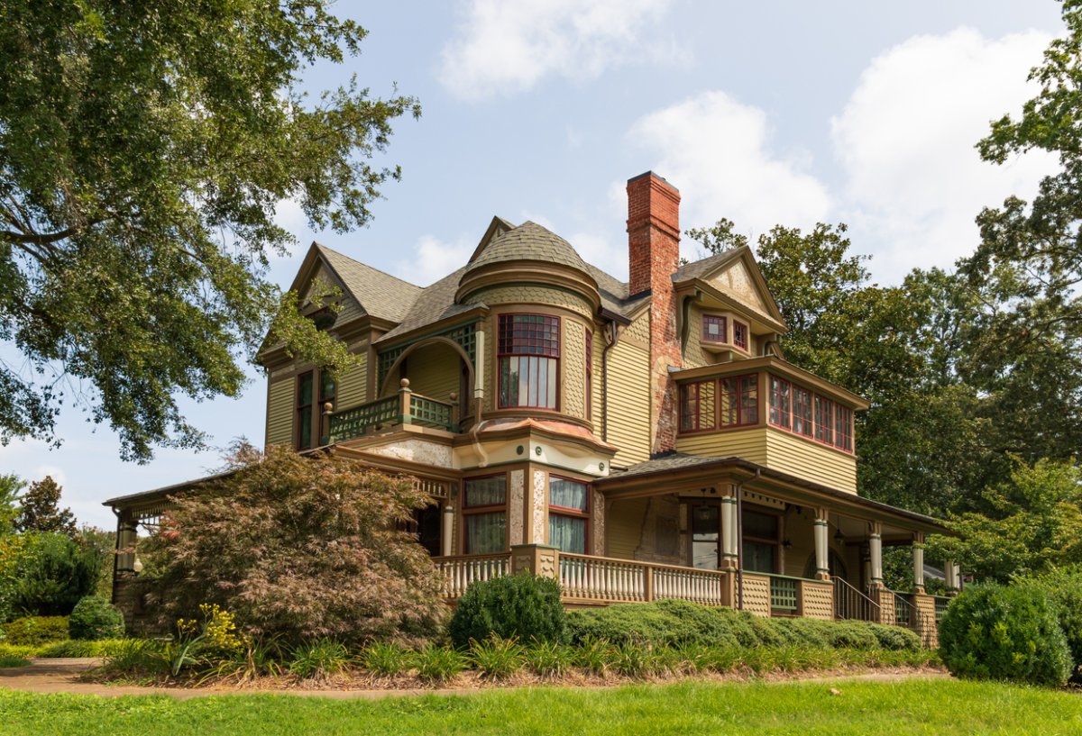

Choosing paint for an old house sounds wonderfully simple until you discover that your “plain white” living room has nine earlier coats hiding underneath it, your 1890s porch once wore three colors at the same time, and that tasteful beige you assumed was historically accurate may have less connection to history than your Wi-Fi router.
Historic paint colors are fascinating precisely because they challenge modern assumptions about how earlier Americans decorated their homes. Colonial, Federal, Victorian, Craftsman, Colonial Revival, and early 20th-century houses were not governed by one universal palette of dusty cream and solemn brown. Homeowners used pigments according to availability, cost, fashion, architecture, geography, and personal taste. Some rooms were restrained. Others were gloriously bold.
For today’s homeowner, the goal does not necessarily have to be museum-level restoration. Understanding historic paint colors can simply help you make choices that complement an older home’s proportions, woodwork, materials, and architectural personality. Whether you own an 18th-century farmhouse or a 1920s bungalow, a little research can keep your renovation from accidentally giving the house the architectural equivalent of a fake mustache.
What Are Historic Paint Colors?
Historic paint colors are colors documented, reproduced, or inspired by paints used during earlier architectural periods. The strongest historic palettes are based on evidence such as surviving paint layers, period paint catalogs, architectural records, photographs, wallpaper samples, historic buildings, and laboratory examination.
That distinction matters. A color with an old-fashioned name is not automatically historically accurate. “Grandmother’s Attic Sage” may sound convincingly antique, but the name alone tells you approximately nothing.
Organizations specializing in historic preservation study actual buildings and their finishes. Paint manufacturers also maintain collections based on architectural research. Benjamin Moore’s Historical Collection, Sherwin-Williams’ historic palettes, Historic New England’s documented color resources, and collections developed from historic Western architecture by Dunn-Edwards are examples of the research-driven approach available to modern homeowners.
Historic Does Not Mean Dull
One of the most persistent myths about historic interiors is that Americans spent several centuries surrounded by muddy beige because bright colors had not yet been invented. Paint analysis has helped dismantle that idea.
Earlier restorations sometimes relied on aged or exposed paint surfaces. Unfortunately, old pigments can fade, oxidize, darken, or otherwise change over time. A faded fragment discovered beneath later paint might therefore give a misleading impression of the original color.
Modern analysis can examine microscopic cross sections of paint layers and identify pigments, binders, coatings, and layer sequences. Preservation specialists can then determine not merely that a room was “green,” but which green belonged to which decorating campaign and how that finish may originally have appeared.
Historic sites have produced memorable examples. Research at Mount Vernon has helped restorers understand that some original schemes used stronger colors than earlier generations of preservationists expected. Thomas Jefferson’s Monticello provides another famous illustration: historical research supported returning the dining room to a brilliant yellow associated with Jefferson’s use of fashionable chrome-yellow pigment.
Apparently, America’s founders were capable of choosing colors that would make today’s timid greige enthusiast clutch a fan deck for emotional support.
How Experts Discover Original Paint Colors
Paint Layer Analysis
A historic wall, door, molding, or window casing can act like a tiny archaeological site. Each decorating campaign may leave another layer behind. Conservators carefully remove very small samples from areas likely to retain an intact sequence.
Under magnification, those layers can reveal primers, finish coats, glazes, varnishes, decorative painting, and later alterations. Specialists compare this evidence with the building’s known construction history to determine which coating belonged to a particular period.
Documentary Research
Physical evidence becomes even more useful when paired with written records. Historic photographs, household accounts, architect specifications, invoices, diaries, paint catalogs, newspapers, and renovation records can narrow the possibilities.
If a receipt shows that a homeowner bought green pigment during a documented remodeling campaign, for instance, researchers have a clue. Combine that clue with matching paint layers on the woodwork, and the case becomes much stronger.
Architectural Context
Your home’s style is another guide, although it should never be treated as an inflexible color rulebook. Regional traditions, homeowner wealth, remodeling, technological changes, and individual preferences all mattered.
A Queen Anne house might support multiple body, trim, sash, and accent colors because its architectural details invite differentiation. A simpler Colonial Revival facade may look better with a more disciplined arrangement. The paint should help explain the architecture rather than fight it for control of the microphone.
Historic Paint Colors by Architectural Era
Colonial and Georgian Homes
Early American palettes included whites, creams, ochres, earth reds, browns, blues, and greens. Pigments such as yellow ochre, iron-oxide reds, indigo, Prussian blue, lampblack, and various earth pigments contributed to period finishes.
Cost mattered. Certain pigments could be expensive, meaning a strong or fashionable color could communicate prosperity. Trim was not automatically modern bright white, either. Creams, colored woodwork, stains, graining, and other treatments were used according to period and location.
Federal and Greek Revival Homes
Federal interiors often favored elegant architectural relationships, with wall colors supporting refined moldings, mantels, plasterwork, and decorative details. Pale blues, greens, yellows, warm neutrals, and stronger accent colors can all work within historically informed interpretations.
Greek Revival architecture is strongly associated today with white, particularly on exteriors influenced by classical architecture. Still, homeowners should avoid assuming that every historic surface was pure white. Surviving evidence and regional research are more reliable than a single architectural stereotype.
Victorian Homes
If your Victorian house has brackets, shingles, spindlework, elaborate window trim, and enough decorative detail to keep a painter occupied until retirement, color can help reveal it.
During the 19th century, improvements in pigment manufacturing and commercial paint expanded color possibilities. Victorian palettes frequently incorporated earthy reds, olive greens, ochres, browns, golds, and other rich shades. Later Victorian schemes could become significantly more complex, especially on Queen Anne houses.
The familiar multicolor “painted lady” approach can therefore have historical logic, but restraint still matters. Painting every bracket a different color simply because a bracket exists may leave your facade looking less Victorian and more like a birthday cake experiencing an identity crisis.
Arts and Crafts and Craftsman Homes
Craftsman color schemes often harmonize with natural materials and landscape. Think olive, moss, russet, brown, ochre, muted gold, warm gray, earthy red, and other nature-inspired hues.
These colors complement stained wood, stone foundations, brick chimneys, exposed rafters, and substantial porch columns. Instead of covering every architectural element with brilliant white trim, consider softer contrasts that allow the materials to remain visually connected.
Colonial Revival Homes
Colonial Revival houses became enormously influential in the late 19th and early 20th centuries. White or light siding with dark shutters remains an iconic treatment, but historically sympathetic alternatives include warm neutrals, muted yellows, soft blues, earthy greens, brick reds, and deeper accents.
The key is hierarchy. Body color establishes the building’s mass, trim clarifies architectural edges, and shutters or doors provide accents. When every surface receives equal visual emphasis, an otherwise graceful facade can become unnecessarily busy.
Early and Mid-20th-Century Homes
A 1930 bungalow, 1948 ranch, and 1962 modern house belong to history too. Historic color planning should not mysteriously stop when automobiles acquire tail fins.
Documented 20th-century palettes include combinations ranging from subdued period neutrals to turquoise, yellow, coral, deep green, blue-gray, and other stronger hues. Historic New England’s research, for example, emphasizes matching colors to both architectural style and specific decades rather than applying a generic “old house” palette.
How to Choose Historic Paint Colors for Your Own Home
1. Identify the House’s Style and Construction Date
Begin with what you know. Determine approximately when the house was built and identify major later additions. A house constructed in 1875 but remodeled substantially in 1925 may legitimately contain evidence from both periods.
Remember that restoration does not always mean returning everything to the day construction ended. Preservation professionals may select a later period of significance when that period better represents a building’s important history.
2. Search for Surviving Evidence
Look carefully around protected locations where earlier coatings may survive: behind hardware, beneath switch plates, inside closets, under later trim, behind radiators, or in protected corners.
Do not aggressively scrape an old house merely to satisfy your curiosity. Aside from damaging useful evidence, disturbing older paint can create a serious lead hazard.
3. Research Your Neighborhood
Nearby houses from the same development or period can provide clues. Local historical societies, preservation commissions, archives, old real estate advertisements, historic photographs, and Sanborn-era records may help document the appearance of a neighborhood.
For historically designated properties, also check local requirements before purchasing twenty gallons of anything. Exterior changes may be subject to preservation review.
4. Use Reputable Historic Paint Collections
If laboratory analysis is unnecessary or outside your budget, curated historic collections offer an approachable starting point. Look for palettes tied to actual architectural research rather than vaguely nostalgic marketing.
You do not need to copy a manufacturer’s sample scheme exactly. Treat the palette as a vocabulary from which you can build combinations appropriate to your house.
5. Respect Permanent Materials
Brick, stone, roofing, tile, stained wood, and masonry are part of the color scheme even though they do not come from a paint can. Choose colors that relate naturally to those fixed materials.
A Craftsman bungalow with a warm fieldstone foundation, for example, may feel far more convincing in olive or earthy brown than in a chilly blue-white chosen under fluorescent store lighting at 9:47 p.m.
6. Test Colors on the Building
Never trust a tiny chip alone. Paint generous samples and observe them during morning, afternoon, evening, sunny, and cloudy conditions. Exterior color can look dramatically lighter under strong daylight, while interior colors shift with window orientation and artificial lighting.
For exteriors, test the entire proposed combination together: body, trim, sash, shutters, porch components, and door. A beautiful green may cease to be beautiful the instant it meets the wrong cream.
Do You Have to Be Perfectly Historically Accurate?
No. There is a useful difference between restoration and historically sympathetic decorating.
A museum-quality restoration may follow documentary and laboratory evidence closely, reproducing a selected historic period as accurately as practical. An ordinary homeowner often has different priorities: comfort, maintenance, budget, modern furniture, resale considerations, and personal taste.
You can therefore borrow the logic of a historic palette without turning your house into a museum exhibit. Choose a period-friendly body color but simplify the trim scheme. Use historically inspired green on kitchen cabinets while keeping contemporary counters. Reproduce an original dining-room wall color but choose a modern washable coating.
The strongest results tend to respect the home’s architecture while admitting that actual human beings still need to live there.
Safety Comes Before Color Archaeology
Owners of older American homes need to treat existing paint carefully. Homes built before 1978 may contain lead-based paint beneath newer coatings. Sanding, scraping, cutting, or otherwise disturbing those surfaces can generate hazardous chips and dust.
Before substantial preparation work, determine whether lead may be present and follow appropriate lead-safe procedures. For larger renovations, hiring a properly trained lead-safe contractor can be the smartest part of the project.
Common Historic Paint Color Mistakes
Assuming every old house should be white. White can be appropriate, but it is only one option among centuries of American color traditions.
Choosing colors by name alone. A shade called “Colonial Blue” is not proof that your 1770 house actually wore it.
Using too much contrast. Bright white trim against every darker wall can create a modern outline effect that may not suit historic interiors.
Ignoring paint placement. Historical accuracy involves where colors appear, not simply which colors are selected.
Copying another historic house blindly. Two houses from the same decade can have different architecture, owners, regional traditions, and decorating histories.
Skipping samples. Historic authenticity does not repeal the laws of lighting.
Practical Homeowner Experience: Lessons Historic Color Projects Teach
Real-world historic color projects tend to teach one lesson very quickly: choosing the color is only half the job. Understanding why it belongs where it does is what makes the finished house convincing.
Consider a common situation involving a circa-1910 Craftsman bungalow. The owner begins with the assumption that cream siding and bright white trim are safe. Nothing is technically wrong with that combination, but the house’s stained porch ceiling, brown roof, stone piers, and deep eaves feel disconnected from it. After testing several earthier combinations, a muted olive body color, warm cream trim, and dark brown sash suddenly make the stone and wood look intentional. No architectural feature has changed. The house simply starts speaking the same visual language from roof to foundation.
Victorian houses offer a different experience. Owners frequently fall in love with five or six historical colors and understandably want to use all of them. On a sample card, the palette looks terrific. On a full facade, however, every cornice, spindle, bracket, sash, panel, and shingle begins demanding attention simultaneously.
A more successful approach is often to start with three functional roles: a dominant body color, a supporting trim color, and a strong accent. Additional colors can be introduced only where the architecture genuinely benefits. That method still celebrates ornament without making the house look as though the paint store accidentally exploded nearby.
Interior projects reveal another practical lesson: homeowners are often surprised by how livable stronger historic colors can be. A deep green library or ochre dining room may look intimidating on a two-inch paper chip, yet architectural moldings, wood floors, textiles, artwork, and changing daylight soften the effect. What seems “too dark” in the store can feel rich and balanced in a room with tall windows and substantial trim.
The opposite problem occurs with pale historical shades. A delicate blue-green that appears beautifully complex in a showroom may wash out beside a south-facing window. Sampling becomes essential because historic palettes were experienced in particular architectural settings, not on a computer monitor.
Another recurring lesson is that discoveries deserve patience. Removing a door hinge might expose dark green paint. A closet may preserve salmon-colored plaster. An old photograph may show dramatically darker window sash than expected. None of these clues automatically dictates the final scheme, but together they can change your understanding of the house.
Finally, successful homeowners learn when not to chase perfection. Exact forensic restoration makes sense for historically significant rooms and carefully documented properties. For many family homes, a thoughtfully researched approximation is enough. Matching the architecture, respecting surviving materials, using colors derived from the right period, and keeping the house comfortable can produce an excellent result without requiring a laboratory microscope next to the coffee maker.
The best historic paint project therefore feels less like decorating a stage set and more like continuing a conversation. Previous owners altered the house according to their own needs and tastes. Your job is not necessarily to freeze it in time, but to understand what came before you well enough to make the next chapter believable.
Conclusion: Let the House Help Choose the Color
Historic paint colors give homeowners something that trend forecasts cannot: a palette connected to the building itself. Layers of old paint, architectural details, local traditions, period photographs, preserved houses, and professional research can all help reveal which colors belong naturally to a particular home.
The biggest surprise may be how colorful American architectural history actually was. From earthy Colonial pigments and refined Federal schemes to saturated Victorian combinations, natural Craftsman hues, and cheerful 20th-century colors, historic houses have never belonged to one enormous beige family.
Start with the building’s age and architecture. Investigate before removing old finishes. Study credible historic palettes. Work with permanent materials rather than against them. Test large samples in real light. Most importantly, decide whether your goal is strict restoration or a historically sympathetic home designed for contemporary life.
Do that, and the finished color scheme will accomplish something better than merely looking “old.” It will look as though it belongs.