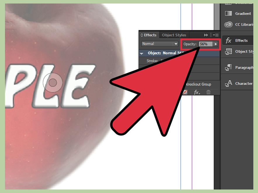

Opacity in Adobe InDesign is one of those tiny design controls that can quietly save a layoutor quietly ruin it while pretending to be “creative.” Used well, it helps you fade a background image, soften a bold shape, create readable text over a photo, or build a polished layered effect without sending your page into visual chaos. Used poorly, it can make your brochure look like it was designed through a foggy shower door.
The good news: adjusting opacity in InDesign is simple once you know where the controls live. The slightly trickier news: InDesign gives you more than one opacity target. You can change the transparency of an entire object, only the fill, only the stroke, or only the text inside a frame. That detail matters. A lot.
This guide walks you through how to adjust opacity in InDesign in eight practical steps. You will learn how to use the Effects panel, change opacity for images and shapes, apply transparency to text, avoid common printing issues, and use opacity like a designer instead of like someone randomly dragging sliders during a caffeine emergency.
What Does Opacity Mean in InDesign?
Opacity controls how solid or see-through an object appears. At 100% opacity, the object is fully visible. At 0% opacity, it becomes fully transparent. Most design work happens somewhere in the tasteful middle: 10% for a subtle watermark, 35% for a faded photo background, 60% for an overlay shape, or 85% for a slightly softened visual element.
InDesign handles opacity through transparency effects. These effects can apply to placed images, graphic frames, text frames, lines, shapes, groups, and even specific parts of an object. This is why opacity is more powerful in InDesign than simply making something “lighter.” You are not just changing color; you are controlling how one layer visually interacts with the content below it.
How to Adjust Opacity in InDesign: 8 Steps
Step 1: Open Your InDesign Document
Start by opening the InDesign file that contains the object you want to adjust. This might be a flyer, magazine spread, book page, brochure, product catalog, poster, newsletter, or social media layout. Opacity works across many types of InDesign projects, but it is especially useful when you are layering text, images, and colored shapes.
Before editing, it is smart to save a copy of your file. This is not dramatic; it is survival. Transparency settings can affect how objects interact, and if you are experimenting with multiple images, blending modes, or print settings, a backup gives you a safe place to return.
Step 2: Select the Object You Want to Make Transparent
Choose the Selection Tool from the toolbar, then click the object you want to adjust. This could be an image frame, rectangle, ellipse, line, text box, or grouped object. If you want to change only the content inside a frame, such as the placed photo rather than the frame itself, use the Direct Selection Tool instead.
This distinction is important. InDesign often treats the frame and the content as separate things. A photo lives inside a frame. A text story lives inside a text frame. A shape may have both a fill and a stroke. Selecting the wrong level can produce the classic “Why did everything fade?” moment. We have all been there. The software is not judging you, but your layout might be.
Step 3: Open the Effects Panel
Go to Window > Effects to open the Effects panel. This panel is the main control center for opacity, blending modes, and other transparency effects in InDesign. If you use opacity often, keep this panel visible in your workspace. It will save time and reduce the number of menu-hunting expeditions you take during a project.
The Effects panel usually shows an opacity percentage and a blending mode menu. You may also see different target levels such as Object, Stroke, Fill, and Text. These levels let you decide exactly what part of the selected item should become transparent.
Step 4: Choose the Correct Transparency Target
In the Effects panel, look for the target area. Depending on what you selected, you may be able to choose from options such as:
- Object: Changes the opacity of the entire selected object.
- Fill: Changes only the filled area of a shape or frame.
- Stroke: Changes only the border or outline.
- Text: Changes only the text inside a selected text frame.
This is where InDesign becomes more precise than many beginners expect. For example, suppose you have a white text box over a busy image. You may want the white box fill to be 70% opaque while the text stays 100% black. To do that, target the fillnot the entire object. If you reduce opacity at the object level, the text fades too, and suddenly your headline looks like it is whispering from another room.
Step 5: Adjust the Opacity Percentage
With the correct object or target selected, change the opacity value in the Effects panel. You can type an exact number, use the dropdown, or drag the slider depending on your workspace and InDesign version. Start with small adjustments. A change from 100% to 85% can soften an object. A change to 40% can dramatically fade it. A change to 5% may make it nearly invisible, which is useful for subtle texture but terrible for important instructions.
Here are practical opacity starting points:
- 90%–100%: Mostly solid, good for slight softening.
- 65%–85%: Useful for overlays that still need strong presence.
- 35%–60%: Good for background shapes, image washes, and layered effects.
- 10%–30%: Best for watermarks, textures, and subtle background graphics.
Opacity is not a one-size-fits-all setting. A 30% black rectangle may look elegant over a bright photo but muddy over a dark one. Always judge opacity in context, not by the number alone.
Step 6: Preview the Layout Carefully
After changing opacity, preview your page. Use View > Screen Mode > Preview or press W when you are not editing text. Preview mode hides guides and frame edges, making it easier to judge the actual design.
Look closely at readability. If you are placing text over a transparent shape or image, ask one simple question: can a real person read this without squinting like they are decoding a treasure map? If the answer is no, increase the opacity of the background shape, darken the overlay, or simplify the image behind the text.
Also check object stacking. Transparency depends on what sits above and below the selected object. If your faded rectangle looks strange, the issue may not be opacity itself. It may be the layer order, blending mode, or an unexpected object underneath.
Step 7: Use Blending Modes When Needed
Opacity controls how transparent something is. Blending modes control how colors interact with objects below. InDesign includes familiar blending modes such as Normal, Multiply, Screen, Overlay, and others. Most everyday opacity work should stay on Normal, especially for clean business documents, catalogs, forms, and print pieces.
However, blending modes can be useful for creative layouts. Multiply can help a dark texture interact with the image below. Screen can lighten visual elements. Overlay can create stronger contrast, although it can also get intense quickly. Think of blending modes like hot sauce: helpful in the right amount, suspicious when poured on everything.
If you use blending modes, test your exported PDF carefully. Some effects may look slightly different depending on the PDF preset, color settings, and output process. For professional printing, ask your printer what PDF standard they prefer before sending final files.
Step 8: Export and Check the Final PDF
Once your opacity settings look good in InDesign, export a PDF and inspect it before publishing or printing. Go to File > Export, choose Adobe PDF, and select the preset appropriate for your project. For digital viewing, a high-quality interactive or print PDF may work well. For commercial printing, PDF/X presets are often used, but requirements vary by printer.
Open the exported PDF and zoom in on transparent areas, image edges, text overlays, shadows, and any objects using blending modes. Look for unexpected white boxes, faded text, strange color shifts, or missing transparent effects. These issues are less common when files are prepared properly, but they can still appear when transparency, spot colors, old PDF standards, or raster effects collide at the worst possible momentusually five minutes before a deadline, because design software has a flair for drama.
How to Adjust Opacity for Different InDesign Elements
Adjusting Opacity for an Image
To fade an image in InDesign, select the image frame with the Selection Tool and lower the opacity in the Effects panel. This is useful when creating a background photo behind text. For example, you might place a city skyline behind a report title and reduce the image opacity to 25% so the title remains readable.
If you want only the placed image to fade while keeping the frame styling intact, use the Direct Selection Tool to select the image content inside the frame. Then apply opacity to the graphic itself. This gives you more control when the frame has a border, fill, or other styling you do not want to alter.
Adjusting Opacity for a Shape
Shapes are among the easiest objects to adjust. Select the rectangle, ellipse, polygon, or line, then lower its opacity. You can fade the whole object or target only the fill or stroke. A common design trick is to place a semi-transparent rectangle over a photo and put text on top. This creates contrast without fully covering the image.
For example, if a travel brochure has a bright beach photo, add a navy rectangle over part of the image, set the fill opacity to around 60%, and place white headline text above it. The photo stays visible, but the words stop fighting for their life against the sand, sky, and sunglasses.
Adjusting Opacity for Text
Text opacity can be adjusted from the Effects panel by selecting the text frame and targeting Text. This can create elegant design effects, such as pale oversized background lettering or subtle typographic texture. However, use this carefully. Body text should almost always remain fully opaque for readability and accessibility.
If your goal is to create a translucent text box while keeping the type crisp, do not reduce opacity at the Object level. Target the Fill of the text frame instead. This keeps the text solid while allowing the box behind it to become transparent.
Adjusting Opacity for a Group
When multiple objects are grouped, opacity can be applied to the entire group. This is helpful for logos, icons, badges, or decorative clusters. Select the group and adjust the Object opacity in the Effects panel. The group will fade as one unit.
If you need individual elements inside the group to behave differently, ungroup them or use the Effects panel carefully. InDesign also provides options such as Isolate Blending and Knockout Group for more advanced transparency behavior. These are useful in complex layouts, but for most beginner opacity adjustments, simple object-level opacity is enough.
Common Mistakes When Changing Opacity in InDesign
Mistake 1: Fading the Whole Text Frame by Accident
This is the most common beginner mistake. You want a semi-transparent background box, but you reduce the entire object opacity. Now the text is faded too. The fix is simple: select the text frame, open the Effects panel, target Fill, and lower only the fill opacity.
Mistake 2: Making Important Text Too Transparent
Opacity can look stylish, but readers still need to read. Keep important text high contrast. Avoid using low-opacity body copy, tiny transparent captions, or pale text over busy images. A design that looks “subtle” on your monitor may look nearly invisible on another screen or in print.
Mistake 3: Ignoring Print Output
Transparency can behave differently when exported, flattened, or printed, especially in older workflows. If you are preparing a file for a professional printer, check the exported PDF and ask for preferred settings. Do not assume that because the InDesign page looks good, every press, printer, or PDF viewer will interpret it the same way.
Mistake 4: Using Opacity Instead of Better Color Choices
Sometimes the best fix is not transparency. If a layout feels too heavy, try choosing a lighter color, adjusting contrast, or simplifying the background. Opacity is powerful, but it should not be used as duct tape for every design problem. Even stylish duct tape is still duct tape.
Best Practices for Professional Opacity Effects
Use opacity with a purpose. Before lowering the transparency of an object, decide what job it should do. Is it meant to create depth? Improve readability? Add atmosphere? De-emphasize a background? Once you know the purpose, choosing the right percentage becomes easier.
Keep opacity consistent across a document. If all callout boxes use 80% opacity, maintain that style unless there is a good reason to change it. Consistency makes your design look intentional. Random transparency values make it look like the layout got dressed in the dark.
Use object styles for repeated effects. If your document includes many similar transparent boxes, create an object style with the opacity settings built in. This saves time and helps keep the layout consistent, especially in long brochures, magazines, books, and brand documents.
Always test on the final background. Opacity depends heavily on what is underneath. A transparent white box may look elegant over a dark photo but nearly disappear over a pale one. A 50% black overlay may work beautifully on a bright image but become too gloomy over a shadowy background.
Practical Examples of Opacity in InDesign
Example 1: Creating a Watermark
Place a logo or large word behind your main content, then reduce its opacity to around 8% to 15%. This creates a watermark effect that supports the brand without overwhelming the page. Lock the layer after positioning it so you do not accidentally select it every three seconds and question your life choices.
Example 2: Improving Text Over a Photo
Add a rectangle behind the headline, set the fill to black or a brand color, and reduce the fill opacity to 50% or 70%. Place white or light-colored text above it. This technique is widely used in posters, magazine covers, event flyers, and social graphics because it balances image visibility with text clarity.
Example 3: Softening a Background Image
Select a placed image and reduce opacity to 20% or 35%. This works well for report covers, chapter openers, menus, and presentation-style documents. The image adds mood without competing with the main message.
Example 4: Creating Layered Editorial Design
Use semi-transparent shapes, oversized text, and subtle image overlays to create depth. Keep the number of effects limited. Two or three well-controlled transparent elements can look polished. Fifteen overlapping translucent circles may look like your document has developed a rash.
Experience Notes: What Designers Learn After Adjusting Opacity a Few Hundred Times
After working with opacity in InDesign for real-world layouts, you start to notice that the slider is only half the story. The number may say 40%, but the result depends on the image, color, paper, screen brightness, surrounding objects, and even the mood of the layout. A 40% white overlay on a dark portrait can look expensive and editorial. The same 40% overlay on a pale product photo can look like someone forgot to remove a rectangle.
One practical habit is to adjust opacity while zoomed out first. Designers often zoom in closely and fine-tune a transparent object until it looks perfect at 200%. Then they view the full page and realize the effect barely registers. Opacity is a page-level decision as much as an object-level decision. Zoom out, look at the hierarchy, and ask whether the transparent element supports the message or simply adds decoration.
Another useful experience: never trust opacity on text until you test readability. It is tempting to create elegant pale-gray type or translucent captions, especially in lifestyle layouts. But readers are not admiring your opacity percentage; they are trying to understand the content. If the text carries important information, keep it crisp. Use transparency around the text, not on the text itself.
For print projects, experienced designers also learn to export early and export often. Do not wait until the final proof to discover that a transparent PSD, a spot color, and a blending mode have formed a tiny rebellion inside your PDF. Export a test page, open it in a PDF viewer, and check it at different zoom levels. If the piece is going to a commercial printer, send a proof or ask for recommended PDF settings before final delivery.
Opacity is also easier to manage when your layers are organized. Put background images on one layer, text on another, and decorative overlays on a separate layer when possible. This keeps you from selecting the wrong object and applying transparency to something that was perfectly innocent. Naming layers may feel boring, but so does hunting for a faded rectangle hidden behind twelve other objects.
Finally, the best opacity effects are usually quiet. They do not announce themselves. They make text easier to read, create a sense of depth, soften a photo, or guide the viewer’s eye. When opacity is working well, people may not notice it directly. They will simply feel that the layout is cleaner, calmer, and more professional. That is the goal. The slider is just the tool; the real skill is knowing when to stop moving it.
Conclusion
Learning how to adjust opacity in InDesign is a small skill with a big visual payoff. Once you understand the Effects panel and know how to target the Object, Fill, Stroke, or Text level, you can create cleaner layouts, better image overlays, subtle watermarks, readable text boxes, and more professional page designs.
The key is control. Do not simply fade everything and hope for elegance to arrive wearing a cape. Select the right object, choose the correct transparency target, adjust the opacity with purpose, preview the design, and test the final PDF. Whether you are designing a flyer, catalog, magazine spread, ebook, report, or poster, opacity can help your layout feel layered, polished, and intentional.
Note: Interface labels and panel placement may vary slightly by InDesign version and workspace, but the core workflow remains the same: select the item, open the Effects panel, choose the right target, adjust opacity, preview, and export-check the result.