
Microsoft Paint may not wear a fancy black turtleneck or charge a monthly design-software subscription, but it has one superpower many beginners love: it is simple enough to open, understand, and use right away. If you want to create a quick logo for a school project, hobby brand, YouTube channel, small online shop, local club, or personal watermark, Paint can help you build a clean design without making you feel like you accidentally enrolled in graphic design boot camp.
This guide explains how to draw a logo in Microsoft Paint in seven practical steps. You will learn how to plan your idea, set up the canvas, use shapes, add text, choose colors, refine the layout, and save your logo correctly. Along the way, we will also cover real design principles such as simplicity, readability, contrast, scalability, and consistency. In other words, yes, you can make a logo in Paintbut please do not make the poor thing carry twelve fonts, six shadows, a rainbow gradient, and a clip-art dragon unless your brand is literally called “The Rainbow Dragon Font Circus.”
Can You Really Make a Logo in Microsoft Paint?
Yes, you can draw a logo in Microsoft Paint, especially if your goal is a simple icon, wordmark, badge, monogram, or basic brand mark. Paint includes drawing tools, brushes, shapes, text, color options, resizing, cropping, and image-saving features. Modern Windows versions of Paint also include newer creative tools such as layers, background removal, and transparent image support, depending on your version and updates.
However, it is important to understand the limitation: Microsoft Paint is primarily a raster graphics editor. That means your logo is made of pixels, not mathematical vector paths. A logo created in Paint can look sharp at the size you design it, but it may lose quality if you enlarge it too much. Professional logos are usually built as vector files in tools like Adobe Illustrator, Affinity Designer, CorelDRAW, or web-based logo editors. Still, for a beginner-friendly logo, draft concept, profile picture, watermark, classroom assignment, or small project, Paint can absolutely do the job.
Before You Start: Think Like a Logo Designer
A good logo is not just a pretty drawing. It is a tiny visual handshake. It introduces your brand before you say a single word. Strong logos are usually simple, memorable, relevant, versatile, and readable. They should work on a website header, social media profile, flyer, sticker, business card, or small app icon. If your logo only looks good when it is the size of a pizza box, it needs some editing.
Before opening Paint, answer three questions:
- What name or initials should appear in the logo? For example, “Green Cup Café” might use “GCC” or a cup icon.
- What feeling should the logo create? Friendly, serious, playful, modern, handmade, sporty, elegant, or bold?
- Where will the logo be used? Website, social media, school presentation, product label, email signature, or printed sticker?
These answers will guide your font, colors, shapes, and layout. A logo for a pet-sitting business may use rounded shapes and warm colors. A logo for a tech repair service may use sharper lines, cool colors, and a cleaner typeface. A bakery logo can get away with a cupcake. A tax consultant logo probably should not, unless the cupcake is filing returns.
How to Draw a Logo in Microsoft Paint: 7 Steps
Step 1: Open Microsoft Paint and Set Up Your Canvas
Start by opening Microsoft Paint from the Windows search bar. Type “Paint,” select the app, and create a new file. Before drawing anything, set your canvas size. A square canvas works well for most beginner logos because it is easy to use as a profile image, icon, or watermark. Try a size such as 1000 x 1000 pixels or 1200 x 1200 pixels. Starting larger gives you more room to work and helps the final image look cleaner when scaled down.
To resize the canvas, use the resize option and choose pixels instead of percentage. Keep the canvas simple and uncluttered. If you are designing a horizontal wordmark, you might use a wider canvas such as 1600 x 800 pixels. If you are designing a round badge, square is usually better.
Turn on gridlines or rulers if your Paint version offers them. These can help you align text and shapes more accurately. A logo that is almost centered but not quite centered has a strange way of annoying the human eye. It is like a crooked picture frame: technically not dangerous, emotionally devastating.
Step 2: Sketch a Simple Logo Concept
Do not begin with details. Begin with structure. Use the Pencil tool or simple Shapes tool to rough out your idea. A logo usually starts with one of these formats:
- Wordmark: The brand name written in a distinctive style.
- Lettermark: Initials, such as “GC” for Green Cup.
- Icon logo: A simple symbol, such as a leaf, cup, bolt, star, house, or camera.
- Combination mark: Text plus an icon.
- Badge or emblem: Text and symbol inside a circle, shield, or frame.
For Microsoft Paint, the easiest logo types are lettermarks, simple icons, badges, and combination marks. Keep your drawing based on basic geometry. Circles, rectangles, triangles, lines, and simple curves are easier to control in Paint than complex illustrations. If you are drawing a logo for “Blue Mountain Media,” for example, you could create a blue circle, add two triangle peaks, and place the initials “BMM” below. That is much cleaner than attempting a full mountain landscape with clouds, birds, snow, a cabin, and a tiny hiker waving at the algorithm.
At this stage, make a few rough versions. Try icon above text, icon beside text, initials inside a circle, or a single symbol only. The best logo idea is often not the first one. It is usually the third or fourth one after your brain has cleared out the obvious ideas.
Step 3: Use Shapes to Build a Clean Logo Mark
Paint’s Shapes tool is your best friend for logo design. Shapes create cleaner edges than freehand drawing with a mouse. Choose from circles, rectangles, rounded rectangles, triangles, lines, arrows, stars, and callouts. For logos, simple shapes are usually stronger than complicated ones.
Use the Oval shape to make a circle, the Line tool for dividers or accents, and the Rounded Rectangle tool for friendly badges. Hold the Shift key while drawing some shapes if you want more even proportions. Choose an outline color and fill color from the color palette. If your Paint version supports layers, place your background shape on one layer, your icon on another layer, and your text on a separate layer. This makes editing easier because you can adjust elements without ruining everything else.
Here is a simple example: imagine you are making a logo for a homemade candle brand called “Moonwick.” You could draw a dark circle, add a crescent moon using overlapping circles, then place a small flame shape below it. Add the word “Moonwick” underneath. That is a clear concept: moon plus wick. The logo tells a story without needing a paragraph or a dramatic violin soundtrack.
Avoid using too many shapes. A strong logo usually has one main visual idea. If your logo includes a mountain, a coffee cup, a lightning bolt, a dog, and a crown, viewers will not know whether you sell hiking gear, espresso, electricity, pet supplies, or royal confusion.
Step 4: Add Text That Is Easy to Read
Next, use the Text tool to add your brand name, initials, or slogan. Click where you want the text to appear, then type your words. Choose a readable font. In Paint, you may not have advanced typography controls, so clarity matters even more. Fonts such as Arial, Calibri, Segoe UI, Verdana, Georgia, or Trebuchet MS can work well depending on the style you want.
Use one main font, or at most two. A common beginner mistake is using too many fonts because each one looks “kind of cool.” Unfortunately, five cool fonts together can look like a design meeting where nobody was in charge. If you want a modern logo, try a clean sans-serif font. If you want something more classic, try a serif font. If you want a handmade feel, use a script or casual font carefullybut only if it remains readable at small sizes.
Make the brand name larger than any slogan. If you include a tagline, keep it short. Many logos become messy because the designer tries to squeeze an entire mission statement under the name. “Fresh Bites” is a logo. “Fresh Bites: Delivering Delicious Locally Inspired Handcrafted Flavor Experiences Since Last Tuesday” is a brochure wearing a logo costume.
Step 5: Choose a Simple Color Palette
Color can make your logo feel friendly, premium, energetic, calm, creative, natural, or professional. But color should support the message, not attack the viewer like confetti from a cannon. For a beginner logo in Paint, choose two or three colors maximum. One main color, one secondary color, and one neutral color is a safe formula.
Here are a few practical color directions:
- Blue: Trust, technology, calm, professionalism.
- Green: Nature, wellness, growth, sustainability.
- Red: Energy, passion, urgency, boldness.
- Yellow: Optimism, warmth, creativity, attention.
- Black: Strength, elegance, simplicity, luxury.
- White: Cleanliness, space, minimalism, contrast.
Test your logo in black and white as well. A logo that only works in full color is less flexible. It may fail on receipts, stamps, simple labels, or dark backgrounds. If the design still looks clear in one color, you are moving in the right direction.
In Paint, use the Color Picker tool if you want to reuse the same shade consistently. Consistent colors help your logo look more intentional. Randomly choosing “almost the same blue” five times is how a design starts looking slightly haunted.
Step 6: Refine Spacing, Alignment, and Balance
Once your shapes and text are in place, zoom out. This is one of the easiest ways to judge a logo. If the logo becomes unreadable when small, simplify it. If the icon looks too heavy compared with the text, resize it. If the letters are too close to the edge, add more breathing room.
Good spacing makes a logo feel professional. Leave clear space around the design so it does not look trapped. Align the icon and text carefully. If the icon sits above the wordmark, center both elements. If the icon sits to the left, make sure the vertical alignment feels natural. Use the Select tool to move elements. Nudge them slowly until the design feels balanced.
Look for these common issues:
- Text is too small to read.
- The icon and text compete for attention.
- Too many colors make the logo busy.
- The shape outline is too thick or too thin.
- The logo touches the canvas edge.
- The design looks good large but unclear small.
If you are using layers, duplicate the logo and create a few variations. Try one with a circle background, one without the circle, one in black and white, and one with the icon beside the text. Comparing versions is much easier than trying to perfect one design forever. Logo design is not a straight road; it is more like trying on hats until one does not make you look like a confused magician.
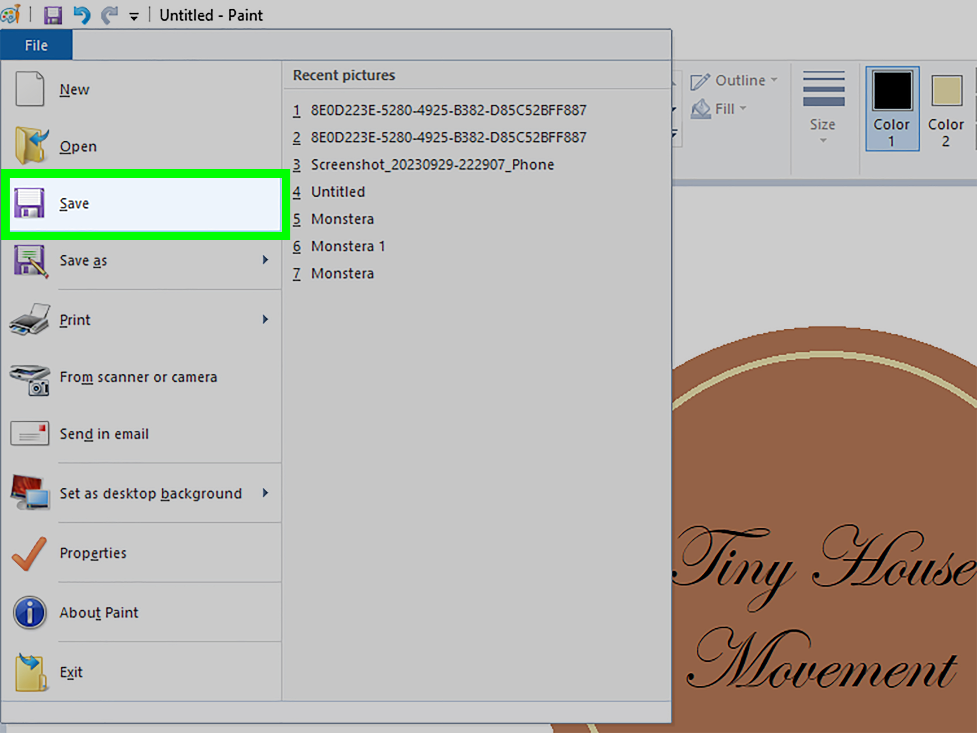
Step 7: Save Your Logo in the Right Format
When you are happy with the design, save your logo carefully. Use “Save As” so you can keep different versions. PNG is usually the best format for a logo made in Paint because it keeps edges cleaner than JPEG and can support transparency when available. JPEG is better for photos, but it can create fuzzy edges and compression marks around text and shapes. BMP files are large and not ideal for most web uses. GIF can work for simple graphics but is limited in color.
Create several exports:
- Master file: Your largest version, such as 1000 x 1000 pixels.
- Small web version: A smaller PNG for website or social media use.
- Black-and-white version: Useful for simple printing or watermarking.
- Icon version: A square version with only the symbol or initials.
If your Paint version lets you save a project file with editable layers, keep one editable copy. If not, save multiple versions as you work, such as “logo-draft-1,” “logo-draft-2,” and “logo-final.” This prevents the classic design tragedy of accidentally flattening your text, changing your mind, and whispering “no, no, no” at your monitor.
Example: A Simple Logo Made in Paint
Let’s say you are creating a logo for a small plant shop called “Leaf & Light.” A clean Paint-friendly concept could look like this:
- Create a 1000 x 1000 pixel canvas.
- Draw a soft green circle as the background badge.
- Use the Curve or Line tool to draw a simple leaf shape.
- Add a small yellow circle to suggest sunlight.
- Type “Leaf & Light” below the icon in a readable font.
- Use dark green or charcoal text for contrast.
- Save the final version as a PNG.
This logo works because it has one clear idea: plants and light. It uses a limited color palette. It can be understood quickly. It is not trying to explain the entire history of photosynthesis, which is thoughtful, because your logo should not require a science teacher and a whiteboard.
Microsoft Paint Logo Design Tips for Better Results
Keep the Design Flat and Simple
Flat logos are easier to draw in Paint and easier to recognize. Avoid complicated shadows, bevels, textures, and tiny details. A simple logo looks more modern and works better at small sizes.
Use Thick, Clear Lines
Thin lines may disappear when the logo is resized. Use outlines that stay visible, especially for icons. If the design depends on a tiny detail, simplify it.
Avoid Overcrowding
White space is not wasted space. It gives your logo room to breathe. A crowded logo feels nervous, like it drank three coffees and forgot its calendar password.
Design for the Smallest Use Case
Check your logo at thumbnail size. If it works as a small profile image, it will probably work in many other places. If it becomes a colorful blur, remove details.
Make Multiple Versions
Create a full logo, icon-only logo, horizontal version, square version, and one-color version. Even a small brand benefits from flexibility.
Common Mistakes to Avoid When Drawing a Logo in Paint
The biggest mistake is starting with decoration instead of meaning. A logo should represent the brand first and look fancy second. Do not add effects just because they are available. Every line, color, and shape should earn its place.
Another mistake is using low contrast. Light gray text on a white background may look delicate, but it is also nearly invisible. Your audience should not need detective equipment to read your logo. Choose colors that stand apart clearly.
Also, avoid using copyrighted icons, brand symbols, or images you do not own. Drawing your own simple symbol is safer and more original. If you use references, treat them as inspiration, not as tracing material. Your logo should belong to your brand, not look like it wandered away from someone else’s business card.
When Should You Use a Professional Logo Tool Instead?
Microsoft Paint is great for learning, sketching, and creating simple logos, but it is not always the final destination. Use a professional vector design tool if you need a logo for serious commercial branding, trademark registration, large-format printing, packaging, merchandise, or long-term business identity. Vector files such as SVG, EPS, AI, or PDF can scale cleanly without losing quality.
A smart workflow is to sketch your idea in Paint, then rebuild the final version in a vector tool later. Paint helps you think quickly because it removes complexity. Sometimes the simplest tool gets you to the strongest idea faster. After all, many great concepts begin as rough sketches. Paint is basically a digital napkin that does not get coffee stains.
Extra Experience: What Drawing Logos in Microsoft Paint Teaches You
Creating a logo in Microsoft Paint teaches one of the most valuable design lessons: limitations can make you better. When you do not have endless effects, filters, templates, and advanced controls, you are forced to focus on the essentials. Is the shape clear? Is the text readable? Does the logo make sense? Does it still work when small? These questions matter more than any fancy feature.
One useful experience is learning to build with basic shapes. Beginners often think design means drawing something complicated from scratch. In reality, many effective logos are built from circles, rectangles, triangles, and lines. Paint makes this obvious. You start to notice that a coffee cup can be a rectangle with an oval and a curved handle. A mountain can be two triangles. A camera can be a rounded rectangle, a circle, and a tiny flash shape. Once you see logos as shape systems, designing becomes less scary.
Another experience is understanding how much spacing matters. In Paint, moving objects by tiny amounts can completely change the feeling of a logo. Text that sits too close to an icon feels cramped. A circle that is slightly off-center feels amateur. A slogan that is too small becomes decoration instead of information. Working in Paint trains your eye because you have to manually judge balance and alignment. It is not glamorous, but it works.
You also learn the importance of saving versions. Paint can be unforgiving when text or shapes become flattened into the image. This teaches a professional habit: save early, save often, and keep editable drafts whenever possible. A file named “final-logo-real-final-v3-actually-final.png” may sound ridiculous, but every designer has met its cousin.
Color discipline is another lesson. Paint’s simple palette encourages you to choose fewer colors. That is a good thing. Many beginner logos fail because they use too many shades. A two-color logo often looks more confident than a five-color logo. When you limit yourself, you pay more attention to contrast, readability, and mood.
Drawing logos in Paint also helps you test ideas fast. You can sketch a badge, monogram, or icon in minutes. Not every version will be good, but that is the point. The first idea is often predictable. The second is better. The third starts to feel original. Paint is excellent for this kind of quick visual brainstorming.
The most important experience is learning that a logo does not need to be complicated to feel professional. In fact, the opposite is usually true. If your logo can be described in one sentence, recognized at a small size, and remembered after a quick glance, it is doing its job. Microsoft Paint may be simple, but simplicity is not a weakness. Used thoughtfully, it can help you create a logo that is clean, useful, and surprisingly charming.
Conclusion
Learning how to draw a logo in Microsoft Paint is a practical way to understand logo design without getting buried under advanced software tools. The seven-step process is simple: set up your canvas, sketch a clear concept, build with shapes, add readable text, choose a focused color palette, refine spacing, and save the logo in the right format. Paint is not the best tool for every professional branding project, but it is excellent for beginners, quick drafts, simple icons, classroom projects, hobby brands, and early logo concepts.
The secret is not to make Paint do everything. The secret is to make your logo do the right things: communicate clearly, look balanced, stay readable, and remain memorable. Keep the design simple, test it small, and create multiple versions. With a little patience and a few smart design choices, Microsoft Paint can help you turn a rough idea into a usable logono design degree, no expensive software, and no dramatic keyboard smashing required.
Note: This article is written for web publishing as original, human-edited SEO content based on current Microsoft Paint features and widely accepted logo design best practices.