
Outlining text in Photoshop is one of those tiny design tricks that can make a graphic go from “I made this at 1:00 a.m.” to “I totally know what I’m doing.” A clean text stroke can make words readable over busy photos, add a bold sticker-style effect, create YouTube thumbnail energy, or give a logo concept that extra little punch. Best of all, you do not need to rasterize your text, wrestle with complicated masks, or sacrifice your editable type layer like some kind of pixel offering.
In this guide, you will learn how to outline text in Photoshop using the Stroke layer style, the most flexible and beginner-friendly method. The process is non-destructive, which means you can change the wording, font, color, stroke size, and other settings later. Translation: if your client changes “Summer Sale” to “Mega Summer Blowout Spectacular” five minutes before delivery, you can survive the chaos with dignity.
Below is a practical, step-by-step tutorial for adding a stroke to text in Photoshop, followed by design tips, common mistakes, troubleshooting advice, and real-world experience notes to help you create sharper, cleaner, more professional text effects.
What Does It Mean to Outline or Stroke Text in Photoshop?
To outline text in Photoshop means to add a visible border around the letters. In Photoshop, this border is usually called a stroke. A stroke can sit outside the text, inside the text, or centered on the edge of the letters. You can make it thin and elegant, thick and cartoonish, bright and loud, or subtle enough that people do not notice itbut their eyes still thank you because the words are easier to read.
The most common method is to apply a Stroke layer style to a text layer. This keeps the text editable and lets you adjust the effect whenever you want. You can also create an outline-only text effect by lowering the text layer’s Fill to 0%, leaving only the stroke visible. This is perfect for modern posters, social graphics, sports designs, album covers, and dramatic photo overlays.
Before You Start: What You Need
You only need Adobe Photoshop, a document, and a text layer. The steps work for most modern Photoshop versions, including Photoshop CC and newer releases. Your interface may look slightly different depending on your version, but the basic workflow remains the same: create text, open Layer Style, choose Stroke, adjust the settings, and save the result.
For best results, start with high-contrast text and a clear font. Thin script fonts can look beautiful, but they may become messy when you add a thick outline. Bold sans-serif fonts, slab serifs, condensed display fonts, and chunky headline fonts usually handle strokes better. Think of it like putting a jacket on your letters: a sturdy letterform wears it well; a fragile one may look like it borrowed clothes from a giant.
How to Outline or Stroke Text in Photoshop: 7 Easy Steps
Step 1: Create a New Photoshop Document
Open Photoshop and create a new document by going to File > New. Choose a canvas size that fits your project. For a social media post, you might use 1080 x 1080 pixels. For a YouTube thumbnail, 1280 x 720 pixels is a common working size. For print, use a higher resolution and set the color mode and dimensions based on your printer’s requirements.
If you are practicing, keep it simple. Create a blank document with a white or dark background so you can clearly see the outline effect. Later, you can test the same text over photos, gradients, patterns, or textured backgrounds.
Step 2: Add Your Text with the Type Tool
Select the Type Tool from the toolbar, or press T on your keyboard. Click on the canvas and type your text. For example, you might type “BOLD MOVE,” “SALE,” “NEW DROP,” or “Adventure Starts Here.” Choose a font, size, alignment, and color from the Options bar or the Character panel.
Photoshop automatically creates a type layer when you add text. This is important because a type layer stays editable. You can change the wording, font, tracking, leading, and size later. Avoid rasterizing the text unless you have a specific reason. Rasterizing turns editable type into pixels, which gives you fewer options if you need to revise the design.
Step 3: Select the Text Layer
Go to the Layers panel and click the text layer you want to outline. If you do not see the Layers panel, go to Window > Layers. Make sure you are selecting the actual text layer, not the background, a photo, or a random shape layer that wandered into the party.
A clean layer structure makes Photoshop much easier to use. If your document has many layers, rename the text layer something obvious, such as “Headline Text” or “Outlined Title.” Future you will appreciate this small act of kindness.
Step 4: Open the Layer Style Panel
With the text layer selected, open the Layer Style panel. You can do this in several ways:
- Double-click the empty area to the right of the text layer name in the Layers panel.
- Click the fx icon at the bottom of the Layers panel and choose Stroke.
- Right-click the text layer and choose Blending Options, then select Stroke.
- Go to Layer > Layer Style > Stroke.
The Layer Style dialog box is where Photoshop keeps many of its most useful text effects, including Drop Shadow, Outer Glow, Bevel & Emboss, Color Overlay, Gradient Overlay, and Stroke. For this tutorial, the star of the show is Stroke.
Step 5: Turn On Stroke
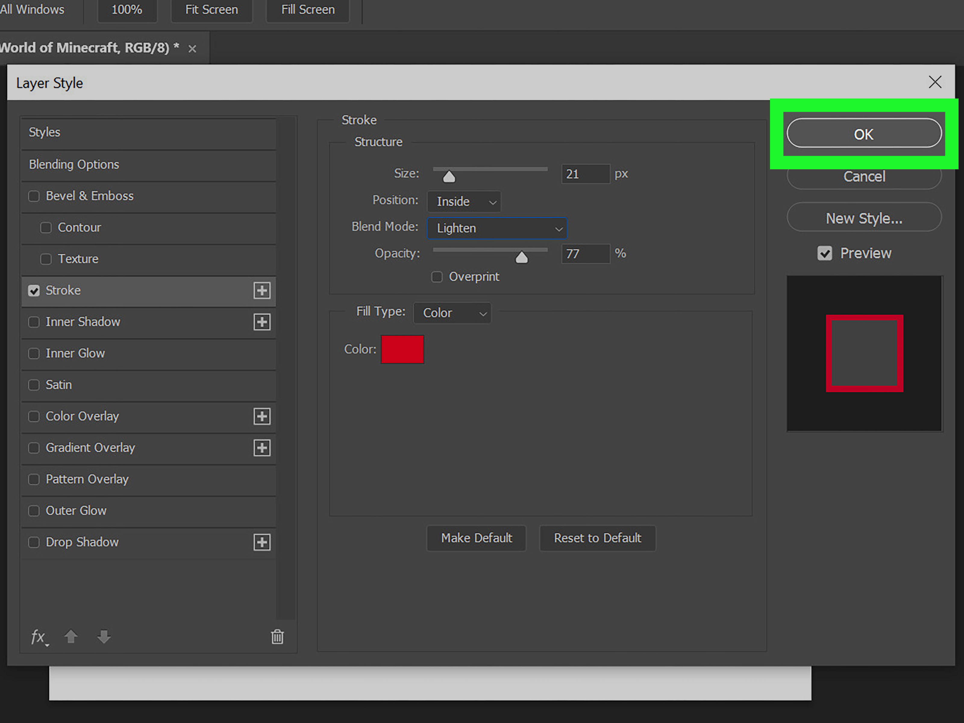
In the Layer Style dialog box, check the box next to Stroke. You should immediately see an outline appear around your text on the canvas. If nothing seems to happen, do not panic. The stroke color may be the same as the text or background, the size may be too small, or the preview may be turned off. Make sure Preview is checked so you can see changes in real time.
Now adjust the main Stroke settings:
- Size: Controls the thickness of the outline. Start with 3–8 pixels for smaller designs and 10–25 pixels for bold poster or thumbnail text.
- Position: Choose Outside, Inside, or Center. Outside is usually best for clean, readable text because it does not eat into the letter shapes.
- Blend Mode: Normal is the safest choice. Try Multiply, Screen, or Overlay for creative effects.
- Opacity: Use 100% for a solid outline or lower it for a softer look.
- Fill Type: Choose Color for a simple stroke, Gradient for a more stylized effect, or Pattern for a decorative border.
Step 6: Choose the Right Stroke Color
Click the color swatch in the Stroke settings and choose your outline color. The best stroke color depends on your background and design goal. For readability, choose a color that contrasts strongly with both the text and the background. White text with a black stroke is a classic because it works over almost anything. Black text with a white stroke is equally useful for darker layouts.
For a cleaner design, pull colors from the image or brand palette. If your background photo has orange sunset tones, a deep navy stroke may look more polished than plain black. If you are designing a gaming thumbnail, a bright yellow or electric blue stroke might fit the high-energy style. If you are working on a luxury logo mockup, a thin gold or cream stroke may feel more refined.
A good rule: if the outline is meant to improve readability, prioritize contrast. If it is meant to create style, prioritize harmony. If it needs to do both, welcome to graphic designthe art of making 14 tiny decisions and pretending it was effortless.
Step 7: Click OK and Refine the Final Look
Once the stroke looks right, click OK. Your text now has an editable outline. You can return to the settings anytime by double-clicking the Stroke effect under the text layer in the Layers panel.
At this point, test the design at the size people will actually see it. A stroke that looks perfect while zoomed in at 300% may look too thin on a phone screen. A giant stroke that looks fun on a thumbnail may look clumsy on a website banner. Zoom out, export a test image, and view it in context.
How to Make Outline-Only Text in Photoshop
Outline-only text is the effect where the inside of the letters disappears and only the border remains. It looks modern, stylish, and slightly mysterious, as if the text is saying, “I am here, but I also own a minimalist apartment.”
To create outline-only text:
- Create your text layer.
- Add a Stroke layer style.
- Keep the text layer selected.
- In the Layers panel, lower Fill to 0%.
Do not lower Opacity if you want the stroke to remain visible. Opacity affects both the text and its layer effects. Fill affects the layer’s contents while keeping the effects visible. That is the magic difference. Lowering Fill to 0% hides the letters but keeps the outline. Lowering Opacity to 0% makes everything vanish like your motivation after opening a 97-layer PSD file named “final_final_REAL_final.psd.”
How to Add Multiple Strokes to Text
Sometimes one outline is not enough. For sticker-style graphics, sports posters, bold social ads, or retro typography, multiple strokes can create a layered border effect. For example, you might use white text, a dark navy stroke, then a thicker yellow stroke outside that.
Depending on your Photoshop version, you may be able to add multiple Stroke effects directly in the Layer Style panel. If your version does not support that workflow clearly, duplicate the text layer and apply a different stroke size and color to each copy. Put the thicker stroke layer below the thinner one. This creates the appearance of stacked outlines while keeping your text easier to manage.
For a simple two-stroke effect, try this:
- Create white text.
- Add a 6 px black stroke to the original text layer.
- Duplicate the text layer.
- Move the duplicate below the original.
- Change the lower layer’s stroke to 14 px yellow or red.
The result is bold, readable, and energeticgreat for thumbnails, stickers, event posters, and anything that needs to shout politely from across the room.
Best Stroke Settings for Different Design Styles
For Clean Website Graphics
Use a thin outside stroke between 1 and 4 pixels. Choose a subtle color that improves contrast without making the text look heavy. This works well for hero images, blog banners, and promotional graphics.
For YouTube Thumbnails
Use large, bold text with an outside stroke between 8 and 20 pixels. High contrast is essential because thumbnails are viewed at small sizes. White or yellow text with a black stroke is common because it remains readable over busy images.
For Posters and Event Flyers
Try a thicker stroke, a second outline, or a gradient stroke. Add a Drop Shadow for depth, but keep it controlled. Too many effects can make text look muddy.
For Luxury or Minimalist Designs
Use a thin stroke, generous spacing, and restrained colors. A 1–2 px gold, beige, charcoal, or white stroke can add polish without turning the typography into a carnival sign.
Common Mistakes When Outlining Text in Photoshop
Using a stroke that is too thick: A huge stroke can close up counters, which are the open spaces inside letters like A, O, P, and R. If your text starts looking like alphabet soup, reduce the stroke size.
Choosing low-contrast colors: A pale gray stroke around white text may look elegant on your monitor, but it may disappear on mobile screens. Always test readability.
Rasterizing too early: Rasterized text is harder to edit. Keep your type layer live until you are absolutely sure the wording and layout are final.
Forgetting the background: A stroke should work with the full design, not just the text. Check the outline against every major background color or image area.
Adding too many effects: Stroke, shadow, glow, bevel, gradient, pattern, and texture can all be useful. Using all of them at once can make your text look like it fell into a special-effects blender.
Troubleshooting: Why Is My Text Stroke Not Showing?
If your stroke is not visible, check these issues first. Make sure the correct text layer is selected. Confirm that the Stroke checkbox is turned on in the Layer Style dialog box. Increase the Size value. Change the stroke color to something obvious, such as bright red, just for testing. Also check whether the stroke is hidden behind another layer or blending into the background.
If you lowered the layer’s Opacity, bring it back to 100% and use Fill instead if you want hollow text. If the text is tiny, the stroke may be too small to notice. Increase the font size or zoom in. If you are working in a strange color mode or with a flattened file, create a fresh type layer and test the effect there.
Pro Tips for Better Photoshop Text Outlines
Use Outside as your default stroke position for bold text. It preserves the interior shape of the letters better than Inside or Center. Use Inside for sharper corners or when you need the text to stay within a strict boundary. Use Center when you want a balanced stroke that overlaps both sides of the letter edge.
Pair strokes with spacing adjustments. Sometimes a thick outline makes letters feel cramped. Increase tracking slightly in the Character panel to give each letter more breathing room. This is especially helpful with all-caps headlines.
For photo backgrounds, try adding a subtle Drop Shadow below the stroke. The stroke creates separation, while the shadow adds depth. Keep the shadow soft and controlled unless you are intentionally going for a dramatic poster style.
Finally, save your favorite stroke combinations as reusable styles when possible. If you often create social media graphics for the same brand, reusable text effects can save time and keep your visuals consistent.
Real-World Experience: What Actually Works When Stroking Text in Photoshop
After working with outlined text across banners, thumbnails, ads, mockups, and social posts, one lesson stands out: the “best” stroke is rarely the fanciest one. It is the one that makes the message readable at the size and speed people will actually see it. Designers often build text effects while zoomed in close, admiring every edge like they are restoring a museum painting. But users usually see the final graphic while scrolling quickly, half-distracted, with one thumb already preparing to move on. In that environment, clarity wins.
For busy photo backgrounds, the most reliable combination is still bold text, a strong outside stroke, and simple color contrast. White text with a dark stroke works because it survives chaos. It can sit over hair, trees, buildings, food, clothes, clouds, or that one mysterious background texture nobody remembers adding. If the design needs more personality, add a second outer stroke in a brand color. This creates a sticker effect without sacrificing readability.
Another practical discovery: stroke size should be judged by output, not by the Photoshop canvas alone. A 6 px stroke may look huge on a small web graphic and almost invisible on a large poster. When designing thumbnails, export a test version and view it at thumbnail size. If you cannot read the text in two seconds, the stroke is not doing its job. The design may look great in Photoshop, but Photoshop is not the audience. The audience is a distracted human with 27 tabs open and no patience for decorative illegibility.
Font choice also matters more than beginners expect. Thick fonts accept outlines gracefully. Ultra-thin fonts often become awkward because the stroke overwhelms the letterform. If you need an outlined look with a delicate font, keep the stroke very thin or use outline-only text with generous spacing. For bold marketing graphics, choose fonts with strong shapes and open counters. The outline should support the letters, not swallow them.
One of the most useful habits is keeping text editable until the final export. It is tempting to rasterize, warp, cut, erase, and paint directly on type layers, especially when experimenting. But the moment the wording changes, that decision comes back wearing villain music. Layer Styles are safer because you can adjust the stroke later, copy it to another layer, or turn it off entirely. If you need advanced distortion or texture, duplicate the editable text layer first and hide a backup copy.
For brand work, consistency is the secret sauce. If one headline uses a 4 px navy stroke and another uses a 9 px almost-black stroke, the design system begins to feel messy. Create a small set of approved text styles: one for large headlines, one for smaller labels, and one for image-heavy layouts. This keeps the project polished and saves time. The goal is not to make every piece of text scream. The goal is to make the important words easy to read, visually intentional, and aligned with the overall design.
The biggest experience-based tip is simple: outline text only when it helps. A stroke can improve readability, create emphasis, and add style. But if the background is already clean and the typography already has enough contrast, a stroke may be unnecessary. Good design is not about using every effect available. It is about knowing when the text needs helpand when it is perfectly capable of standing on its own.
Conclusion
Learning how to outline or stroke text in Photoshop is a small skill with big design value. The Stroke layer style helps you create readable, editable, professional-looking typography in just a few clicks. Whether you are designing a thumbnail, poster, website banner, social media graphic, logo mockup, or outline-only text effect, the key is to keep the workflow non-destructive and make choices based on clarity.
Start with a live text layer, open Layer Style, enable Stroke, adjust size and position, choose a smart color, and refine the result in context. Use Fill at 0% for hollow text, try multiple strokes for bold sticker effects, and avoid rasterizing too early. With a little practice, outlined text becomes one of those Photoshop tools you reach for constantlynot because it is flashy, but because it works.