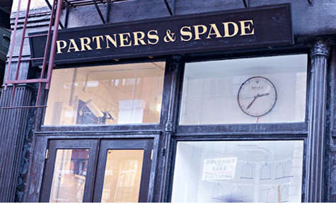

Some stores sell things. Other stores sell a point of view. Partners & Spade in New York belonged proudly to the second group, the rare retail space where a stapler, an antique globe, a photography book, a vintage lamp, and a curious piece of corporate memorabilia could sit together and somehow start a conversation. It was not a normal shop, which was exactly the point. Located at 40 Great Jones Street in NoHo, Partners & Spade felt more like a cabinet of curiosities with a front door, a cash register, and a very good sense of humor.
Created by Andy Spade and Anthony Sperduti, Partners & Spade was part branding studio, part gallery, part weekend store, and part New York design experiment. During the week, it functioned as a creative agency. On weekends, it opened to the public as a retail-gallery hybrid filled with objects that looked as if they had been rescued from estate sales, artist studios, old offices, and the back room of someone’s wonderfully eccentric uncle. The result was charming, strange, highly edited, and deeply influential.
For anyone interested in independent retail design, New York boutiques, creative branding, or the art of shopping without feeling like a barcode on legs, Partners & Spade remains a fascinating case study. It proved that a store could be more than inventory. It could be theater. It could be storytelling. It could be a mood board you could walk through while trying not to knock over a priceless-looking globe.
The Big Idea Behind Partners & Spade
Partners & Spade was founded on a deceptively simple idea: brands become memorable when they behave like real people with taste, wit, memory, and a little mystery. Rather than shouting through glossy advertising alone, the studio built worlds. It used objects, interiors, books, art, humor, and unexpected details to make a brand feel lived-in.
That philosophy made the Great Jones Street shop feel different from traditional retail. The store did not appear to be arranged by category in the predictable sense. It was not “lamps over here, books over there, please follow the arrows to checkout.” Instead, the space felt curated like an exhibition. A visitor could wander from antique office supplies to art books, from vintage furniture to odd collectibles, and from practical design objects to items that seemed to exist purely to make you pause and ask, “Wait, why do I want this so badly?”
This approach reflected Andy Spade’s well-known ability to turn everyday things into emotional objects. After helping shape the Kate Spade brand and later working on distinctive retail concepts, Spade brought a playful yet disciplined eye to Partners & Spade. Anthony Sperduti, with deep experience in advertising, film, and design, added another layer of creative structure. Together, they created a space that made shopping feel less like consumption and more like discovery.
Why 40 Great Jones Street Mattered
Location is never just location in New York. Great Jones Street has long carried the kind of downtown energy that makes even a quiet doorway feel like it might lead to a secret club, a private archive, or a very expensive chair. Placing Partners & Spade there made sense. NoHo offered the right balance of artistic history, design credibility, and sidewalk curiosity.
The storefront itself became part of the brand. It was not a shiny flagship with aggressive lighting and a fragrance cloud waiting to tackle you at the entrance. It felt intimate, layered, and slightly mischievous. The shop’s weekend-only rhythm also gave it a special quality. Because it was not open in the conventional way, visiting felt intentional. You did not just “run into” Partners & Spade; you made time for it, or you stumbled upon it and then congratulated yourself for having excellent instincts.
That sense of limited access created an atmosphere that modern retailers still chase. Before “experiential retail” became a boardroom phrase repeated next to cold brew and quarterly targets, Partners & Spade was already doing it naturally. The store gave visitors a reason to linger. It asked them to look closely. It rewarded curiosity. Most importantly, it made the physical act of shopping feel valuable in an age when buying something online was already becoming easier by the minute.
A Store, a Gallery, and a Branding Studio Walk Into a Room
The magic of Partners & Spade came from the tension between its roles. It was a working creative studio, but it also behaved like a gallery. It sold objects, but it displayed them as if each one had a biography. It attracted shoppers, designers, editors, collectors, and people who simply wanted to see what all the downtown fuss was about.
The inventory could include antique globes, staplers, art books, vintage lighting, photography, and unusual design pieces. These were not random props thrown together for atmosphere. The selection communicated a worldview: old things have energy, ordinary things can be beautiful, and design is most powerful when it carries a story.
In many stores, products are stripped of context. At Partners & Spade, context was the product. A vintage Herman Miller lamp was not just a lamp; it was a piece of modernist confidence with a plug. A stack of books was not filler; it was an invitation to think. A collection of office supplies could become sculpture if arranged with enough conviction. The store had conviction in bulk.
The Art of Curated Clutter
One of the hardest things in retail design is making abundance look intentional. Too little product and the shop feels cold. Too much and it begins to resemble a garage sale hosted by someone with eight hobbies and no shelving plan. Partners & Spade found the sweet spot. Its displays had density, but they also had rhythm. The shop felt full, not messy; eccentric, not chaotic.
This is where the brand’s eye for storytelling became visible. Objects were grouped in ways that encouraged association. A visitor might see a book, a tool, a lamp, and a photograph together and begin to imagine the person who would own them. The store created characters through things. It suggested lifestyles without spelling them out. That restraint made the experience feel smarter than ordinary retail theater.
Today, many boutiques use “curation” as a polite word for “we bought fewer things.” Partners & Spade used curation in the deeper sense. It selected, edited, arranged, and framed objects so that they carried meaning. Nothing felt overly polished. Nothing felt aggressively commercial. The result was a shop that seemed casual at first glance and highly considered at second glancethe retail equivalent of someone who says they “just threw this outfit on” while wearing the perfect jacket.
How Partners & Spade Changed the Conversation About Retail
Partners & Spade arrived at a moment when American retail was beginning to wrestle with sameness. Chain stores had become efficient but predictable. Many shopping streets were starting to feel interchangeable, as if the same few brands had simply packed a bag and moved from city to city. Against that backdrop, a small weekend shop on Great Jones Street offered something different: personality.
The store suggested that retail could still surprise people. It did not need to compete only on price, scale, or convenience. It could compete on taste. It could build loyalty through atmosphere. It could create desire by making every object feel chosen rather than stocked.
This influence extended beyond the shop itself. Partners & Spade became known for brand and retail work connected to companies such as J.Crew, Warby Parker, Shinola, Harry’s, Target, and Sleepy Jones. The studio’s projects often shared a recognizable sensibility: smart nostalgia, clean storytelling, approachable cool, and a belief that physical spaces could make brands more human.
The J.Crew Liquor Store Connection
One of the most discussed examples of this sensibility was J.Crew’s Liquor Store in Tribeca. Rather than creating a standard men’s shop with bright signage and predictable fixtures, the concept preserved the feeling of an old neighborhood liquor store. The original atmosphere became part of the experience. It was not retail camouflage; it was retail character.
That strategy echoed the same philosophy visible at Partners & Spade: a store should feel discovered, not manufactured. The Liquor Store helped reposition J.Crew menswear with downtown credibility, while Partners & Spade showed how a small physical environment could carry a full creative identity. Both projects understood that a good retail space should have a plot.
Warby Parker, Shinola, and the Rise of Story-First Brands
Partners & Spade’s influence also aligned with the rise of direct-to-consumer and story-first brands. Warby Parker, Shinola, Harry’s, and similar companies did not succeed simply because they sold glasses, watches, razors, or lifestyle goods. They succeeded because they made ordinary product categories feel thoughtful, stylish, and culturally aware.
That was Partners & Spade territory. The studio understood how to create the impression that a brand had a past, a personality, and a reason to exist beyond “please buy this.” Whether through a traveling pop-up, a carefully designed storefront, or a campaign with unusual charm, the goal was the same: turn products into stories people want to join.
What Shoppers Found Inside
A shopper entering Partners & Spade could expect the unexpected. The store might offer antique globes, vintage lamps, rare books, art objects, odd collections, or small design pieces. Some items were affordable curiosities; others belonged firmly in the “look lovingly, then check your bank account in silence” category. That range was part of the fun.
The shop was not built around mass accessibility. It was built around fascination. You could visit without buying anything and still leave with ideas. In fact, that may have been one of its greatest strengths. Partners & Spade made browsing feel productive. It sharpened your eye. It reminded you that taste is built through attention, not just acquisition.
For design lovers, the store was especially satisfying because it celebrated objects with history. In a culture obsessed with the new, Partners & Spade made the old feel fresh. A used object could be more interesting than a new one because it carried marks, mystery, and evidence of a previous life. The store treated patina almost like a design material.
The Humor Factor
Good taste can be exhausting when it takes itself too seriously. Partners & Spade avoided that trap. Its best quality may have been its dry wit. The store loved beautiful things, but it also loved odd things. It could admire a design classic while making room for a strange relic or a clever visual joke.
That humor made the shop feel welcoming. It lowered the temperature of high design. You did not need a graduate degree in modernism to enjoy the space, though it probably helped if you knew your way around a midcentury lamp. The store gave visitors permission to be curious, amused, and occasionally confused. In retail, confusion is usually bad. Here, it was part of the charm.
This playful intelligence is one reason Partners & Spade still gets discussed years after the original storefront closed. Many stores are remembered for what they sold. Partners & Spade is remembered for how it made people feel: alert, entertained, inspired, and slightly more stylish by association.
Why the Store Still Feels Relevant
The Great Jones Street storefront closed in 2014 as the business evolved, and the agency later continued under the name Mythology. Still, the spirit of Partners & Spade remains highly relevant because modern retail keeps returning to the lessons it practiced early and well.
First, physical stores need a reason to exist. If customers can buy a product online in thirty seconds, the store must offer something the screen cannot: atmosphere, touch, memory, surprise, and human-scale discovery. Partners & Spade understood that before it became urgent.
Second, storytelling works best when it is embedded in details. A brand does not become interesting because it writes a long mission statement. It becomes interesting because every object, surface, sign, display, and gesture reinforces a point of view. Partners & Spade was a masterclass in this kind of detail-driven branding.
Third, small spaces can have large influence. The shop was not a massive department store. It did not need to be. Its impact came from clarity of vision. In a world where many brands try to scale before they have a soul, Partners & Spade showed the power of starting with soul first.
Shopper’s Diary Experience: Walking Through the Partners & Spade State of Mind
Imagine planning a Saturday in downtown New York with Partners & Spade as the anchor stop. You begin in NoHo, where the streets are narrow enough to feel cinematic and the buildings seem to have better cheekbones than most people. You arrive at Great Jones Street expecting a store, but the window tells you this may not be a normal shopping errand. There is no loud invitation, no frantic sale sign, no display begging you to hurry inside before your personality expires. Instead, there is a quiet confidence that says: come in, look closely, and try to keep up.
Inside, the first experience is visual adjustment. Your eyes do not land on one hero product. They travel. A lamp catches your attention, then a book, then a small object whose purpose is not immediately clear. You pick it up, consider whether you need it, and realize that “need” is not the most useful category here. The store operates on curiosity, not necessity. Nobody needs an antique globe in the strict survival sense, but plenty of people need a reminder that the world once looked better when printed in faded blues and browns.
The pleasure of shopping in a place like Partners & Spade comes from slowing down. In a conventional store, you scan for size, price, color, and exit strategy. Here, you browse like a detective. Why is this object next to that photograph? Who owned this book before? What kind of person buys a vintage stapler because it has better posture than modern office equipment? The answers are not supplied, which makes the experience more engaging. The shop trusts you to make connections.
Another part of the experience is the feeling of permission. Partners & Spade made it acceptable to admire the humble and the peculiar. A worn object could be beautiful. A practical tool could be sculptural. A stack of books could be décor, research, and personality test at once. For shoppers used to polished luxury stores where everything gleams with intimidating perfection, this was a relief. The space had taste, but it also had fingerprints.
A smart way to experience a shop inspired by Partners & Spade is to treat it like a museum where the gift shop has taken over the entire building. Do not rush toward the most expensive item. Look for the small pieces that reveal the point of view: old packaging, typography, hardware, paper goods, book covers, frames, lampshades, and the odd object that seems useless until it becomes the thing you remember most. The best find may not be the rarest. It may be the one that changes how you look at your own home.
That is the real legacy of the Partners & Spade shopping experience. It trained visitors to see. After leaving, a shopper might notice the shape of a diner mug, the lettering on an old sign, the charm of a scratched wooden desk, or the quiet dignity of a well-made tool. The store’s influence continued outside its walls because it adjusted the eye. It made design feel less like a luxury category and more like a daily habit of attention.
For anyone recreating the experience today, the lesson is not to copy the objects exactly. The lesson is to shop with patience and personality. Visit independent bookstores, flea markets, vintage furniture shops, small galleries, and neighborhood boutiques. Choose things because they make a room feel more alive, not because an algorithm whispered that other people also bought them. Mix high and low, useful and odd, polished and worn. Let your home collect stories instead of just products.
In that sense, Partners & Spade in NY was never only about shopping. It was about developing a personal vocabulary. It encouraged people to understand that style is not a uniform; it is a collection of decisions. Some decisions are elegant. Some are funny. Some are slightly impractical but emotionally correct. The best rooms, like the best stores, contain all three.
Conclusion
Partners & Spade in New York remains one of the great examples of how a small retail space can leave a large cultural footprint. Its Great Jones Street shop blended gallery, store, studio, and storytelling laboratory into one unforgettable experience. Founded by Andy Spade and Anthony Sperduti, it helped define a style of retail that valued curiosity over convenience, character over polish, and narrative over noise.
For shoppers, it offered the thrill of discovery. For designers, it offered a lesson in curation. For brands, it proved that identity is built through behavior, details, and atmosphere. Long after the storefront closed, the Partners & Spade approach still feels fresh because it answers a question retailers continue to ask: why should anyone visit a store at all? The answer, in this case, is simple. Because a truly great store does not just sell objects. It changes how you see them.