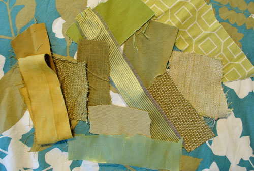

Choosing bedroom curtains sounds easy right up until you realize there are approximately 9,000 shades of beige, six kinds of linen that all look identical online, and one suspiciously confident product photo that turns “soft oatmeal” into “surprise banana” in real life. That is exactly why fabric swatches matter.
If you want curtains that actually look good, feel right, control light, and play nicely with your bedroom’s color palette, ordering swatches is not the fussy extra step. It is the step. A little square of fabric can save you from buying panels that are too shiny, too stiff, too yellow, too gray, too heavy, too sheer, or somehow all six at once.
In a bedroom, curtains do more than decorate. They affect privacy, sleep quality, softness, mood, insulation, and even how polished the room feels. The right fabric can make a space feel calm and layered. The wrong one can make the room feel like a hotel conference annex with a lamp. So before you commit to full panels, it pays to test fabric swatches like a person who enjoys making smart decisions and not like someone ordering mystery drapery at 1:17 a.m.
Why Fabric Swatches Matter More in a Bedroom
Bedrooms have different needs than living rooms or dining rooms. In a social space, you may care most about style. In a bedroom, style still matters, but performance matters just as much. You are dealing with early morning sun, nighttime privacy, glare from streetlights, temperature swings, and the general human desire to sleep without feeling like you are camping under a spotlight.
Fabric swatches help you judge four things that photos usually hide:
1. True color
Online product images are helpful, but they are not sacred truth. A curtain fabric can look warm ivory on your phone and cool greige in your room. Swatches let you see how the fabric behaves next to your wall paint, bedding, headboard, rug, and wood tones.
2. Texture and weave
A fabric’s surface changes the entire mood of a bedroom. Washed linen feels relaxed. Velvet feels cocooning and dramatic. Cotton can read classic and crisp. Polyester blends often offer easy care and budget-friendly durability. A swatch tells you whether the material feels soft and tailored or stiff and slightly grumpy.
3. Opacity
A bedroom curtain does not just need to be pretty when sunlight is behind it. It needs to perform. Swatches allow you to hold the material up to the light and see whether it softly filters daylight, blocks it substantially, or becomes a glowing fabric ghost by 6 a.m.
4. Drape
Some fabrics fall in elegant folds. Others behave like laminated poster board with opinions. Even a small swatch gives clues about weight and movement. If you want soft, luxurious puddling or smooth, tailored panels, the swatch will reveal whether the fabric can pull it off.
What to Compare Your Curtain Swatches Against
Do not judge swatches in isolation on your kitchen counter under one lonely ceiling bulb. Bedrooms are layered spaces, and curtain fabric should be tested against the elements that already define the room.
Wall color
Place your swatches directly against the wall, especially if your bedroom paint has undertones. A warm white curtain can look creamy and inviting against taupe walls, but oddly yellow against crisp cool white paint. Gray-beige walls can also trick neutral fabrics into looking pink, green, or muddy.
Bedding
Your bed is usually the largest visual feature in the room, so your curtain fabric should make sense with your duvet, quilt, shams, and throws. If your bedding is patterned, solid curtains may calm things down. If your bedding is simple, textured or patterned curtain fabric can add depth.
Headboard and furniture
Wood tone, metal finishes, upholstered headboards, and bedside tables all affect how a curtain color reads. Swatches help you spot whether your “soft flax” curtain is sophisticated with your oak furniture or looks like it accidentally matched the cat tree.
Natural and artificial light
This is the big one. Look at swatches in the morning, afternoon, evening, and with the bedroom lights on. A fabric that seems calm at noon can look gloomy at dusk or too reflective under warm lamps.
How to Test Fabric Swatches the Smart Way
If you want a better result than “well, I guessed,” use a simple swatch-testing routine.
Pin or tape swatches by the window
Hang them where the finished curtains will live. Looking at a swatch flat on a table is not the same as seeing it vertical against changing light. This helps you understand how the color shifts and how much light comes through.
Layer the swatch if needed
If you are considering lined curtains, fold the swatch over or test it with a second backing fabric behind it. This gives you a more realistic sense of opacity and body.
View from across the room
Swatches are tiny, but curtains are not. Step back several feet. Sometimes the weave or color contrast becomes more obvious from across the room, which is exactly how you will actually see the finished panels most of the time.
Touch it repeatedly
Yes, really. Bedrooms are tactile spaces. If the fabric feels scratchy, plasticky, or flimsy in your hand, you probably will not grow to love it just because it has a poetic color name.
Check care instructions before you fall in love
Some bedroom curtain fabrics are easy to clean and steam. Others are more high-maintenance. A gorgeous fabric that wrinkles dramatically or requires elaborate care may not be ideal if you want a low-fuss room.
Best Curtain Fabrics to Consider for Bedrooms
There is no one perfect curtain fabric for every bedroom. The best choice depends on how you sleep, how much light you get, and what atmosphere you want.
Linen
Linen is beloved for a reason. It looks relaxed, airy, and expensive without screaming for attention. In bedrooms, linen works well when you want softness and natural texture. The tradeoff is that unlined linen is usually more light-filtering than light-blocking, so people sensitive to morning brightness often prefer it with a lining.
Cotton
Cotton is versatile, classic, and easy to style. It can look casual or polished depending on the weave and header style. Cotton curtains are often a strong middle-ground option for bedrooms that need softness without the visual weight of velvet.
Velvet
If your bedroom goals include cozy, quiet, and slightly glamorous, velvet deserves a serious look. It is heavier, richer, and typically better at blocking light and softening sound than breezier fabrics. It also makes a room feel more wrapped and restful.
Polyester or blended fabrics
These can be practical winners. Many blends resist wrinkles, hold color well, and come in a wide range of looks, from faux linen to smooth blackout panels. A good swatch helps you separate the polished options from the ones that feel a little too synthetic.
Silk or silk-look fabrics
Silk can be elegant and luminous, but it is usually more formal and higher maintenance. In a bedroom, it often works best when the room leans traditional or luxurious. Swatches are especially helpful here because sheen can shift dramatically depending on light.
Sheers
Sheers are wonderful for softness and filtered daylight, but in a bedroom they usually work best as part of a layered setup. Pairing sheers with heavier drapes gives you daytime glow and nighttime privacy without forcing you to choose between romance and actual sleep.
How Lining Changes Everything
When people choose curtains by color alone, lining is often the forgotten hero. In reality, lining affects light control, insulation, structure, privacy, and the overall finished look.
A lined curtain generally hangs better, feels fuller, and protects the face fabric from harsh sun. In a bedroom, that can make a noticeable difference. If you sleep lightly, a blackout lining may be worth every penny. If you want a softer morning atmosphere, a privacy or room-darkening lining may be enough.
Swatches are useful here because some brands provide both face fabric samples and lining samples. That lets you build your own tiny curtain experiment before spending real money.
How to Match Curtain Swatches to Bedroom Style
For a calm, hotel-like bedroom
Look for solid fabrics in warm whites, oat, sand, mushroom, taupe, soft gray, or muted blue. Subtle texture is your friend. You want the curtains to add depth without shouting.
For a cozy, cocooning bedroom
Go darker or richer. Think olive, deep blue, tobacco, charcoal, rust, or plum in a fabric with body. Heavier materials and lined panels help the room feel insulated and snug.
For a bright, airy bedroom
Choose light-filtering fabrics with movement, such as linen blends or layered sheers with a simple drape panel. These work beautifully when privacy is not a constant issue or when you can combine them with shades.
For a patterned bedroom
Use swatches to make sure your curtain fabric supports the room instead of starting a pattern argument. If the bedding and rug already bring lots of activity, curtains may need to be quieter. If the room is mostly solids, a stripe, floral, plaid, or subtle geometric can wake things up.
Common Swatch Mistakes to Avoid
Choosing from a phone screen only
That is how “soft neutral” becomes “aggressively peach.” Always test a real swatch when possible.
Ignoring undertones
White is not just white. Beige is not just beige. Curtain fabrics can lean yellow, pink, gray, green, or cream. Swatches expose that immediately.
Forgetting about nighttime
Bedroom curtains need to look good under lamps as well as sunlight. A fabric with too much sheen can suddenly steal the spotlight after dark.
Focusing only on color
Texture, weight, opacity, and care are just as important. A beautiful color in the wrong fabric still leads to disappointment.
Buying before measuring
Even the prettiest fabric cannot save curtains that are too short, too narrow, or awkwardly placed. Test swatches while you plan hardware, width, and length together.
Final Tips Before You Commit
Once you narrow your options to two or three swatches, live with them for a couple of days. Move them around the room. Put them beside your pillowcases. Hold them against the wall at sunrise. Turn on the bedside lamp at night. Open and close the blinds. Annoy the swatches a little. They can take it.
If one fabric keeps looking good in every situation, that is your answer. If a swatch looks amazing only at one angle in one kind of light, it is probably a charming liar.
The goal is not just to buy curtains. The goal is to choose a fabric that makes your bedroom feel restful, intentional, and pleasing at every hour. Swatches help you make that decision with your eyes open instead of crossed fingers.
Real-World Experiences: What Happens When You Actually Use Fabric Swatches for Bedroom Curtains
One of the most common experiences people have with fabric swatches is discovering that their “favorite” online curtain is not actually their favorite in the bedroom. On a laptop screen, a fabric may seem perfectly neutral, soft, and luxurious. In the room itself, it may suddenly pull pink against beige walls, look dingy next to white trim, or feel too shiny next to matte bedding. This is usually the moment swatches earn their keep.
Another frequent experience is realizing how different bedroom light is throughout the day. A swatch that feels bright and breezy at noon can look flat by evening, while a richer fabric that seemed too dark in daylight can feel warm and cocooning once bedside lamps are on. This matters because bedrooms are emotional spaces. People do not just want a curtain that matches. They want a curtain that feels right when the day starts and when it winds down.
Many homeowners also notice that texture becomes more important than they expected. Smooth fabrics can feel crisp and clean, but in some bedrooms they read a little cold. Linen-look materials often soften the space immediately, while velvet samples tend to make the room feel quieter and more finished, even before the curtains are installed. Just touching several swatches side by side often changes the decision faster than comparing color names ever could.
There is also the practical surprise of opacity. People often assume a fabric is substantial because it looks thick folded in a sample packet. Then they hold it up to the window and realize it glows like a lantern. Swatching makes that obvious. It also helps people decide whether they need lined panels, blackout lining, or a layered combination of shades and curtains. In bedrooms facing the street or catching early sunrise, this test alone can prevent a costly mistake.
Another real-life lesson is that bedroom fabrics need to work with the rest of the room’s quiet details. A curtain swatch may not seem dramatic by itself, but once it is compared with brass hardware, walnut furniture, a cream rug, and pale blue bedding, its role becomes clearer. Some swatches blend into the background in the best possible way. Others become the room’s accent. Both approaches can work, but people are usually happiest when they discover that role before ordering full-size panels.
And then there is the emotional side, which sounds dramatic until you have had to return curtains the size of boat sails. Swatches reduce decision fatigue. They make the process feel manageable. Instead of gambling on a giant purchase, you are narrowing the field with evidence. You are seeing the fabric, touching the weave, checking the color, and testing the mood. That creates confidence, and confidence is a very underrated design tool.
In the end, real experiences with swatches usually lead to the same conclusion: the extra step feels small, but the payoff is huge. People sleep better, decorate smarter, and avoid the classic curtain regret of spending good money on panels that looked perfect online and deeply confused in real life.
Conclusion
Using fabric swatches to choose bedroom curtains is the difference between decorating with intention and decorating with hope. Swatches let you test color, texture, opacity, drape, and mood before you commit, which is especially important in a room designed for rest. When you compare samples in real light and against the pieces already in your bedroom, you get curtains that do more than cover a window. You get a finish that supports sleep, style, comfort, and the overall feel of the room.