
If you have ever stared at a block of text in Adobe Illustrator and thought, “Why are you still black?” welcome to the club. Changing font color in Illustrator is not difficult, but the app does enjoy hiding simple tasks behind panels, swatches, and tiny squares that seem to whisper, “Good luck, designer.” The good news is that once you understand how text color works in Illustrator, it becomes much easier to control live text, outlined text, and even whole groups of words in one go.
In this guide, we will walk through three practical ways to change Adobe Illustrator font color. You will learn how to change the fill color of normal text, how to use stroke and appearance settings for more dramatic typography, and how to recolor multiple pieces of text quickly when your design needs a full makeover. Along the way, we will also cover common mistakes, helpful shortcuts, and real-world examples so you can stop fighting the interface and get back to making good-looking stuff.
Understanding How Font Color Works in Illustrator
Before jumping into the three methods, it helps to know one important thing: Illustrator treats text a little differently from a word processor. In Microsoft Word, changing text color is usually one click. In Illustrator, text can have a fill, a stroke, and sometimes extra appearance attributes stacked on top like toppings on a very nerdy pizza.
That means “font color” can refer to a few different things:
- Fill color: the main color inside the letters
- Stroke color: the outline around the letters
- Appearance-based color effects: extra fills or strokes added in the Appearance panel
- Recolored outlined text: text converted to shapes and edited like vector objects
If your goal is simply to make black text blue, the fill color is usually what you want. If you want bold outlined lettering, neon typography, or a two-tone look, you will use stroke and appearance settings. And if you need to change twenty headlines across a poster series because the client suddenly wants “a more energetic coral,” you will want batch recoloring tools. Because of course they do.
Way 1: Change the Fill Color of Text
The first and easiest method is to change the fill color of your text. This is the standard way to change font color in Adobe Illustrator when you are working with live text and want a quick, clean result.
How to Change Text Fill Color in Illustrator
- Select the Type Tool and click your text, or use the Selection Tool to select the whole text object.
- Look for the Fill box in the toolbar, Properties panel, Control panel, or Color panel.
- Make sure the fill is active, not the stroke. If the wrong square is highlighted, click the fill square.
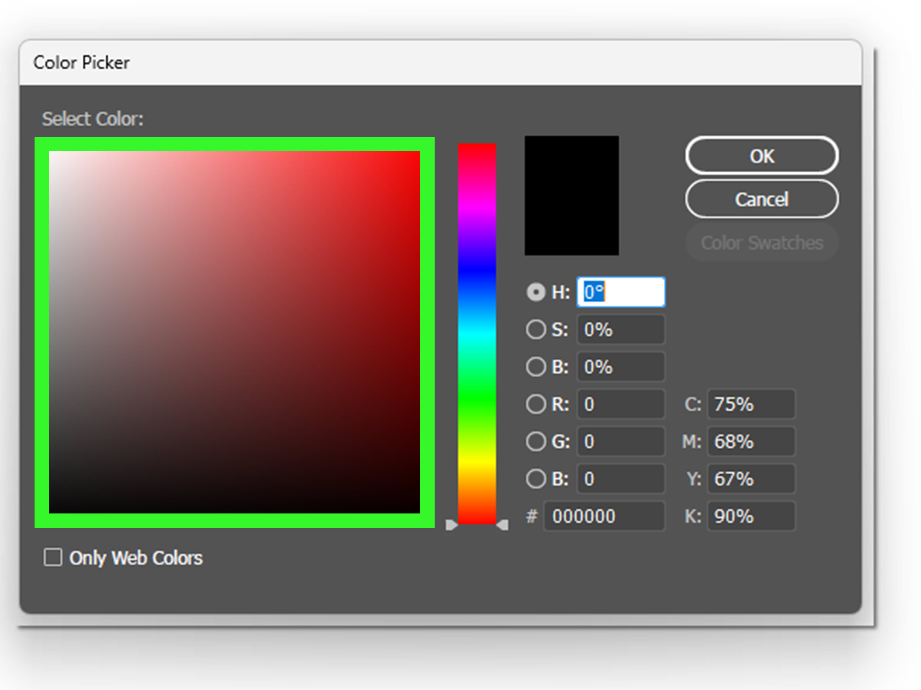
- Choose a new color using the Color Picker, Swatches, or Color panel.
- Click away from the object and admire your suddenly less depressing text.
This method is ideal for headlines, labels, logos, callouts, and just about any time you are working with regular editable text. It is also the best choice when you need to keep the text fully editable for later changes. That matters more than people think, especially when someone emails, “Can we change one word?” twenty minutes before a deadline.
When This Method Works Best
Use the fill color method when you want speed, simplicity, and clean typography. It is especially useful for:
- Changing body text to a brand color
- Updating headline colors in a layout
- Testing multiple color options quickly
- Keeping text editable for future revisions
For example, imagine you are designing a social media graphic for a coffee shop. The headline says “Cold Brew Season,” but it is in plain black. Selecting the text and changing the fill to a rich mocha brown instantly makes the design feel more intentional. Add a cream background, and suddenly you are not just typing words anymore. You are branding.
Common Mistakes With Fill Color
The most common mistake is changing the stroke instead of the fill. If your text still looks black after you choose a new color, check which square is active. Illustrator loves giving you two overlapping squares and pretending that is emotionally supportive.
Another issue happens when only part of the text changes color. That usually means you selected individual characters rather than the whole text object. If you want all the text to match, select the entire text box or highlight all characters with the Type Tool before changing the fill.
Way 2: Use Stroke and Appearance for More Stylish Text Color
The second method is for people who do not just want colored text. They want text with attitude. This is where stroke color and the Appearance panel come in. With these tools, you can create outlined text, layered fills, and more advanced typographic styles without converting your text to outlines right away.
How to Add or Change Stroke Color on Text
- Select your text object.
- Click the Stroke square instead of the Fill square.
- Choose a stroke color from the Swatches or Color panel.
- Open the Stroke panel and increase the weight if the outline is too thin to see.
- Adjust alignment and corners if needed for a cleaner look.
A stroke can make text stand out against busy backgrounds, photos, or colorful illustrations. White text with a dark outline is a classic solution when readability matters. It may not be glamorous, but it gets the job done, which is honestly more than some fonts can say for themselves.
Using the Appearance Panel for Advanced Color Control
If you want more than a simple fill and stroke, open the Appearance panel. Here, Illustrator lets you stack multiple fills and strokes on the same text object. That means you can create effects like:
- A colored fill with a contrasting outline
- A double-outline title effect
- A soft shadow style using extra appearance layers
- A faux badge or sticker look without expanding the text
This method is powerful because your text can stay live and editable while still looking customized. If you later need to change the wording, you are not rebuilding the design from scratch. You are simply editing the text and keeping the effect. That is the kind of efficiency that makes designers feel like magicians and project managers feel slightly less nervous.
Example of a Better Visual Hierarchy
Let’s say you are designing a flyer with the title “Summer Sale.” A plain red fill works fine, but adding a white fill with a thick navy stroke makes the headline more visible from a distance. If you add an extra stroke behind that using the Appearance panel, the text can start to feel like signage rather than just typography. Same words, better presence.
This is also a great technique for YouTube thumbnails, posters, event graphics, and marketing materials where text needs to punch through the visual noise. In other words, anywhere the design is fighting for attention in a very crowded digital room.
Way 3: Recolor Multiple Text Objects Fast
The third method is the time-saver. If you need to change the font color of several text objects, or if your text has already been converted to outlines, using Illustrator’s selection and recoloring tools can save you a lot of repetitive clicking.
Option A: Select Same Fill Color
If multiple text objects already share the same color, Illustrator can help you select them together. This is useful when updating brand colors across a file.
- Select one text object with the color you want to replace.
- Go to Select > Same.
- Choose the relevant attribute, such as Fill Color or another matching property.
- All matching text objects will be selected.
- Apply a new fill color once, and all of them update together.
This is the design equivalent of cleaning your room by moving everything into one very strategic pile. Suddenly, the chaos becomes manageable.
Option B: Use Recolor Artwork
If you are working on a more complex illustration, logo system, or stylized type treatment, the Recolor Artwork feature can be incredibly helpful. It allows you to shift entire color groups instead of changing one object at a time.
This method works especially well when text has been outlined or when it is part of a larger piece of vector artwork. After outlining, Illustrator treats the letters like shapes, which means you can recolor them with the same tools you would use on icons, badges, or illustrations.
When to Outline Text First
Sometimes designers outline text before recoloring because they need per-letter shape control, custom fills, or advanced edits that live text cannot handle as easily. That can be useful, but it is not always necessary. Once text is converted to outlines, it is no longer editable as text. So before you do that, ask yourself a simple question: “Will Future Me regret this?” Future You is often tired, under-caffeinated, and not thrilled about rebuilding a typo fix.
Outlined text makes sense when you are finalizing logo artwork, preparing files for certain print workflows, or building decorative letterforms that need shape-by-shape adjustments. For normal editing, live text is still the smarter choice.
Tips for Choosing Better Text Colors in Illustrator
Changing font color is not just a technical task. It is also a design decision. The prettiest color in the world can still be a terrible text color if nobody can read it.
Here are a few smart habits to keep in mind:
- Use strong contrast between text and background
- Test brand colors at actual viewing size
- Avoid overly thin strokes on small text
- Use swatches to keep colors consistent across files
- Preview your design on screen and, if relevant, in print
For instance, a pale yellow headline on a white background may look trendy for about six seconds before it becomes unreadable. Stylish is good. Legible is better. Stylish and legible is the dream.
Troubleshooting: Why Illustrator Is Not Changing the Font Color
If Illustrator refuses to cooperate, do not panic. It is usually one of a few common issues:
- You selected the stroke instead of the fill
- You selected only part of the text
- The text has appearance attributes overriding the basic fill
- The text has been outlined and is now a vector shape
- The object is locked or grouped with other elements
When in doubt, open the Appearance panel and inspect what is really applied to the text. Illustrator often looks simple on the surface, but underneath it can be carrying enough hidden styling to qualify as emotional baggage.
Final Thoughts on Changing Font Color in Adobe Illustrator
If you want the easiest route, change the fill color. If you want text with more visual punch, use stroke and appearance settings. And if you need to update several text objects or work with outlined lettering, use Select Same and Recolor Artwork to speed up the process.
That is really the secret to working faster in Illustrator: understand which tool matches the kind of text you are editing. Live text, styled text, and outlined text each behave a little differently. Once you know the difference, changing Adobe Illustrator font color stops feeling like a scavenger hunt and starts feeling like an actual workflow.
So the next time your text needs a color refresh, you will know exactly where to click, what to avoid, and how to keep your design both editable and polished. Illustrator may still have its little quirks, but at least now you can color your type without needing a support group.
Experience and Practical Lessons From Real Illustrator Work
In real design work, changing font color in Illustrator is rarely just about “make this blue.” It usually happens in the middle of a larger problem. Maybe a client says the branding feels too serious. Maybe a product label needs stronger shelf impact. Maybe an event poster looked perfect on your laptop and then somehow turned into a low-contrast ghost when projected in a conference room. That is when font color stops being a tiny design detail and starts becoming part of communication.
One common experience is realizing that the first color choice looked great only because the background was temporary. Designers often build a layout with placeholder shapes, then later swap in a photo or textured background. Suddenly, the text color that seemed bold now disappears. In those moments, adding a stroke or shifting the fill to a more saturated tone can rescue the design fast. That is why experienced Illustrator users do not just pick pretty colors. They test how text behaves in context.
Another practical lesson comes from brand work. A company may have official colors, but those colors do not always behave well in every size or medium. A bright accent color can look fantastic in a logo but become hard to read in smaller typography. In Illustrator, it helps to create swatches for the official colors and then test darker or lighter companion versions for text applications. This keeps the design on-brand without sacrificing legibility. In plain English: sometimes the brand color needs a responsible older sibling.
There is also the very familiar experience of inherited files. Someone sends over an Illustrator document, and the text refuses to change color the way it should. You click the fill, choose a new swatch, and nothing happens. That usually means the file has strokes, appearance layers, outlined text, or grouped objects with more history than a documentary series. Opening the Appearance panel often reveals the truth. Once you get used to checking that panel early, you waste far less time wondering whether Illustrator is broken or whether the file is just complicated.
Batch recoloring is another lifesaver in real projects. Imagine updating a campaign with ten artboards, each using the same headline style. Manually changing every text object is possible, but it is also an excellent way to question your life choices. Selecting objects with matching attributes or using recolor tools makes the process faster and more reliable. It also reduces the risk of missing one random piece of text hiding in the corner like a tiny design goblin.
Over time, the biggest lesson is simple: good text color choices in Illustrator come from balancing technique and judgment. You need the technical skill to know whether to edit fill, stroke, appearance, or outlined shapes. But you also need the design judgment to ask whether the color improves readability, hierarchy, branding, and mood. When those two things work together, the result feels effortless. And that is usually the sign that a design is working well, even if you know there was plenty of clicking, testing, tweaking, and muttering behind the scenes.