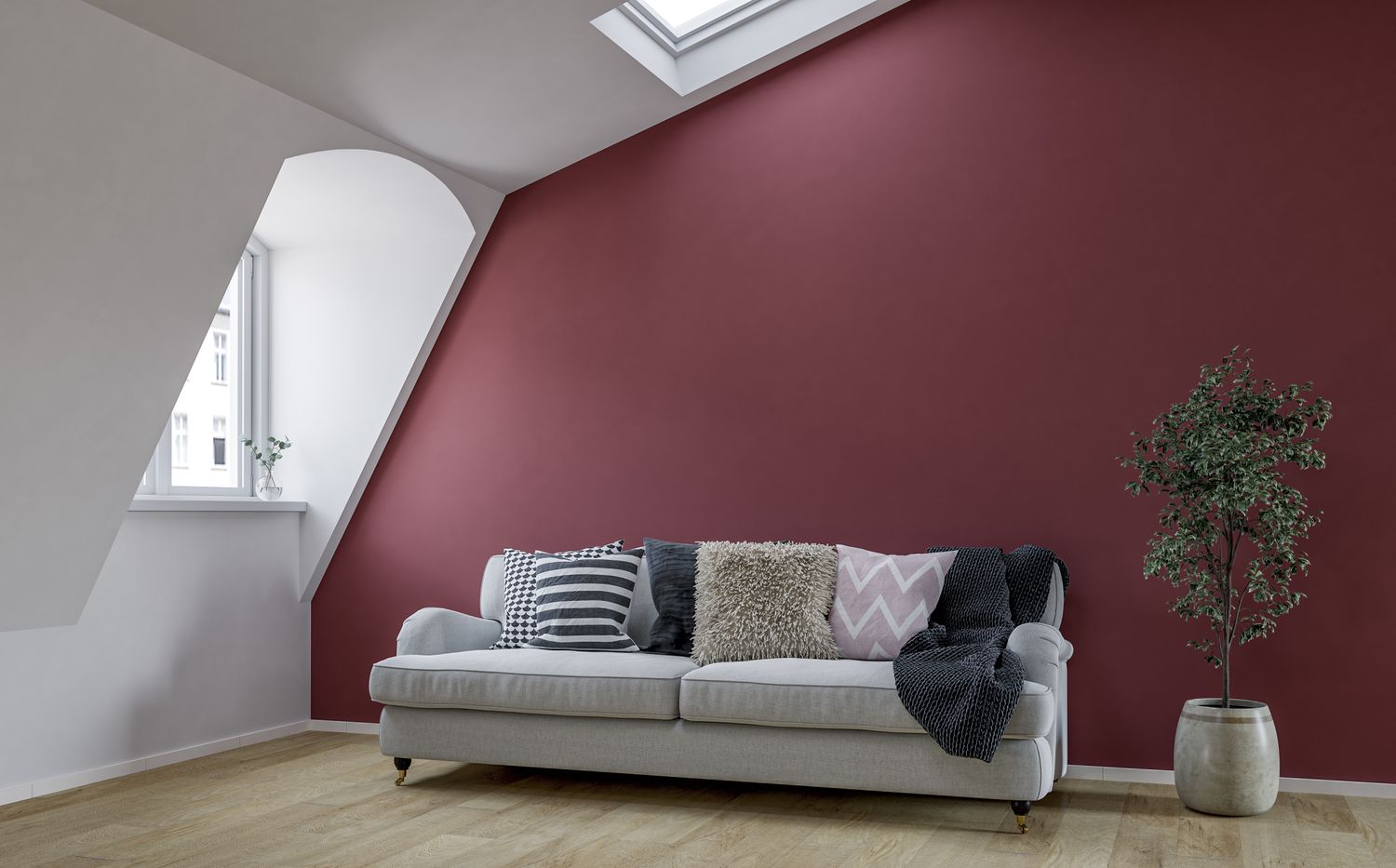

Some colors do not disappear overnight. They simply stop getting invited to the cool design meetings.
Introduction: 2026 Is Not Anti-ColorIt Is Anti-Boring
Paint trends in 2026 are moving in a warmer, softer, more personal direction. The new mood is not about copying a showroom or making every room look like a rental listing with a candle budget. Instead, homeowners are leaning into color that feels lived-in, layered, calming, and a little more emotionally intelligent. Think earthy neutrals, smoky greens, muted blue-greens, deep browns, warm khakis, plaster-inspired pinks, and shades that look good in real daylight, not just under perfect catalog lighting.
That means several once-beloved paint colors are beginning to look tired. Some were overused. Some were too cold. Some became victims of their own popularity. And some, frankly, have been hanging around like that one throw pillow from 2014 that refuses to retire.
Before anyone panics and starts apologizing to their gray hallway, remember this: a color going out of style does not mean it is ugly. It means the design conversation has shifted. In 2026, the best interiors feel warm, grounded, specific, and human. The paint colors falling out of favor are the ones that feel flat, overly safe, harsh, or too obviously trend-driven.
1. Cool Gray
Why It Is Fading
Cool gray dominated homes for years because it promised sophistication without risk. It was neutral, modern, and easy to pair with white trim. Then everyone used it everywhere: living rooms, bedrooms, kitchens, bathrooms, hallways, offices, basements, and probably a few dog houses. By 2026, the cool-gray-everything era feels dated because it often makes rooms look chilly, shadowy, and emotionally unavailable.
The issue is not gray itself. The problem is the blue-leaning, sterile version of gray that can make a home feel more like a waiting room than a relaxing space. In northern light, cool gray can turn icy. In open-concept homes, it can drain warmth from wood floors, leather furniture, brass fixtures, and natural textiles.
What To Use Instead
Instead of cool gray, designers are leaning toward warm taupe, mushroom, clay beige, soft stone, and brown-based neutrals. These colors still give you flexibility, but they add comfort. A warm neutral can make white trim look intentional, wood tones look richer, and artwork feel more connected to the room.
For example, a cool gray living room with a gray sofa and chrome fixtures may feel flat in 2026. Repainting the walls in a warm khaki, soft taupe, or creamy mushroom shade instantly gives the same room more depth. Add walnut wood, linen curtains, and a textured rug, and suddenly the space says “quiet luxury” instead of “corporate onboarding packet.”
2. Stark White
Why It Is Fading
Stark white had a long run because it photographed beautifully. It made rooms look bright, clean, and minimal. But in real life, bright white walls can be unforgiving. They show scuffs, make shadows look harsh, and can feel cold when there is not enough natural light. In 2026, homeowners want rooms that feel welcoming, not rooms that look like they are judging you for owning a coffee mug with a chip in it.
The all-white interior also became heavily associated with the flip-house aesthetic: white walls, white cabinets, white countertops, gray floors, and exactly one plant placed near a window for emotional support. That look can still be crisp, but it no longer feels fresh when used without contrast, texture, or personality.
What To Use Instead
Warm whites, creamy off-whites, and soft ivory shades are replacing stark white. These colors still brighten a space, but they bring a gentler glow. They work especially well in bedrooms, kitchens, entryways, and small rooms where you want light without glare.
If your home currently has bright white walls and feels a bit flat, you do not have to swing wildly into dark emerald or cinnamon brown. Try a warm white with a hint of cream, a barely-there beige, or a soft natural linen tone. The room will still feel airy, but it will also feel like actual humans live there.
3. Flat Greige and Builder Beige
Why It Is Fading
Greige was supposed to be the perfect compromise between gray and beige. In many homes, it was. But after years of being used as the universal “safe choice,” flat greige has started to lose its charm. In 2026, the least stylish versions are those muddy, noncommittal shades that do not feel warm enough to be cozy or crisp enough to be modern.
Builder beige has a similar problem. It is not offensive, but it can be forgettable. When every wall in a home is painted the same vague beige, the architecture disappears. The furniture looks disconnected. The room becomes background music with no melody.
What To Use Instead
The updated neutral palette is richer and more intentional. Look for sandy khaki, camel, warm putty, soft caramel, muted terracotta, pale coffee, and pink-beige. These shades still function as neutrals, but they have a point of view.
A dining room painted in flat greige may feel unfinished, especially with dark wood furniture. Repainting it in a warm clay-beige or muted caramel can make the space feel grounded and elegant. In a bedroom, swapping builder beige for a soft plaster pink or creamy tan can make the room feel calmer and more custom without screaming, “I follow paint trends on the internet,” even though, yes, here we are.
4. Millennial Pink and Chalky Pastels
Why They Are Fading
Millennial pink had a cultural moment. It was cute, soft, Instagram-friendly, and surprisingly versatile. But its most recognizable versiona chalky, blush-pink pastelnow feels tied to a specific era of design. In 2026, homeowners still love pink, but they want it to feel more grown-up, earthy, and architectural.
The same goes for chalky pastels like powder blue, pale mint, and sugary lavender. These colors can be charming in the right room, but when used carelessly, they feel thin and juvenile. They may also clash with the deeper woods, richer textiles, and earthier finishes gaining popularity.
What To Use Instead
Instead of millennial pink, try dusty rose, plaster pink, muted mauve, baked clay, or peach-beige. These colors still bring softness, but they have more depth. They pair beautifully with antique brass, dark wood, creamy trim, burgundy accents, and natural stone.
For pastels, the 2026 update is all about complexity. Instead of powder blue, consider a smoky blue-gray. Instead of mint, choose a muted eucalyptus or blue-green. Instead of lavender, try a dusky plum or gray-lilac. The goal is to keep the charm but lose the cupcake frosting effect.
5. Overused Sage Green
Why It Is Fading
Sage green is not gone. In fact, green remains one of the most important color families in interiors. The problem is that the pale, dusty, overused version of sage has become predictable. It appeared on cabinets, bedrooms, bathrooms, nurseries, accent walls, and every “calming home makeover” mood board for years. By 2026, the most washed-out sages can feel a little too safe.
Design is moving toward greens with more personality: smoky jade, deep garden green, olive, eucalyptus, moss, lichen, and blue-green hybrids. These shades still connect interiors to nature, but they feel fresher and more sophisticated than the default sage that once solved every design problem.
What To Use Instead
If you love sage, choose a version with more depth or warmth. A gray-green with earthy undertones can look beautiful on kitchen cabinets. A deep muted green can make a study or powder room feel enveloping. A smoky jade can bring color to a space while still acting like a neutral.
For example, pale sage cabinets paired with white subway tile may now look a bit expected. Updating the cabinets to a deeper muted green and adding warm metal hardware creates a more current look. The room still feels calm, but it has moved from “farmhouse Pinterest board” to “thoughtful, layered home.”
6. Heavy Navy and Flat Black Accent Walls
Why They Are Fading
Navy and black accent walls had a strong run because they created instant drama. One dark wall behind a bed or sofa could make a room feel designed with minimal effort. But in 2026, the single dark accent wall can feel formulaic, especially when the rest of the room is plain white or gray. It is the design equivalent of wearing a tuxedo jacket with pajama pants.
Flat black can also be difficult in everyday homes. It absorbs light, highlights dust, and can make a room feel smaller when the lighting plan is not strong. Navy has a similar issue when it is too saturated or too cold. Instead of feeling classic, it can feel heavy and dated.
What To Use Instead
The more current approach is depth with nuance. Try espresso brown, charcoal umber, deep olive, smoky teal, aubergine, warm black-brown, or muted ink blue. These colors still offer drama, but they feel softer and more luxurious.
Another major update is color drenching, where walls, trim, doors, and sometimes ceilings are painted in the same or closely related shades. This creates a more intentional envelope of color than a single dark wall floating in a pale room. If you are nervous, start with a powder room, reading nook, pantry, or small office. Drama is easier to enjoy when it is not yelling from across the living room.
How To Update Your Home Without Repainting Everything
If your home includes one or more of these fading paint colors, you do not need to cancel your weekend and start panic-rolling every wall. Paint trends are useful guides, not emergency sirens. The smarter approach is to look at how the color behaves in your specific home.
Check The Undertone First
A cool gray with blue undertones may look outdated in a warm, wood-filled living room. But a soft gray with taupe undertones can still look elegant. A stark white may feel harsh in a north-facing bedroom, but it may work beautifully in a sun-filled kitchen with warm floors and natural textures.
Use Contrast And Texture
Many “outdated” colors can be rescued with better styling. Add woven shades, wood furniture, warm lighting, linen, stone, vintage art, or brass accents. A flat greige room becomes more interesting when it includes layered materials. A white room becomes warmer when it has texture. A navy room becomes more current when paired with brown leather, cream textiles, and aged metal rather than chrome and gray.
Paint Smaller Areas First
If you want to try a 2026-friendly color, start with a small space. Powder rooms, laundry rooms, mudrooms, bookshelves, interior doors, and vanities are perfect testing grounds. These areas allow you to experiment without committing your entire open-concept living area to a shade named something poetic like “Moody Forest After Rain.”
Best 2026 Paint Color Alternatives By Room
Living Room
Replace cool gray or stark white with warm mushroom, soft khaki, creamy ivory, or muted clay. These shades make living rooms feel relaxed and social. They also pair well with wood furniture, textured rugs, and mixed metals.
Kitchen
Instead of pale sage or flat white cabinets, consider smoky green, muted olive, warm cream, deep blue-green, or natural wood paired with a soft neutral wall. Kitchens in 2026 feel less sterile and more collected.
Bedroom
Move away from chalky pastels and icy grays. Try plaster pink, warm taupe, dusty mauve, soft brown, or muted eucalyptus. These colors create a restful atmosphere without making the room feel sleepy in the wrong way.
Bathroom
Bathrooms are great places for richer color. Instead of stark white walls and black accents, try warm ivory with bronze fixtures, smoky jade with cream tile, or deep garden green with natural stone.
Home Office
Replace flat navy or black accent walls with espresso, charcoal brown, olive, or muted teal. These colors bring focus and depth without making the space feel like a cave where productivity goes to disappear.
Personal Experience: What These Color Shifts Look Like In Real Homes
The biggest lesson from watching paint trends evolve is that color does not fail alone. It usually fails because the room around it changes. A cool gray that looked sharp with white trim and new furniture ten years ago may now feel cold because the homeowner has added warm wood, vintage rugs, cream upholstery, and brass lighting. The gray did not suddenly become a villain. It simply stopped speaking the same design language as the rest of the house.
One common experience is repainting a room from cool gray to a warm neutral and realizing the furniture did not need replacing after all. A beige sofa that looked dull against icy gray walls can look intentional against soft taupe. A wood dining table that looked orange next to stark white can look rich beside a clay-based neutral. Paint is powerful because it changes the relationship between everything else in the room.
Another real-world lesson involves lighting. Many people choose paint from a tiny sample under store lighting, then wonder why it looks completely different at home. In 2026, with warmer and more nuanced colors trending, testing samples is more important than ever. A smoky green may look elegant in morning light and almost charcoal at night. A warm white may look creamy in one room and yellow in another. A khaki neutral may feel calm in a sunny space but too muddy in a dark hallway. Large swatches are not optional; they are the difference between “designer-approved” and “why does my wall look like soup?”
It is also worth noting that many homeowners do not actually dislike color. They dislike the fear of choosing the wrong one. That is why gray, white, and greige became so dominant: they felt safe. But the most memorable homes rarely come from fear. They come from thoughtful decisions. A muted eucalyptus bedroom, a warm brown office, or a smoky jade vanity can feel personal without being loud. The trick is choosing colors that support the mood of the room.
If you are updating a home in 2026, start by asking what each room should feel like. A living room may need warmth and conversation. A bedroom may need softness and quiet. A kitchen may need energy without chaos. Once you know the feeling, the color choice becomes easier. You are no longer asking, “What is trendy?” You are asking, “What helps this room do its job?” That is where good design begins.
The best experience with paint often comes from small, confident changes. Paint the interior of a bookcase a deep green. Swap a stark white powder room for a warm plaster shade. Turn a flat navy office into a richer espresso-toned retreat. These updates do not require a total renovation, but they can make a home feel current, comfortable, and more personal. In the end, 2026 paint trends are not about chasing every new color announcement. They are about leaving behind flat, overused choices and making room for shades that feel warmer, wiser, and much more you.
Conclusion: The New Rule Is Warmth With Personality
The paint colors going out of style in 2026 share one thing: they became too automatic. Cool gray, stark white, flat greige, millennial pink, overused sage, and heavy navy or black accent walls were all popular for good reasons. But design has moved toward colors with more warmth, complexity, and emotional depth.
The good news is that you do not have to abandon neutrals or repaint your entire house in dramatic jewel tones. The best 2026 updates are often subtle: warmer whites, earthier neutrals, richer greens, softer pinks, deeper browns, and smoky colors that change beautifully with the light. The goal is not to make your home look trendy for one season. The goal is to make it feel alive, comfortable, and unmistakably yours.
Note: This article is written for web publishing and is based on current 2026 U.S. paint color forecasts, official paint brand announcements, and interior design trend reporting. No source links are inserted in the article body so the content remains clean for publication.
SEO Tags