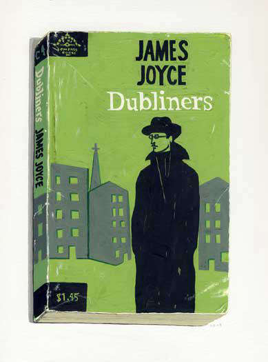

Some art shouts across the room. Richard Baker’s book cover series does something far trickier: it whispers, and somehow still steals the whole wall. At first glance, these paintings look like beloved old paperbacks casually left on a table by an unusually stylish reader. Then your eyes adjust, your brain does a double take, and you realize you are looking at paintings of bookstrue-to-size portraits of worn, handled, lived-with paperbacks rendered with extraordinary attention to scuffs, creases, faded color, and frayed spines.
That’s the magic of Richard Baker’s work. He takes objects that most of us were taught not to judge by their covers and proves that, aesthetically speaking, we absolutely do. His vintage paperback paintings sit at a rich crossroads of art and decor, memory and material culture, literature and design. They are bookish without being fussy, nostalgic without becoming syrupy, and sophisticated without acting like they need their own velvet rope. For collectors, readers, designers, and anyone who has ever fallen in love with a dog-eared novel from a used bookstore shelf, Baker’s series feels uncannily personal.
What makes the Richard Baker book cover series especially compelling is that it does not merely celebrate books as vessels for text. It treats them as emotional artifacts. These are not pristine museum copies. Baker has long favored ordinary, well-used editions rather than rare trophy objects, and that choice matters. His paintings capture the evidence of a book’s life in the world: folded corners, rubbed edges, darkened paper, softened bindings, tiny bruises of time. In other words, he paints not only design, but biography.
Who Is Richard Baker, and Why Does This Series Matter?
Richard Baker is an American representational painter known for reimagining still life in ways that blur the line between two-dimensional image and three-dimensional object. Over the years, he has painted flowers, magazines, toys, candy, photographs, and tabletops loaded with everyday clutter. But his book cover works have become one of the most recognizable and beloved branches of his practice. They distill many of his larger artistic concerns into a compact format: illusion, intimacy, memory, and the quiet poetry of ordinary things.
What separates Baker from the kind of artist who simply paints “cool old stuff” is his refusal to treat books as generic symbols of intelligence, taste, or vintage charm. He paints specific books. Specific editions. Specific copies. A James Joyce paperback is not just James Joyce. A worn Virginia Woolf cover is not just a literary name badge for smart walls. In Baker’s hands, each volume becomes a characterpart portrait, part relic, part design object. That specificity gives the work its emotional voltage.
The series also matters because it arrived at a moment when printed books were increasingly being measured against screens. Baker’s paintings do not launch a melodramatic anti-digital tantrum. They are subtler than that. Instead, they remind viewers that physical books have bodies. They carry scars. They age with us. A file can be stored forever, but it cannot yellow in the sun, develop a cracked spine, or hold the memory of being read in a dorm room, on a train, or in a beach house with a cheap lamp and a bad ceiling fan. Baker paints the evidence that reading leaves behind.
What Defines the Richard Baker Book Cover Series?
True-to-size painting with a trompe l’oeil twist
One of the most impressive things about the Richard Baker book cover series is scale. Many of these works are painted at one-to-one size, which gives them a startling physical authority. They do not “represent” books in a loose, poster-like way. They behave like books, at least at first. That choice heightens the trompe l’oeil effect and makes the viewer pay attention to the objectness of the subject. You are not just looking at a literary reference. You are confronting a thing that once fit in a coat pocket, got stuffed into a tote bag, or spent a decade underlining somebody’s twenties.
Wear and tear as visual language
In lesser hands, damage would read as distressing for style points. In Baker’s work, wear becomes meaning. Every crease, stain, dog-ear, and softened corner tells a tiny story. The battered surfaces give the paintings a tactile charge that makes them feel almost touchable. He does not polish the past; he paints its abrasions. That matters in decor because these paintings bring texture, not just image, into a room. They are elegant, yes, but never sterile.
Spines, fronts, and the illusion of depth
Baker often includes the spine in perspective, which is a deceptively smart move. A flat cover would already be visually compelling, but the visible edge and thickness push the work beyond graphic reproduction. Suddenly the painting occupies space. It has heft. It behaves like a small sculptural event disguised as a painting. For an interior, this is gold. It means the work can hold its own among layered furnishings, shelving, lamps, ceramics, and other textured decor elements.
Why These Paintings Work So Well in Art & Decor
Let’s be honest: “bookish decor” can go wrong fast. One minute you are curating a thoughtful interior; the next minute your living room looks like a coffee shop that serves lavender oat milk irony. Richard Baker’s paintings avoid that trap because they are not props. They are serious works of art that happen to be deeply decorative.
They fit beautifully in reading corners, libraries, studies, bedrooms, hallways, and even kitchens with literary personality. A Baker book cover painting adds color, typography, history, and cultural resonance without overwhelming the room. Vintage paperback design has its own built-in charmmuted inks, bold titles, mid-century graphics, eccentric illustration, and imperfect printing. Baker preserves all of that while also giving the image painterly depth.
His works can complement multiple interior styles. In a minimalist room, they act as a warm note of human memory. In a traditional room, they reinforce literary richness and collected character. In eclectic interiors, they bridge high art and everyday nostalgia. In modern apartments, they can soften sleek lines with something intimate and handmade. These pieces do not need a room designed around them; they are flexible enough to join the conversation without hijacking it.
Literary Memory Turned into Wall Art
One reason people respond so strongly to the Richard Baker book cover series is that the paintings trigger recognition on several levels at once. There is the immediate visual pleasure of color, typography, and composition. Then there is title recognition: maybe you spot Billy Budd, The Tempest, Lunch Poems, or a Virginia Woolf cover and feel a small jolt of literary association. Then comes a third layerthe memory of your own reading life.
That layered response is rare in decor. A lamp can be beautiful. A rug can be gorgeous. But a painting of an old paperback can make you remember the kind of person you were when you first read that author. It can remind you of a college course, a breakup, a summer job, a parent’s bookshelf, or the exact used bookstore where you bought a copy with somebody else’s name written inside. Baker’s paintings turn private reading history into visual atmosphere.
This is why the series resonates with collectors and casual viewers alike. Even when the exact title is unfamiliar, the format is familiar. Almost everyone has known a paperback like this. Almost everyone has held something flimsy that ended up carrying disproportionate emotional weight. Baker understands that paperback books are humble objects with shockingly long shadows.
Specific Examples That Show the Series’ Range
The Richard Baker book cover series is not limited to a single literary lane. That breadth is part of its charm. His subjects have included canonical writers such as James Joyce, Virginia Woolf, William Faulkner, Tennessee Williams, Truman Capote, and Franz Kafka, along with titles tied to poetry, children’s books, and genre fiction. The range matters because it keeps the series from feeling like a syllabus turned into wall art. Baker’s choices suggest a real reader’s life: eclectic, emotionally driven, a little nostalgic, and gloriously resistant to tidy categorization.
Some pieces lean toward the high-modernist aura of literary classics. Others feel more democratic and playful. A weathered copy of Naked Lunch brings one kind of energy. A children’s title like Good Morning, Miffy brings another. A work like Lunch Poems carries the intimacy of poetry culture, while a title like Octopussy hints at the strange and delightful fact that memory has no snobbery filter. The heart keeps what it keeps.
That variety also makes the series especially effective in home decor. Depending on the chosen title, a Baker work can feel intellectual, mischievous, tender, moody, or sharply graphic. The paintings invite personal selection, which is exactly what great decor should do. They help a room say something specific rather than merely stylish.
Why the Series Feels So Timely in a Digital World
Baker’s paintings of vintage paperbacks have a distinctly contemporary relevance, even though they dwell on older objects. In a time when so much reading happens on screens, these paintings do not just document book design; they preserve the social and emotional life of physical reading. They remind us that an object can be both ordinary and sacred, cheap and priceless, mass-produced and deeply individual. A paperback is one of the few cultural objects that routinely becomes more itself through damage.
That idea is powerful in design culture, which sometimes leans too hard toward newness, perfection, and frictionless surfaces. Baker offers a different value system. He privileges use over untouched condition, attachment over prestige, and memory over polish. His book cover paintings say, in effect, that lived-with things matter. Not in a slogan-on-a-pillow way. In a genuine, visual, quietly devastating way.
How to Style Richard Baker-Inspired Book Cover Art at Home
Pair with real books, but not too many
A Baker painting looks fantastic near shelving, but restraint helps. Let the artwork breathe. A small stack of actual books nearby can create a satisfying echo without turning the whole setup into theme decor. You want conversation, not costume.
Use simple framing
The subject matter already carries visual complexitytypography, wear, image, history. Clean framing lets the painting do the talking. Thin wood, understated black, or natural finishes work especially well. Overly ornate frames can feel like putting a denim jacket in a tiara.
Mix with tactile materials
Because Baker’s work is so attentive to surface, it pairs beautifully with linen, wool, leather, wood, matte ceramics, and paper lampshades. These materials reinforce the sense of touch and age that the paintings already suggest.
Choose titles that mean something to you
This may be the most important styling advice of all. The best Baker-adjacent decor move is not matching the sofa. It is choosing a work tied to your own reading life. A room becomes memorable when it carries actual feeling. If a title matters to you, the art will always look better than something selected only because it coordinates with the throw pillows.
The Deeper Appeal of the Richard Baker Book Cover Series
At its core, the Richard Baker book cover series is about recognition. We recognize the object. We recognize the era. We recognize the wear. Sometimes we recognize the title. Sometimes, more surprisingly, we recognize ourselves. That is what turns these paintings from clever visual exercises into lasting works of art.
They also expand the idea of what decorative art can be. Decor is often dismissed as superficial, while fine art is granted the glamour of seriousness. Baker quietly sabotages that old divide. His book cover paintings are deeply decorative and deeply serious at the same time. They make a room better, yes. But they also ask bigger questions: What do we keep? What shapes us? What marks does use leave behind? How do ordinary objects become containers for private history?
Not bad for a painting of a beat-up paperback. Then again, the best art has always known how to hide enormous feeling inside modest forms.
Experience: What It Feels Like to Live with the Spirit of the Richard Baker Book Cover Series
There is a particular kind of experience that comes from spending time with art inspired by Richard Baker’s book cover world, and it is very different from the experience of hanging a generic print that merely “matches the room.” Book-cover art changes the atmosphere slowly. It does not announce itself like a neon sign or a giant abstract shouting over the sofa. Instead, it behaves like a great conversation partner at dinner: observant, witty, quietly confident, and unexpectedly memorable a few hours later.
Imagine walking into a room where a Baker-style vintage paperback painting hangs above a writing desk. At first, the piece reads as graphic and clean. The typography catches your eye. The color blocks settle into the room. But the longer you look, the more intimate it becomes. You notice the fold in the corner, the softened edge, the bruise of a thumbprint near the spine, the slight waviness that suggests the book has traveled through rain, sunlight, backpacks, apartments, and maybe one or two existential crises. Suddenly the work stops being “decor” and starts feeling like company.
That is the emotional genius of this subject matter. A painted book cover can make a room feel read, not just decorated. It adds the sense that a life has happened there. Even if the room is freshly painted and outrageously tidy, the artwork brings in the human evidence of use. It can make a home office feel less corporate, a bedroom feel more introspective, and a hallway feel like a passage between chapters rather than just walls with opinions.
There is also a social experience attached to this kind of art. Guests do not just glance at it and move on. They lean in. They squint. They smile. Then the questions begin: “Wait, is that a painting?” “Did you read that book?” “My mother had that edition.” “I used to buy paperbacks like that for a dollar.” Few art objects invite memory so quickly. Baker’s subject opens the door to stories, which is a lovely thing for any home to encourage.
For people who love books, the experience can be even more personal. A book-cover painting does not simply celebrate reading as an abstract virtue. It recalls the physical ritual of reading: carrying a novel in a jacket pocket, flattening a page with your thumb, reading in bed until the spine cracks a little more, finding someone else’s note on page 47. Living with art like this means living with a visual reminder that culture is not only consumed; it is handled, worn down, and woven into daily life.
And then there is the mood. Baker’s book-cover sensibility carries a wonderful balance of intelligence and warmth. It feels literary but not pompous, nostalgic but not dusty, designed but not overdesigned. The experience is almost like hearing vinyl through a very good sound system: yes, you know digital is convenient, but that is not the point. The point is texture. Presence. Imperfection doing a little emotional heavy lifting.
In the end, the lived experience of the Richard Baker book cover series is simple to describe and oddly hard to forget. It makes rooms feel more human. It makes memory visible. It turns reading into atmosphere. And it proves that even a creased old paperbackespecially a creased old paperbackcan carry enough beauty to hold a wall, shape a room, and start a conversation that outlasts the coffee.