
There are few objects we recognize as quickly as a smartphone call screen. A name appears. Two buttons wait. One says yes, the other says no. In less than a second, the brain understands the situationand sometimes begins negotiating with itself. Answer the call? Pretend the phone was on silent? Move to a remote island and start a new life?
A Collection Of Phone Screens (10 Pics) takes that familiar visual language and gives it a wonderfully silly food-photography makeover. Instead of ordinary contact photos and standard call controls, doughnuts, gummy rings, apples, pizzas, cookies, peppers, cheese, bottle caps, and one suspiciously misplaced tomato become part of the interface. The concept is simple enough to understand instantly, yet clever enough to reward a second look.
The original 2023 series was created by food photographer Daisy May, who presented familiar phone-screen conventions through playful food-based visual puns. The project arrived in the context of how deeply smartphones had become embedded in ordinary lifefrom communication and maps to shopping, banking, alarms, and entertainment.
That context matters. Smartphone screens are no longer merely pieces of glass we occasionally consult. Pew Research Center reported in 2025 that 91% of U.S. adults owned a smartphone, making the tiny rectangular interface one of the most broadly recognized visual spaces in modern American life. The Smithsonian has likewise explored the cellphone as a cultural object connected to personal habits, global infrastructure, labor, materials, and changing patterns of human interaction.
So, yes, these are pictures of snacks pretending to be phone controls. But they also work because almost everyone already knows the grammar of the screen.
Why These Funny Phone Screens Work So Well
The joke begins before we read a single word. Dark background. Large caller name. Familiar circular controls. Two choices positioned where our thumbs expect them. The layout is instantly legible because years of smartphone use have trained us to recognize certain interface patterns almost automatically.
That familiarity gives the photographer room to break the rules. Nielsen Norman Group has long emphasized that interface icons need to communicate meaning clearly rather than exist as decoration. In this series, that principle is humorously reversed and remixed: the interface remains recognizable, but familiar buttons are replaced by physical foods whose colors, shapes, names, or cultural associations create a second layer of meaning.
The minimalist composition also does a lot of heavy lifting. Adobe’s photography guidance notes that negative space can focus attention and give a few carefully chosen elements greater visual weight. Here, the deep black background removes nearly every distraction. A doughnut is not competing with a tablecloth, plate, fork, napkin, houseplant, and somebody’s elbow. It gets the stage to itself.
The 10 Phone Screen Pictures, Explained
1. Doughnut Disturb
The first image wastes no time announcing the project’s personality. The caller is “Doughnut Disturb,” a pun on “Do Not Disturb,” and the incoming-call choices are represented by two frosted doughnuts.
A pinkish doughnut sits under “Decline,” while a green one appears beneath “Accept.” The comedy comes from several directions at once. There is the verbal pun, the visual resemblance between round doughnuts and circular call buttons, and the classic red-versus-green logic of stop and goexcept translated into frosting and sprinkles.
It is the kind of joke that makes you groan and smile simultaneously, which is arguably the highest achievement available to a food pun.
2. Ring Ring
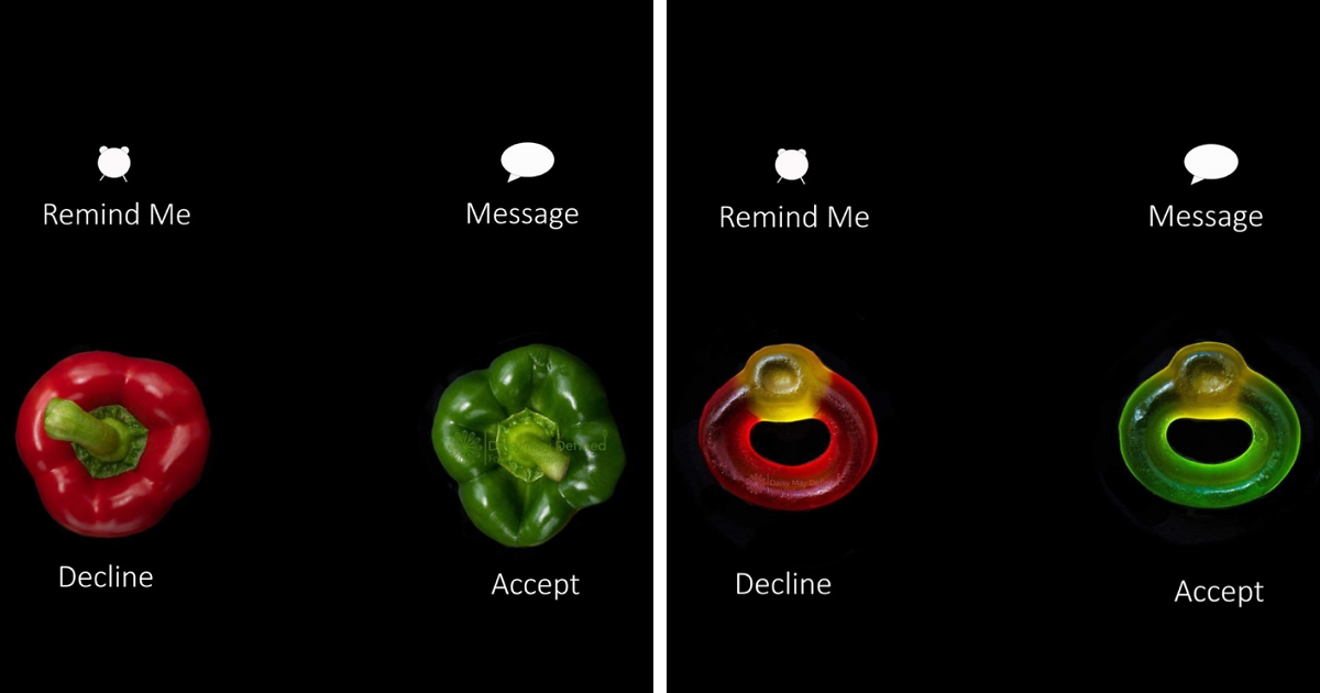
The next screen turns the sound of a telephone into something edible. “Ring Ring” appears as the caller, while ring-shaped gummy candies replace the conventional decline and accept controls.
The red gummy ring handles rejection. The green one accepts the call. The shapes are so naturally suited to the interface that the concept feels almost suspiciously obvious after someone else has thought of it.
That is often the secret behind effective visual humor. A good idea can make viewers say, “Of course!” immediately after spending their entire lives not thinking of it themselves.
3. Granny Smith
“Granny Smith” appears on the incoming-call screen, with a red apple offered as the decline choice and a green Granny Smith apple representing accept.
The color logic is beautifully clean, while the caller name turns an apple variety into a believable contact. Is Granny calling? Is the fruit calling? Is Granny actually a fruit? The picture wisely refuses to answer these important questions.
What makes the image especially effective is its economy. Two apples, one name, one recognizable phone layoutthat is all the joke needs.
4. Papa John
Few calls are more emotionally complicated than one involving pizza. In this screen, “Papa John” is calling, and two pizzas occupy the decline and accept positions.
Suddenly, answering the phone feels less like a communication decision and more like ordering dinner. One pizza becomes “no,” another becomes “yes,” and the ordinary interface turns into a miniature menu.
The photograph also demonstrates how strongly context shapes meaning. A pizza sitting on a plate is lunch. A pizza positioned beneath the word “Accept” becomes a button, a decision, and possibly a commitment to eating far more cheese than originally planned.
5. The Ex
Then the collection becomes dangerous.
“The Ex” appears on an active-call screen, accompanied by a devil-like figure cleverly assembled from pepperoni. Even the interface language gets a mischievous adjustment: one control reads “Don’t Call,” while the FaceTime option has effectively become a firm “No.”
The humor here is more narrative than the earlier color-based jokes. The picture does not merely replace a button with food. It creates a tiny relationship story. We do not know what happened between the caller and recipient, but the pepperoni devil strongly suggests nobody should be sending a “hey stranger” text at 11:47 p.m.
6. Mother-in-Law
The “Mother-in-Law” screen uses two expressive cookies as call choices. One wears a knowing wink; the other offers a bright smile. Even the reminder option becomes “Don’t Remind Me,” adding another little joke to the interface.
The cleverness lies in ambiguity. The picture playfully borrows a familiar mother-in-law comedy trope without forcing a single interpretation. Some viewers may choose the happy cookie immediately. Others may stare at the screen until the call goes to voicemail. Family dynamics are wonderfully diverse.
The cookies also show why food works so well in this series. A tiny change in icing can give an inanimate snack a personality. Add eyes and a smile, and suddenly a biscuit seems emotionally invested in whether you answer your phone.
7. Doctor
The “Doctor” call presents a red bell pepper for decline and a green bell pepper for accept.
The color code is instantly understandable, but the choice of vegetables adds another layer. Healthy food has long been associated with general wellness, so placing fresh produce on a doctor’s incoming-call screen feels oddly appropriateeven though a pepper is not, technically speaking, qualified to provide medical advice.
The visual simplicity makes the joke easy to scan on a small screen, which is important. Mobile interfaces depend on clear hierarchy, contrast, and quickly recognizable controls because users interact within limited space. That same principle helps the photograph communicate its joke almost immediately.
8. Baby Belle
“Baby Belle” arrives through a WhatsApp-style call screen featuring a round Babybel cheese as the central image. The name becomes a phonetic joke, while the bright red food packaging naturally belongs in the visual world of bold mobile-interface graphics.
This picture is especially satisfying because it combines branding, shape, language, and smartphone culture in one composition. The round cheese looks almost like an oversized contact avatar. Once placed inside the screen design, an everyday grocery item suddenly appears to have its own account, social life, and urgent reason for calling at 4:30.
Honestly, answering a video call from cheese may still be preferable to another meeting that could have been an email.
9. Sparkling Wino
“Sparkling Wino” appears as a video caller, while colorful bottle caps stand in for the decline and accept choices.
The composition uses objects that already have the circular geometry of digital buttons. Their colors and decorative details make them visually convincing inside the fake interface, while the caller name provides the verbal punch line.
This image also captures one of the project’s strongest recurring techniques: finding real-world objects that resemble digital controls. The food and drink items are not merely photographed and pasted onto a random background. Their shapes are chosen because they can participate in the visual logic of the phone screen.
10. Cherry
The final image may deliver the collection’s most delightfully ridiculous payoff. The caller is “Cherry.” The large food image, however, is unmistakably a tomato.
That mismatch is the joke.
After nine pictures that train us to expect clever correspondence between names and foods, the last screen gives us the wrong answer with complete confidence. It is the visual equivalent of introducing your golden retriever as “Mr. Hamster” and refusing to elaborate.
The tomato also resembles a round contact image or call graphic perfectly, making the mistake look strangely official. The screen says Cherry. The screen must know what it is doing. Who are we to question technology?
More Than Food Puns: A Portrait of Smartphone Culture
The collection is funny because smartphone interfaces have become a shared visual language. We know what an incoming call looks like. We understand the emotional difference between an accept button and a decline button. We recognize a contact name, a message icon, a speaker symbol, a keypad, and a reminder control with almost no conscious effort.
Modern phones even track our relationship with the screen itself. Apple’s Screen Time can summarize app use, device pickups, and notifications, while Google’s Digital Wellbeing offers information about screen time, phone openings, and notification activity. Those tools are practical, but they also reveal something culturally significant: the screen has become important enough that the screen now measures how much time we spend looking at the screen. Technology has achieved self-awareness, or at least a very enthusiastic spreadsheet.
The screen is also increasingly adaptable to different users. Apple and Samsung provide built-in accessibility features involving screen readers, magnification, contrast, larger text, and other display adjustments. A phone interface is therefore not one fixed experience; it can be customized to help people perceive and navigate information in different ways.
That makes a playful art project about phone screens more interesting than it might first appear. The photographs take a functional environment designed for rapid decisions and turn it into a space for visual comedy. Instead of asking, “Who is calling?” they ask, “What happens when the familiar digital world is rebuilt from groceries?”
Why Food Photography Is Perfect for This Idea
Food is unusually good at impersonating interface elements. Doughnuts, cookies, pizzas, apples, bottle caps, candies, and tomatoes all offer simple shapes that remain recognizable even when isolated against a dark background.
Color is equally important. Red and green already carry powerful cultural associations with stopping and going, rejecting and accepting, danger and permission. A photographer can therefore communicate an interface decision without adding another paragraph of instructions.
Texture provides the bonus. Digital buttons are usually smooth abstractions. Food is gloriously physical. Frosting has ridges. Apples have speckles. Pizza has bubbling cheese. Gummy candy catches light. The photographs create a small visual collision between the perfectly controlled world of user-interface design and the imperfect, tactile world of things we can actually eat.
The result is both familiar and strangethe sweet spot for memorable visual humor.
What These 10 Pictures Teach About Creative Ideas
One lesson from A Collection Of Phone Screens (10 Pics) is that creativity does not always require inventing an entirely new universe. Sometimes the strongest idea begins with something so ordinary that people have stopped noticing it.
A call screen is boringuntil doughnuts become buttons.
A cookie is ordinaryuntil it has to decide whether to answer your mother-in-law.
A tomato is familiaruntil a phone insists that its name is Cherry.
The creative leap is the connection between two existing visual languages: food photography and mobile interface design. Once those worlds meet, the series can generate joke after joke while keeping a consistent identity.
This is also why the collection feels cohesive rather than random. Every image follows a recognizable system. The artist changes the caller, food, wording, and punch line, but preserves enough of the screen structure for viewers to understand the rules. Consistency creates anticipation, and anticipation makes the final deviations funnier.
Experiences Inspired by “A Collection Of Phone Screens (10 Pics)”
The Strange Moment You Start Seeing Buttons Everywhere
Spend enough time looking at this collection and a funny thing happens: ordinary objects begin auditioning for jobs in a smartphone interface.
You walk through a grocery store and notice that limes and tomatoes are suspiciously perfect accept-and-decline buttons. Two macarons on a plate suddenly look like a choice between “Remind Me Later” and “I Have Made a Terrible Decision.” A stack of onion rings begins demanding to know why it was not cast in the “Ring Ring” photograph.
That change in perception is one of the most enjoyable experiences connected with playful visual art. The work does not stop when you finish looking at the pictures. It alters, however briefly, the way you look at everyday objects.
I found the strongest idea in the collection to be its refusal to overcomplicate the joke. It would have been easy to fill every screen with dozens of foods, elaborate backgrounds, and layers of visual references. Instead, the compositions remain controlled. The black background creates the recognizable atmosphere of a phone display, while the food provides the surprise.
The experience also makes you appreciate how much interface design you have memorized without trying. Most people do not wake up in the morning and study the visual architecture of an incoming-call screen. Yet show them two circular choices beneath a caller’s name and they instantly understand what is happening. We carry a mental library of buttons, icons, alerts, menus, and notification patterns everywhere we go.
That realization can be slightly unsettling. A familiar notification sound can make a hand reach toward a pocket before the conscious mind has decided to move. A screen lighting up on a table can steal attention from a conversation. Apple and Android now include tools intended to help people observe or limit aspects of their device use, while broader reporting on digital habits has suggested practical strategies such as reducing unnecessary notifications, using focus tools, or making distracting screens less visually tempting.
But this photo series offers a gentler response to our screen-saturated lives: laugh at the interface.
Turn the call button into a doughnut. Let a gummy candy answer the phone. Make pizza handle your communications. Give a tomato a completely incorrect contact name.
There is something refreshing about taking an object associated with urgency and making it absurd. Phones regularly tell us that something requires attention right now. A message arrived. An app updated. Someone called. A calendar event begins in ten minutes. The battery is low. Your storage is full. Your screen-time report would like to have a deeply uncomfortable conversation.
In these pictures, however, the screen asks nothing serious from us. The choice between accept and decline is made of frosting, fruit, candy, or cheese. The familiar interface becomes a playground.
Another enjoyable aspect is imagining additional entries. “Spam Likely” could feature an actual slice of canned meat. “Missed Call” might show a doughnut with one bite missing. “Emergency Contact” could be a cup of coffee photographed at 6:00 a.m. “Unknown Caller” might simply display a mystery leftover found at the back of the refrigerator, where even science has stopped asking questions.
That is perhaps the best experience a creative series can produce: it makes the audience want to continue the idea in their own heads.
After viewing all 10 phone screen pictures, the lasting impression is not merely that the images are funny. It is that creativity often begins with attention. Look closely at the objects you use every day. Notice their shapes, conventions, colors, and habits. Then ask the deeply serious artistic question: could this button be replaced by a doughnut?
Conclusion
A Collection Of Phone Screens (10 Pics) succeeds because it combines three things nearly everyone understands: food, phones, and the occasional desperate desire not to answer a call. By borrowing the familiar structure of mobile interfaces and rebuilding it with photographed foods and visual puns, the series turns an everyday screen into a compact comedy stage.
The best pictures are immediately readable but still contain a second joke waiting to be discovered. Doughnuts become call buttons. Gummy rings literally “ring.” Apples answer Granny Smith. Pizza receives a call from Papa John. The Ex becomes a pepperoni devil. A tomato boldly identifies as Cherry.
In a world where smartphone screens usually compete for attention, these screens do something pleasantly different: they invite us to pause, notice the design we normally ignore, and laugh at how easily a piece of food can impersonate technology.
Note: The pictures discussed in this article are creative food-photography compositions inspired by familiar mobile call-screen conventions. They are artistic visual jokes rather than literal examples of current operating-system interfaces.