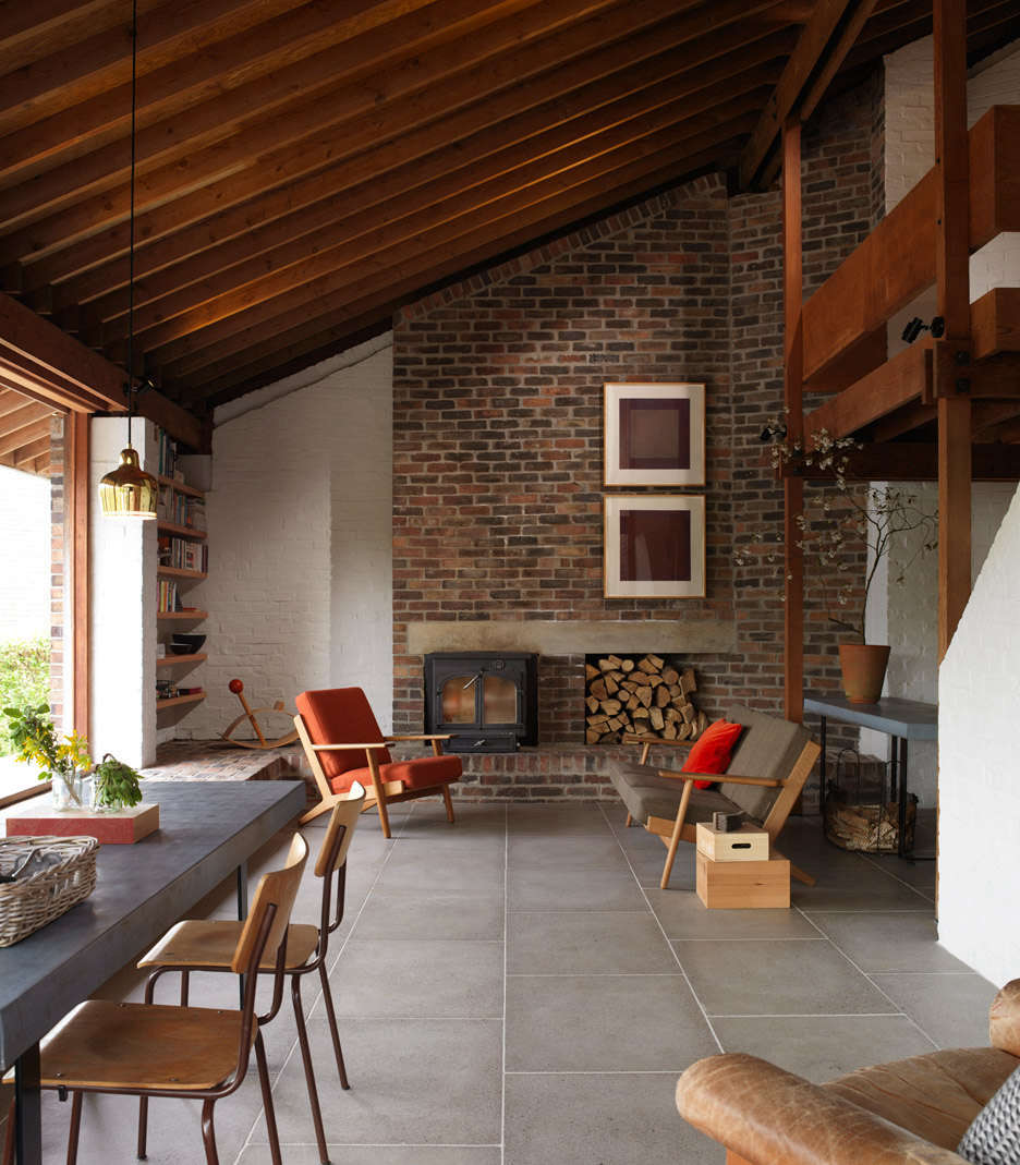

Some houses announce themselves with gates, columns, and enough landscaping drama to make a peacock feel underdressed. Antsy Plum takes the opposite approach. Tucked into a steep, wooded hillside in rural Wiltshire, England, this compact 1960s Modernist house nearly disappears into its surroundings. Its roof follows the slope, its materials speak plainly, and its rooms direct attention toward the valley rather than toward themselves.
Officially known as Ansty Plum, the house was conceived in the early 1960s and completed in 1964 for engineer Roger Rigby, a former partner at Ove Arup. Young architect David Levitt designed the main residence, while Peter and Alison Smithson later contributed a separate studio and landscape interventions. Decades of alterations, weather exposure, and deferred maintenance eventually left the property uncomfortable and partly derelict.
Then architect Sandra Coppin and her husband discovered it in 2009. What followed was not a glossy makeover designed to chase trends. Coppin Dockray’s restoration was closer to architectural detective work: remove distracting additions, repair what had failed, reuse what remained useful, and improve energy performance without scrubbing away the building’s character. The result is a persuasive lesson in how to revive a midcentury hillside house without turning it into a showroom wearing vintage sunglasses.
A Small House With an Impressive Architectural Family Tree
Antsy Plum is modest in area, measuring only a little over 1,000 square feet, but its architectural pedigree is unusually rich. David Levitt designed the original house for Roger Rigby during a period when British architects and engineers were testing new ideas about structure, materials, efficiency, and domestic life.
The project benefited from the collaborative culture surrounding Arup Associates. Engineers Peter Rice, Max Fordham, and Ron Marsh were connected with the property at different stages, helping blur the conventional boundaries between architecture, engineering, and building services. Instead of hiding structure beneath decorative layers, the house lets visitors understand how it stands up, how it is heated, and how its materials fit together.
David Levitt’s Economy of Means
Levitt’s design was shaped by economy rather than excess. Dimensions were coordinated around standard bricks and uncut sheets of Douglas fir plywood, reducing waste while giving the interior a clear visual rhythm. The staircase is narrow because it needs to be no wider. The structure is exposed because covering it would add cost without adding meaning. Every component appears to have been asked a stern question: “Are you necessary?” Those unable to answer were apparently not invited.
This restraint gives the house its lasting appeal. Antsy Plum does not depend on expensive stone slabs, oversized rooms, or decorative gestures. Its beauty emerges from proportion, construction, light, and the relationship between interior and landscape.
The Smithsons’ Hillside Studio
As the original owners needed more storage and workspace, architects Peter and Alison Smithson became involved. They designed a separate studio and garage, followed later by a concrete path that combined steps with a wheelbarrow ramp up the steep site.
The studio had a more fortress-like personality than the main house. Set into the slope and constructed from a limited palette of stone, concrete, zinc, and timber, it felt like a small retreat hidden in the garden. Unfortunately, limited insulation, failing waterproofing, and structural movement eventually made it damp and difficult to use.
Architecture That Follows the Hillside
The defining feature of Antsy Plum is its mono-pitched roof. Rather than sitting horizontally against the land, the roof descends at roughly the same angle as the hillside. The building appears to lean with the terrain instead of resisting it.
This gesture was influenced by sloping roofs observed in Provençal villages, where water traditionally moves from one roof to the next down a hillside. At Antsy Plum, the form serves both practical and visual purposes. It creates a dramatic interior section, reduces the apparent bulk of the house, and connects the building with the topography.
A long brick retaining wall and continuous timber roof plane extend the eye beyond the glazing. Inside and outside seem to share the same architectural lines. Although the floor plan is compact, views across the valley make the rooms feel connected to a much larger territory.
The lower portion of the house contains communal areas for cooking, dining, and relaxing. Sleeping spaces occupy the upper level, including a loft above the kitchen. This arrangement makes intelligent use of the sloping section while preserving an open social core below.
Restoration by Subtraction
When Sandra Coppin and her family acquired Antsy Plum, it was not ready for cozy weekends and heroic quantities of tea. The house had inadequate insulation, outdated services, vulnerable openings, and alterations that weakened the clarity of Levitt’s original design. The studio was in worse condition, suffering from water penetration, decay, and structural failure.
Coppin Dockray approached the renovation as an exercise in subtraction. Later partitions and awkward additions were removed where they interfered with the original spatial logic. The goal was not to freeze the house in 1964 but to uncover its essential design and help it function in the present.
Making a Seasonal Retreat Livable Year-Round
The most important improvements are also among the least visually obvious. New insulation, upgraded windows, modern plumbing, central heating, and underfloor heating transformed the building from a chilly seasonal retreat into a comfortable year-round family home.
The original ground floor was lifted so insulation and heating could be installed below it. Concrete paving slabs were then laid and ground to expose their aggregate, producing a durable surface compatible with the house’s utilitarian character. Cork tiles were used upstairs, where their warmth, acoustic softness, sustainability, and midcentury appearance made them an appropriate choice.
These interventions reportedly cut annual energy use or associated carbon emissions by approximately 80 percent. That figure is especially impressive because the architects did not achieve it by wrapping the house in a visually unrelated new shell. Performance improved while the building continued to look unmistakably like itself.
Rescuing the Derelict Studio
The studio required deeper intervention. Its failed roof was replaced with an insulated zinc roof, drainage was rebuilt, and the structure was underpinned and waterproofed. Insulation was added to the walls, roof, and floor, then concealed behind precisely detailed Douglas fir linings.
A small extension created a shower room embedded in the hillside. Its glazed wall faces a dense bank of native ferns, making the bathing space feel less like a conventional bathroom and more like a secret clearing. Exterior lighting illuminates the vegetation after dark, sending green light back into the room without filling the ceiling with attention-seeking fixtures.
The addition is contemporary, but it respects the studio’s compact, bunker-like identity. It does not imitate the Smithsons’ work literally. Instead, it extends the original vocabulary of stone, concrete, timber, zinc, and close contact with the ground.
Material Honesty Without Architectural Theater
Antsy Plum belongs to a Modernist tradition in which materials are valued for what they are rather than for what they pretend to be. Brick looks like brick. Douglas fir remains visibly timber. Steel supports are not dressed up as classical columns. Concrete is allowed to be concrete without receiving a motivational speech from a decorative plasterer.
The restoration preserved this material directness. Exposed Douglas fir framing continues to organize the interior. A bespoke stainless steel kitchen counter, part of the original design, remains a focal point. Supported by a substantial steel section, the counter reflects the original client’s enthusiasm for cooking and demonstrates how one carefully designed element can give a small kitchen unusual authority.
New cabinetry and shelving are restrained, allowing the architecture to remain legible. Rather than filling every wall with built-ins, the rooms retain visual breathing space. Furniture includes enduring midcentury pieces, such as Hans Wegner seating and Alvar Aalto stools, but the interior never feels like a design museum where sitting down might trigger an alarm.
Reuse as a Design Method
One of the most compelling aspects of the Antsy Plum renovation is its treatment of existing materials. The architects tried to keep usable components on site rather than automatically sending them to a landfill. This was not merely an environmental gesture; it actively shaped the finished design.
Zinc panels removed from the studio roof were folded over inexpensive door blanks to create tables. The available amount of zinc determined how many tables could be made, turning material scarcity into a practical design brief. Old floor bricks found new life in the landscape, while soil excavated during construction helped settle the renovated structures back into the hillside.
The project also accepted that some surviving elements were simply “good enough.” That phrase may sound unambitious in a culture addicted to perfect reveal photographs, but it represents a disciplined form of sustainability. Replacing a functional component solely because it is not pristine consumes materials, energy, labor, and money. Antsy Plum demonstrates that patina and imperfection can carry history rather than signal failure.
A Sustainable Midcentury Renovation Without Greenwashing
Sustainable renovation is often marketed through visible products: solar panels, smart thermostats, high-tech heat pumps, and appliances capable of sending emotional-support notifications. Antsy Plum offers a quieter model.
Its environmental strategy began with retention. Keeping the main structure preserved the energy and carbon already invested in its bricks, concrete, steel, and timber. Repairing instead of demolishing avoided substantial new construction. Reusing zinc, bricks, and soil reduced waste. Improving insulation and eliminating drafts lowered the energy needed for heating.
The project also remained compact. A small, well-planned house generally requires fewer materials to renovate and less energy to operate than a sprawling residence. The existing volume was reorganized carefully rather than enlarged beyond recognition.
This combination of conservation and performance is particularly relevant for aging midcentury houses. Many were designed with generous glazing, thin walls, limited insulation, and heating systems that no longer meet modern expectations. Sensitive retrofits must therefore balance comfort, moisture management, ventilation, energy efficiency, and architectural significance. Antsy Plum proves that these goals do not have to behave like relatives arguing over the last chair at Thanksgiving.
Why Antsy Plum Still Feels Contemporary
The house feels current not because it predicts every modern trend but because it avoids depending on trends in the first place. Its defining principles remain useful: build only what is needed, respond to the site, expose genuine materials, plan around daily life, and make limited space feel expansive through views and proportion.
Its interior also resists the pressure to become one giant undifferentiated room. The kitchen, dining area, living space, loft, and bedroom remain connected but distinct. Changes in height, enclosure, and outlook create variety without requiring excessive floor area.
Most importantly, the architecture acts as a background for ordinary activities. Cooking, reading, working, gardening, and gathering with friends take precedence over architectural spectacle. The house is memorable, but it does not constantly demand applause.
Renovation Lessons Homeowners Can Borrow
Understand the Original Design Before Changing It
Old drawings, photographs, structural clues, and surviving materials can reveal why a house was organized in a particular way. Removing a wall or replacing a window without understanding that logic may erase the feature that made the property special.
Spend First on the Building Envelope
Insulation, drainage, waterproofing, windows, and heating rarely dominate social media, but they determine whether a renovated home is comfortable and durable. Antsy Plum’s restoration budget prioritized weather protection and thermal performance before decorative upgrades.
Use a Limited Material Palette
Repeating a few compatible materials can make a compact interior feel calm and coherent. Douglas fir, brick, cork, concrete, zinc, steel, and glass provide enough variation at Antsy Plum without turning every surface into a separate personality.
Let Reclaimed Materials Influence the Design
Rather than forcing salvaged materials into a predetermined plan, examine their dimensions, condition, and quantity. A limited supply can inspire furniture, shelving, landscape walls, or small architectural details that feel specific to the property.
Avoid Making Every Old Surface Look New
Successful restoration does not require sanding away every mark of age. Gentle repair can preserve texture, evidence of use, and the visual depth that new materials need decades to acquire.
The Experience of Antsy Plum: Arrival, Daily Life, and Changing Seasons
The most revealing way to understand Antsy Plum is not through a list of materials or energy statistics. It is to consider the sequence of experiences created by its site and section.
Arriving From Below
Approaching a house on a steep slope changes the emotional rhythm of arrival. Instead of stepping directly from a driveway into a front hall, visitors climb through the landscape. The path slows movement and creates anticipation. Trees, retaining walls, and fragments of roof appear before the complete house becomes legible.
That gradual reveal makes Antsy Plum feel discovered rather than displayed. The building does not dominate the valley from a flattened platform. It stays attached to the land, and the effort of reaching it encourages visitors to notice the incline, vegetation, weather, and view.
Living in a Small but Expansive Interior
Once inside, the compact floor area is counterbalanced by long sightlines. The retaining wall, roof structure, and floor surfaces guide the eye toward the glazing and into the landscape. A person may be sitting in a modest living room, yet visually occupying the valley beyond it.
The open communal level also concentrates family life. Cooking is not isolated in a service room. The stainless steel counter participates in conversation, while dining and sitting areas remain close enough to share heat, light, and activity. In a larger house, family members can vanish into separate wings like minor characters leaving a television series. At Antsy Plum, the plan encourages informal contact.
Experiencing the House Through the Seasons
A building with extensive glazing and close contact with woodland changes continuously. Winter exposes branches and distant views. Spring pushes new green growth toward the windows. Summer foliage increases privacy and filters sunlight. Autumn introduces warmer colors that echo the timber interior.
The sloping roof and changing daylight also alter the atmosphere from hour to hour. Low light can emphasize the texture of brick and Douglas fir, while brighter conditions dissolve the glazing and make interior surfaces feel connected to the terrace. Architecture remains constant, but the experience does not.
Working in the Garden Studio
The separate studio provides another kind of experience: withdrawal without complete isolation. Reaching it requires a short journey through the garden, creating a psychological boundary between domestic life and focused work.
Inside, warm timber linings contrast with the studio’s heavy external form. The shower room intensifies that relationship with nature. Looking directly onto a fern-covered bank turns an ordinary routine into a moment shaped by moisture, filtered light, stone, glass, and vegetation.
What Renovating a House Like This Demands
For an owner, restoring a vulnerable Modernist house requires patience and restraint. The most rewarding decision may be keeping a weathered component rather than buying a flawless replacement. The most expensive work may disappear beneath a floor or behind timber lining. Progress can look suspiciously unimpressive until the first cold, wet winter proves that the building is finally warm and dry.
Such a project also asks the owner to collaborate with the original architect across time. New needs must be accommodated, but not every contemporary preference deserves to overpower the existing design. The challenge is to distinguish between necessary evolution and casual alteration.
Antsy Plum succeeds because its restoration treats inhabitation as an ongoing conversation. The house was not returned to a fictional perfect moment in the 1960s. It was repaired so another family could cook, work, sleep, garden, entertain, and watch the seasons change there. That continuing usefulness is the most meaningful form of preservation.
Conclusion: A Quiet Model for Modernist Preservation
Antsy Plum shows that architectural revival does not require dramatic reinvention. Sandra Coppin and Coppin Dockray preserved David Levitt’s compact hillside house by understanding its original logic, removing distracting changes, repairing structural weaknesses, and improving comfort with carefully concealed upgrades.
The project’s value lies in its balance. It honors an important piece of British Modernism without treating the building as untouchable. It reduces energy demand without disguising the original architecture. It introduces new spaces without overwhelming the hillside. It celebrates recognizable design classics while remaining relaxed enough for muddy shoes, family meals, and garden tools.
In an era when renovation often means demolition followed by an enormous replacement, Antsy Plum offers a smarter alternative: keep what works, repair what matters, reuse what you can, and let the landscape have the final word.