
A colorful kitchen or bathroom should feel joyful, intentional, and personalnot like three paint stores collided during rush hour. The secret is not simply choosing beautiful colors. It is choosing colors that behave well together across walls, cabinets, tile, countertops, floors, lighting, and hardware.
Paint is flexible, cabinets provide visual weight, and tile introduces texture, pattern, and shine. When these three elements are coordinated thoughtfully, even bold colors can feel comfortable and timeless. When they are selected independently, the room may look busy despite every individual sample appearing perfectly innocent at the store.
This guide explains how to create colorful paint, cabinet, and tile combinations that remain balanced, practical, and easy to live with. It also includes specific palette ideas, common mistakes, budget-friendly strategies, and real-world lessons gathered from colorful renovation projects.
Research synthesis:
Why Paint, Cabinets, and Tile Must Be Chosen Together
Cabinetry usually occupies more visual space than homeowners expect. Even when the wall color covers more square footage, rows of cabinet doors sit directly at eye level and create a strong block of color. Tile may cover a smaller area, but its grout lines, reflective finish, pattern, and texture attract attention.
Paint acts as the connecting background. It can soften a bold cabinet color, repeat a subtle tone from patterned tile, or provide contrast that prevents the room from becoming visually flat.
A successful palette normally gives each material a specific job:
- The cabinets establish the room’s personality.
- The tile adds movement, texture, or contrast.
- The wall paint creates breathing room and continuity.
Not every surface needs to perform a dramatic solo. A kitchen containing emerald cabinets, multicolored patterned tile, bright orange walls, heavily veined counters, and gold hardware may have plenty of personality, but it also has the visual volume of a marching band warming up in a pantry.
Begin With the Least Flexible Surface
Start with the material that is hardest or most expensive to replace. In an existing room, this is usually the countertop, flooring, or backsplash tile. During a full renovation, it may be a stone slab with distinctive veining or a handmade tile that has limited color options.
Paint can be mixed in thousands of colors. Tile collections and cabinet finishes offer far fewer choices. Therefore, selecting paint first and expecting every permanent material to cooperate later is a little like buying shoes before deciding which size you wear.
Identify the Dominant Undertones
Undertones determine whether colors look harmonious or strangely disconnected. A white tile may lean creamy, gray, blue, pink, or green. Wood cabinets may contain honey, orange, red, gray, or chocolate tones. Even black can appear warm, cool, brownish, or blue-based.
Place samples together and ask several practical questions:
- Does the tile look warmer or cooler than the cabinet finish?
- Does the wall color repeat a tone already present in the tile?
- Does the countertop introduce a fourth color that competes with everything else?
- Do all the whites belong to the same family?
Colors do not need to match exactly. They do, however, need a believable relationship. A creamy backsplash can work beautifully with navy cabinets because the warm and cool contrast feels intentional. The same backsplash may look yellowed next to an icy blue-white wall.
Materials and selection guidance:
Colorful Paint, Cabinet, and Tile Combinations That Work
1. Sage Green Cabinets, Cream Walls, and Handmade White Tile
Sage green is one of the easiest colorful cabinet finishes to live with because it behaves almost like a neutral. Pair it with warm cream walls and slightly irregular white or ivory tile. The tonal variation of handmade-look tile keeps the backsplash from feeling sterile.
Choose unlacquered brass, aged bronze, or matte black hardware. Light oak floors and butcher-block accents strengthen the natural character of the palette. Avoid pairing a yellow-based sage with sharp blue-white paint, which can make the cabinets look muddy.
2. Navy Cabinets, Warm White Paint, and Terracotta Tile
Navy and terracotta create a sophisticated warm-versus-cool contrast. Navy provides depth, while clay-colored tile prevents the room from feeling too formal. Warm white walls keep the combination bright and allow both colors to remain distinct.
This palette works especially well in traditional, Spanish-inspired, Mediterranean, and transitional interiors. Use terracotta on the floor for an earthy foundation or as a backsplash for a stronger focal point. Natural wood stools and woven lighting make the combination feel relaxed rather than nautical.
3. Dusty Blue Cabinets, Soft Ivory Walls, and Blush Tile
Dusty blue and muted blush create a colorful kitchen without relying on high saturation. The blue provides freshness, while pink or salmon-colored tile introduces warmth. Soft ivory walls connect the two.
For a refined result, choose tile with natural variation instead of a perfectly uniform bubble-gum pink. Brushed nickel keeps the palette cool and contemporary, while antique brass produces a warmer vintage effect.
4. Forest Green Cabinets, Mushroom Paint, and Cream Zellige Tile
Deep green cabinets can feel dramatic, but mushroom-colored walls make them more approachable than stark white would. A glossy cream backsplash reflects light and provides textural contrast against satin or matte cabinetry.
This combination is particularly effective in rooms with moderate or generous natural light. In darker kitchens, use forest green primarily on lower cabinets or the island while keeping upper cabinets lighter.
5. Terracotta Cabinets, Pale Pink Walls, and Ivory Tile
Terracotta cabinetry brings warmth, personality, and a slightly retro quality. Pale pink walls may sound daring, but a dusty plaster-like pink behaves as a warm neutral. Ivory square tile or vertical stacked tile keeps the surfaces calm.
Repeat the cabinet color in small accessories or tile details rather than introducing another large, saturated shade. Walnut accents, aged brass, and creamy quartz counters complete the grounded palette.
6. Butter Yellow Cabinets, White Walls, and Cobalt Accents
Yellow cabinetry can make a kitchen feel sunny even when the window faces a less-than-sunny brick wall. Select a softened butter or ocher yellow rather than a fluorescent lemon. White walls provide clarity, while small cobalt tile accents create lively contrast.
Cobalt can appear in a narrow border, patterned backsplash, range niche, or decorative tile panel. Keeping the blue application controlled allows the yellow cabinets to remain the main attraction.
7. Teal Lower Cabinets, White Upper Cabinets, and Seafoam Tile
Two-tone cabinets are useful when you want color without visually shrinking the room. Teal base cabinets anchor the space, while white upper cabinets reduce the weight above the countertop. A seafoam, pale aqua, or softly variegated blue-green backsplash creates a layered monochromatic effect.
Choose a wall white that relates to the upper cabinets but is not necessarily identical. A subtle difference can add depth, although mismatched undertones should be avoided.
8. Burgundy Island, Mushroom Cabinets, and Warm Gray Tile
A colorful island offers an excellent compromise for homeowners who admire dramatic kitchens but do not want every cabinet painted a strong shade. Burgundy, oxblood, or muted merlot adds richness when surrounded by mushroom or beige cabinetry.
Use warm gray tile with brown or taupe undertones. Cool silver-gray tile can fight with burgundy and make the surrounding neutrals appear dull. Bronze hardware and warm white lighting emphasize the luxurious character of the palette.
9. Natural Wood Cabinets, Blue-Green Tile, and Warm White Paint
Colorful combinations do not require painted cabinets. Walnut, white oak, and medium-toned wood cabinetry pair beautifully with blue-green backsplashes. The tile supplies color while the grain supplies pattern and movement.
For orange-toned wood, consider muted teal or deep green tile. Pale oak works well with dusty blue, aqua, and celadon. Warm white walls prevent the room from becoming overly cool.
10. Charcoal Cabinets, Pale Mint Walls, and Glossy White Tile
Charcoal cabinets offer nearly as much drama as black but are usually more forgiving. Pale mint walls add a surprising hint of color without competing with the cabinetry. Glossy white tile reflects light and keeps the combination crisp.
Add light wood flooring and simple hardware to prevent the room from feeling severe. This palette suits compact kitchens because the reflective backsplash and gentle wall color balance the visual weight of the dark cabinets.
11. Tone-on-Tone Blue Cabinets, Walls, and Tile
A monochromatic room can be just as colorful as a high-contrast one. Try deep blue lower cabinets, medium blue walls, and glossy blue tile in a slightly lighter shade. Variation in sheen and texture keeps the colors from blending into one featureless block.
The safest approach is to keep all three blues within a similar undertone family. Add white counters, warm wood, or metal fixtures to provide visual punctuation. Otherwise, the room may begin to resemble the inside of a very stylish aquarium.
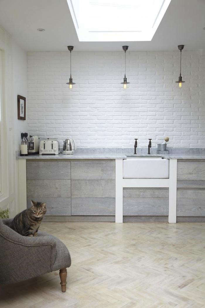
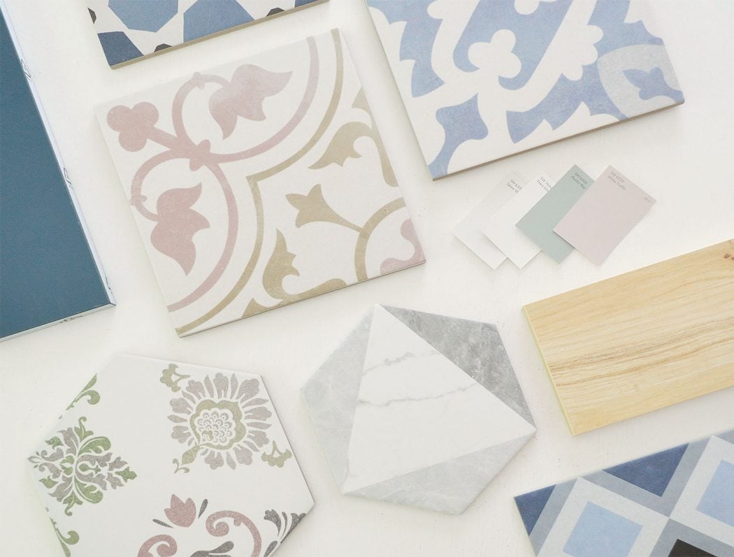
Palette inspiration and colorful project examples:
How to Balance Bold Tile and Colorful Cabinets
Let One Element Lead
Decide whether the cabinets or tile will be the main statement. Bold cabinets generally look best with quieter tile. Highly patterned tile usually benefits from simpler cabinet doors and a restrained wall color.
There are successful rooms where both elements are bold, but they normally share colors. For example, a patterned tile containing teal, cream, and rust can coordinate with teal cabinets and cream walls because the palette repeats rather than multiplies.
Use Pattern Scale Strategically
Large patterns need enough uninterrupted surface to be appreciated. Small backsplashes divided by outlets, windows, and cabinetry may be better suited to compact mosaics, solid-color tile, or simple geometric layouts.
In a large kitchen, tiny multicolored mosaics can create visual static when installed across an entire wall. A larger checkerboard, wide stripe, oversized diamond, or color-blocked arrangement may look cleaner from a distance.
Do Not Forget the Grout
Grout can quietly support a palette or shout over it. Matching grout makes colorful tile appear smoother and more continuous. Contrasting grout emphasizes every tile shape and creates a busier, more graphic surface.
When the cabinets are already saturated, grout close to the tile color usually provides better balance. Dark contrasting grout can work with simple tile and restrained cabinetry, but it should be treated as an additional design color rather than an invisible construction detail.
How Lighting Changes Color Combinations
Never approve paint, cabinet, or tile colors from a phone screen alone. Screens are bright, backlit, and far more cooperative than actual kitchens.
North-facing rooms often produce cooler, subdued light. Warm whites, creamy tiles, muted greens, and earthy colors can prevent these spaces from feeling cold. South-facing rooms typically receive stronger warm light, allowing many cool blues and greens to appear more balanced.
Artificial lighting matters just as much. Warm bulbs can make cream, terracotta, yellow, and warm wood glow, but they may cause blue-based whites to look dingy. Cooler lighting can sharpen blues and grays while draining warmth from beige or clay colors.
Move samples around the room and review them in morning light, afternoon light, and evening light. Paint large sample boards rather than covering the wall with a collection of tiny squares that eventually resembles a confused patchwork quilt.
Choosing the Right Paint and Tile Finishes
Finish affects both color and maintenance. Matte surfaces absorb light and generally make saturated colors appear softer. Glossy tile reflects nearby colors and can appear lighter or brighter depending on the angle.
Cabinets require a durable, washable coating designed for trim, furniture, or cabinetry. Proper cleaning, sanding, priming, and curing are more important than rushing to finish before the weekend barbecue. Paint applied over grease or glossy surfaces without preparation may chip regardless of how lovely the color looks.
For walls, washable eggshell or satin finishes are common in active kitchens. Tile should be selected according to location. A decorative backsplash does not face the same wear, standing water, heat, or impact as a countertop or floor.
Painted tile can provide a budget-friendly visual update, but it is better suited to lower-impact areas. Frequently soaked surfaces, heavily used counters, and damaged tile generally need more durable solutions.
Application and durability guidance:
Common Color-Combination Mistakes
Choosing Several Unrelated Whites
A blue-white wall, creamy tile, yellow-white cabinet, and gray-white countertop can make each surface look accidentally discolored. Compare all white materials together before committing.
Matching Every Surface Exactly
Coordination does not require cloning. When the cabinets, walls, tile, counters, and accessories are nearly identical, the room can lose depth. Use differences in value, finish, or texture to keep a limited palette interesting.
Ignoring Existing Flooring
Floors form a large part of the visual environment, even when they are not featured on the inspiration board. Orange oak, cool gray tile, red brick, and beige stone each influence which cabinet and wall colors will work.
Using Too Many Focal Points
Colorful cabinets, dramatic tile, strong countertops, decorative lighting, and patterned floors can coexist, but they require repetition and restraint. Without a clear hierarchy, the eye does not know where to rest.
Skipping Full-Size Samples
A two-inch tile chip cannot demonstrate the rhythm of an entire backsplash. Order multiple pieces and arrange them with grout samples, cabinet doors, countertop material, and painted boards.
Budget-Friendly Ways to Experiment With Color
You do not need to renovate every permanent surface to create a colorful room. Paint only the island, base cabinets, pantry door, open shelves, or cabinet interiors. Introduce colorful tile behind the range while using affordable neutral tile elsewhere.
Peel-and-stick products can help renters or cautious homeowners test a palette before making a permanent decision. Painted backsplashes and stencil patterns may also provide temporary improvement when the existing surface is properly prepared and suitable for coating.
Hardware, bar stools, pendant lights, rugs, cookware, artwork, and window treatments can repeat colors from the cabinets or tile. These smaller additions help a bold feature look intentional without forcing every permanent material to carry color.
Real-World Experiences and Lessons From Colorful Projects
One of the clearest lessons from reviewing colorful kitchens and bathrooms is that the most successful combinations usually begin with a physical object rather than an abstract color idea. Homeowners often fall in love with a paint name online, but a tile sample, stone slab, vintage rug, or existing cabinet finish provides a much more useful starting point. Real materials contain variation and undertones that a digital swatch cannot communicate accurately.
Another repeated experience is that people are often more comfortable with strong color once it has been installed than they expected to be. During planning, a dark green or deep blue cabinet door can look enormous and intimidating when viewed alone. In the completed room, countertops, appliances, windows, hardware, and open spaces break up the color. The result is generally less overpowering than the isolated sample suggested.
The opposite can happen with patterned tile. A single tile may appear charming and subtle, while several hundred tiles create a much stronger pattern. Laying out at least one square yard of tileor creating a digital elevation based on the actual wall dimensionshelps reveal the final visual rhythm. This is particularly important with checkerboards, high-contrast grout, encaustic patterns, and mosaics.
Homeowner projects also demonstrate the value of living with samples for several days. Colors that look perfect at noon may become unexpectedly gray, yellow, or purple after sunset. Attaching cabinet and tile samples vertically is important because materials receive light differently on a wall than they do while lying flat on a table. A sample should visit every wall like a very quiet houseguest before receiving permanent approval.
Another practical lesson involves cleaning. Glossy dark tile can be gorgeous but may reveal water spots and fingerprints. Very light grout behind a stove may require more maintenance than expected. Deep cabinet colors can conceal minor marks but may show dust around detailed moldings. A beautiful palette should be evaluated with a sponge in mind, not only a camera.
Many successful renovations use color in stages. Homeowners may begin by painting an island, installing a small range backsplash, or introducing colorful stools. After becoming comfortable with the palette, they extend it to surrounding cabinetry or walls. This gradual method reduces risk and allows the room’s natural light and existing materials to guide later decisions.
It is also common for an initially complicated palette to improve after one element is removed. A homeowner may collect four favorite colors and assume all four must appear on permanent surfaces. In practice, using two as dominant colors, one as a supporting neutral, and the fourth in removable accessories creates a calmer room. Not every favorite color needs a mortgage-length commitment.
Finally, the most memorable colorful spaces rarely look as though they were copied directly from a trend report. They reflect the architecture of the home and the personality of the people using it. A 1920s bungalow may comfortably support mint cabinets and checkerboard tile. A modern loft may favor cobalt cabinetry and simple stacked tile. A cottage kitchen may welcome butter yellow, soft blue, and warm cream.
The practical goal is not to create the boldest room on the internet. It is to create a room that makes daily routines more enjoyable. When the palette relates to the home, responds to the light, and balances statement surfaces with quiet ones, colorful design can remain appealing long after the paint cans have been moved to the garage.
Conclusion
Colorful paint, cabinet, and tile combinations work best when they are planned as one connected palette. Begin with the least flexible material, study undertones in the actual room, and assign each surface a clear role. Let cabinets establish personality, allow tile to contribute texture or pattern, and use wall paint to connect the design.
Bold color does not automatically make a room chaotic. Sage and cream can feel peaceful, navy and terracotta can appear sophisticated, and yellow with cobalt can be energetic without becoming cartoonish. The difference lies in balance, repetition, lighting, finish, and restraint.
Choose combinations that suit the architecture of the home and the people who use the space. Trends can provide inspiration, but the best palette is the one that still makes you smile while unloading the dishwasher on an ordinary Tuesday.
Note: The article is original, publication-ready content synthesized from current U.S. design, paint, renovation, and tile guidance.