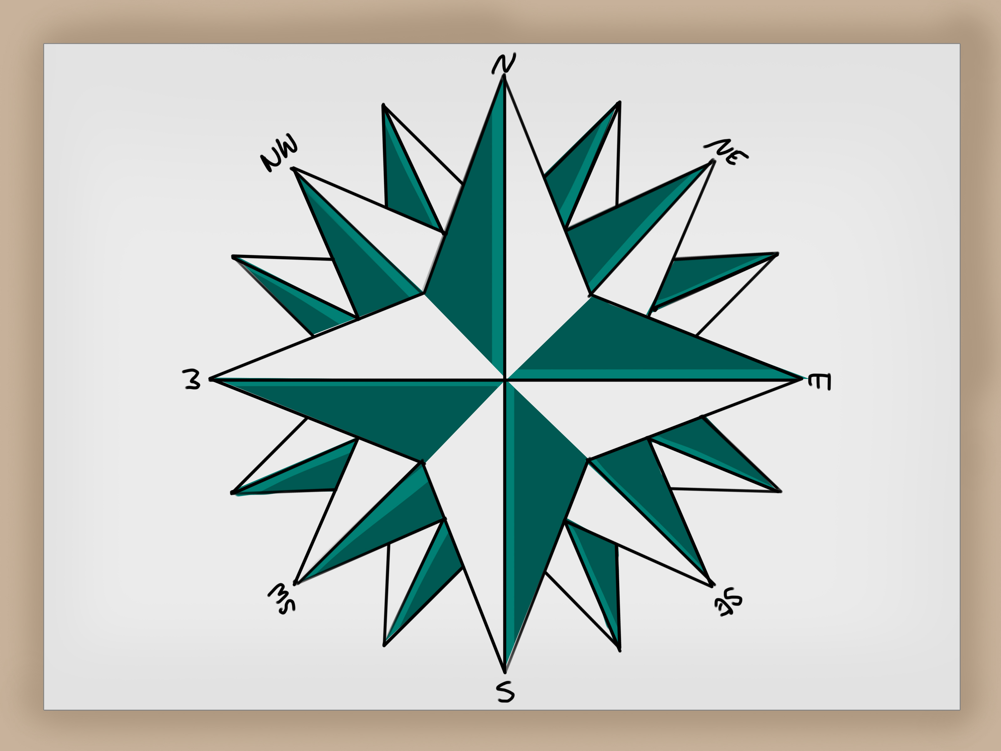

A compass rose may look like the fancy little star that lives in the corner of a pirate map, but it is far more useful than decorative map jewelry. For centuries, compass roses have helped readers understand direction, orientation, and movement. Today, they still appear on maps, nautical charts, classroom projects, travel illustrations, fantasy maps, tattoos, logos, and journal pages. In other words, this tiny star has range.
The good news? You do not need to be a professional cartographer, a sailor, or someone who owns a mysterious antique telescope to draw one. With a pencil, ruler, compass, protractor, eraser, and a little patience, you can create a clean, balanced compass rose in 12 simple steps. This guide will show you how to draw a compass rose that looks polished, symmetrical, and ready to point north with confidence.
Whether you are making a school geography project, designing a fantasy map, decorating a travel journal, or simply practicing geometric drawing, this tutorial breaks the process into manageable parts. We will cover the structure, the cardinal directions, the intercardinal points, line weight, shading, lettering, and finishing details. By the end, your compass rose will look less like a confused snowflake and more like a proper navigation symbol.
What Is a Compass Rose?
A compass rose is a figure used on maps, charts, and compasses to show direction. The most basic compass rose marks the four cardinal directions: north, east, south, and west. More detailed designs include the intercardinal directions: northeast, southeast, southwest, and northwest. Some advanced versions divide the circle into 16 or even 32 points, creating a more complex navigational star.
The classic compass rose often combines function and beauty. It tells the viewer how the map is oriented, but it can also become a decorative design element. On old nautical charts, compass roses were often elaborate, colorful, and dramatic, because apparently even sailors crossing dangerous seas appreciated a good design moment.
When drawing one, your main goal is symmetry. Every point should feel balanced around the center. The north and south points should align vertically, east and west horizontally, and the diagonal points should sit evenly between them. Once the structure is correct, you can add style: bold outlines, shaded halves, ornate lettering, small circles, rings, arrows, or vintage map details.
Materials You Need
You can draw a compass rose with basic supplies. For a neat result, gather a pencil, eraser, ruler, drawing compass, protractor, black fineliner or marker, and colored pencils if you want to add color. If you do not have a drawing compass, trace around a cup or round lid. If you do not have a protractor, you can still draw a simple eight-point compass rose by carefully dividing your circle into equal sections, though a protractor will make your life much easier.
Use smooth paper if you plan to ink the design. Sketchbook paper, printer paper, or light cardstock all work well. If you are designing a compass rose for a larger map, draw it separately first. That way, one tiny mistake does not send your entire island kingdom into cartographic chaos.
How to Draw a Compass Rose: 12 Steps
Step 1: Draw a Light Circle
Start by drawing a light circle in pencil. This circle will act as the outer boundary of your compass rose. Place the point of your drawing compass in the center of your paper and rotate it smoothly. A circle with a radius of two to three inches works well for beginners because it gives you enough space for clean points and labels.
Do not press too hard. This first circle is a guide, not a permanent line. Think of it as the quiet stage manager behind the performance. It helps everything stay organized, but it does not need to steal the show.
Step 2: Mark the Center Point
Every compass rose depends on a strong center. Mark the exact center point of your circle with a small dot. This is where all your lines will meet. If the center is slightly off, the entire compass rose may look lopsided, like it got dizzy and sat down.
Use your ruler to check that the center is evenly placed. If you drew the circle with a compass, the needle hole is already your center. Keep this point visible because you will use it again and again throughout the drawing.
Step 3: Draw the North-South Line
Place your ruler vertically through the center point and draw a straight line from the top of the circle to the bottom. This line represents the north-south axis. The top will become north, and the bottom will become south.
Make this line light at first. It will guide the main points of your compass rose, but you may erase parts of it later. Accuracy matters here because this vertical axis anchors the whole design.
Step 4: Draw the East-West Line
Now rotate your ruler horizontally through the center point and draw a line from the left side of the circle to the right side. This creates the east-west axis. The right side will become east, and the left side will become west.
You should now have a circle divided into four equal sections, like a very serious pizza. These four lines mark the cardinal directions and form the foundation of your compass rose.
Step 5: Add the Diagonal Guidelines
Use a protractor to mark 45-degree angles between the vertical and horizontal lines. Draw diagonal lines through the center point from northeast to southwest and from northwest to southeast. These lines create the intercardinal directions.
Your circle should now be divided into eight equal wedges. This is the basic structure of an eight-point compass rose. If you want a simple design, this is enough. If you want a more detailed compass rose, you can later add smaller points between these sections.
Step 6: Sketch the Four Main Points
The four main points are north, east, south, and west. Start with the north point. From the center, draw two straight lines that extend upward and meet at a sharp point near or slightly beyond the outer circle. The shape should look like a long, narrow triangle.
Repeat this for south, east, and west. Try to make all four points equal in length and width. The north point is often drawn slightly longer or more dramatic than the others, especially in traditional compass rose designs. This helps viewers immediately identify the top direction.
For a classic look, draw each main point as a diamond-like arrow made from two long triangles. You can later shade one half darker than the other to create depth.
Step 7: Draw the Four Smaller Diagonal Points
Next, draw the northeast, southeast, southwest, and northwest points. These should sit between the larger cardinal points. Make them slightly shorter and narrower so the main directions remain visually dominant.
Use the 45-degree guidelines as the centerline for each diagonal point. Keep the angles clean and the lengths consistent. If one diagonal point is chunky and another looks like a toothpick, pause and adjust. A compass rose should feel balanced, not like it dressed in the dark.
Step 8: Add an Inner Circle
Draw a small circle around the center point. This inner circle gives the design a finished, professional look and hides the place where all the points meet. It also creates a visual hub, which makes the compass rose easier to read.
You can add a second slightly larger circle around it if you want a decorative ring. Many compass rose designs use concentric circles because they create order and make the drawing feel more like a real map symbol.
Step 9: Refine the Shape and Erase Extra Lines
Now clean up the sketch. Erase guideline sections that are no longer needed, especially lines running through open areas between the points. Keep the structure of the compass rose crisp.
Look carefully at the symmetry. Are the north and south points aligned? Are east and west the same length? Do the diagonal points sit evenly between the large ones? This is the moment to fix small mistakes before you ink the drawing.
A useful trick is to turn the paper upside down. When you look at the compass rose from a different angle, uneven points become easier to spot. Artists use this trick all the time, mostly because our brains are sneaky and love ignoring obvious problems.
Step 10: Label the Directions
Add the direction letters around the compass rose: N at the top, E on the right, S at the bottom, and W on the left. If your design includes diagonal points, add NE, SE, SW, and NW in the correct positions.
Choose lettering that matches your style. For a vintage map, use serif letters with small decorative strokes. For a clean modern map, use simple block letters. For a fantasy map, you can make the letters slightly ornate, but keep them readable. A beautiful compass rose loses points if nobody can tell whether that fancy squiggle is an N or an angry seahorse.
Step 11: Ink the Final Lines
Once you are happy with the pencil sketch, trace the final lines with a black fineliner, marker, or pen. Use slow, steady strokes. Outline the main points first, then the smaller points, inner circles, and letters.
You can vary the line weight to add depth. Make the outer edges slightly thicker and the interior detail lines thinner. This simple technique gives the compass rose a cleaner, more professional appearance.
Wait for the ink to dry before erasing pencil marks. This step is important. If you erase too soon, the ink may smear, and suddenly your elegant compass rose becomes modern abstract art. Maybe interesting, but not exactly helpful for navigation.
Step 12: Add Shading, Color, or Decorative Details
Finish your compass rose with shading or color. A traditional method is to shade one half of each point dark and leave the other half light. This creates a folded, dimensional effect. You can use black and white, navy and cream, brown and gold, or any color palette that fits your project.
For a nautical look, add blue tones, thin rings, and clean lettering. For an antique map style, use warm browns, sepia shading, and slightly uneven ink lines. For a classroom project, use bright colors and clear labels. For a fantasy map, add flourishes, tiny dots, weathered edges, or a dramatic north arrow.
At this stage, your compass rose is complete. It should clearly show direction while also adding personality to your map or artwork.
Tips for Drawing a Better Compass Rose
Keep the Center Clean
The center is where all the points meet, so it can become messy quickly. Use an inner circle or small decorative star to cover overlapping lines. This makes the design look intentional rather than crowded.
Use Light Pencil Lines First
Compass roses rely on geometry, and geometry occasionally likes to humble us. Sketch lightly so you can erase and adjust without damaging the paper. Heavy pencil marks are harder to remove and may show through ink or color.
Make North Easy to Find
Many compass roses make the north point longer, darker, or more decorative. You can also add a fleur-de-lis shape, arrowhead, or bold letter N. This helps readers quickly understand orientation.
Do Not Overcrowd the Design
Decorative details are fun, but too many can make the compass rose hard to read. If you are creating a map for practical use, clarity should come before decoration. If you are creating artwork, you can be more playful, but the directions should still be recognizable.
Practice With Simple Shapes First
Before attempting a 16-point masterpiece, practice a basic four-point or eight-point design. Once you understand the structure, more complex compass roses become much easier to draw.
Common Mistakes to Avoid
One common mistake is starting with dark lines too early. A compass rose usually needs several construction lines, and some will be erased. Keep the early sketch soft.
Another mistake is making the diagonal points too large. If the intercardinal points are the same size as the main points, the design can look cluttered. Slightly smaller diagonal points create hierarchy and make the compass rose easier to read.
Uneven spacing is another issue. If you are not using a protractor, it is easy to place diagonal points at awkward angles. For a neat compass rose, divide the circle as evenly as possible.
Finally, avoid placing labels too close to the points. Direction letters need breathing room. Leave enough space so the design does not feel cramped.
Creative Compass Rose Ideas
Once you learn the basic method, you can adapt your compass rose to different styles. A minimalist compass rose may use only thin lines, a small center circle, and simple letters. A vintage compass rose may include aged colors, ornate points, and hand-drawn imperfections. A fantasy compass rose can include symbols such as moons, waves, mountains, vines, or tiny stars.
You can also create themed designs. For an ocean map, add wave patterns or a blue-and-gold palette. For a desert map, use sun shapes and warm earth tones. For a travel journal, combine the compass rose with dotted route lines, small airplane icons, or handwritten place names.
If you are drawing digitally, use layers. Place the guidelines on one layer, the final compass rose on another, and shading on a third. This makes editing much easier. If you are working on paper, draw the compass rose on tracing paper first, then transfer the final version to your map.
Experience Notes: What Drawing a Compass Rose Teaches You
Drawing a compass rose is one of those projects that looks simple until you actually start. At first, you may think, “It is just a star with letters. How hard can it be?” Then you draw one diagonal point slightly too wide, and suddenly the whole thing looks like it is leaning into a strong wind. That is part of the charm. A compass rose teaches patience, measurement, observation, and design balance all at once.
One useful experience is learning to slow down during the layout stage. Beginners often rush straight into the exciting part: the sharp points, ink, and decorative details. But the best compass roses usually begin with quiet, careful construction. The circle, center point, vertical line, horizontal line, and diagonal guides may not look impressive, but they are the skeleton of the drawing. If the skeleton is crooked, the final design will struggle no matter how beautiful the shading is.
Another lesson is that symmetry is not only about measuring; it is also about looking. A ruler can tell you that two points are the same length, but your eye can tell you whether they feel balanced. Sometimes a design needs tiny visual adjustments. For example, a north point that is slightly longer can make the compass rose look more traditional and easier to read. That choice is not a mistake; it is design hierarchy.
Shading is where the compass rose really starts to come alive. When one side of each point is darkened and the other side stays light, the flat star suddenly looks folded, polished, and dimensional. This is a great way to practice light and shadow without drawing anything complicated like a face, a hand, or a horse, which are all famous for making artists question their life choices.
Lettering also matters more than many people expect. A compass rose with elegant points but messy direction labels can feel unfinished. Before writing N, E, S, and W on the final drawing, test the letters on scrap paper. Try block letters, serif letters, or small handwritten capitals. The right lettering style can make the whole piece feel nautical, modern, antique, or adventurous.
If you are adding the compass rose to a map, think about placement. Corners usually work well because they keep the symbol visible without covering important map details. Leave enough margin around it so it feels intentional. A compass rose squeezed into a tiny gap between a mountain range and a sea monster may be memorable, but not necessarily readable.
The biggest practical tip is to make more than one version. Your first compass rose is practice. Your second one will be cleaner. By the third, you will start making confident style choices. Try drawing one simple four-point design, one eight-point classic design, and one decorative version. This gives you a small library of compass rose ideas you can reuse in school projects, map art, journals, posters, or digital designs.
Most importantly, do not aim for machine-perfect lines unless that is your goal. Hand-drawn compass roses have personality. Slight texture, small variations, and human linework can make the final piece feel warmer and more artistic. The key is controlled imperfection: neat enough to read, handmade enough to feel alive.
Conclusion
Learning how to draw a compass rose is a satisfying mix of art, geometry, and map-reading skill. You begin with a simple circle and a few guidelines, then build a balanced design with cardinal points, intercardinal points, labels, ink, shading, and decorative details. The process is beginner-friendly, but it also gives experienced artists plenty of room for creativity.
A compass rose can be simple and practical or detailed and dramatic. It can guide a classroom map, decorate a travel journal, complete a fantasy world, or become a standalone illustration. Once you understand the basic 12-step method, you can adjust the style, size, colors, and level of detail to fit almost any project.
So sharpen your pencil, find the center, and let north do what north does best: point you in the right direction.