
The kitchen is supposed to be the heart of the home. Unfortunately, it can also become the museum wing of the home if the finishes are stuck in another decade. One day your cabinets feel fresh, the next day they look like they still listen to ringtones. That is the funny thing about kitchen design: finishes age faster than most homeowners expect, especially when a room leans too hard into a trend.
Designers keep returning to the same idea when they talk about kitchens that feel current instead of stale. The goal is not to make every kitchen ultra-modern or boringly neutral. It is to create a space with warmth, balance, texture, and materials that feel believable. In other words, a kitchen should look like people actually cook there, gather there, and occasionally stand there wondering why they opened the fridge.
If you are planning a remodel or simply trying to figure out why your kitchen feels “off,” the finishes below are the ones designers most often describe as dated. That does not mean every older finish is automatically bad. It means these choices tend to timestamp a kitchen when they are overused, overly glossy, overly coordinated, or paired with the wrong supporting details.
Why Some Kitchen Finishes Start Looking Old So Fast
Kitchen finishes usually look dated for one of three reasons. First, they were tied to a very specific trend cycle, like cool gray everything or faux-Tuscan drama. Second, they were chosen to make a big visual statement but lack lasting flexibility, which is why an ornate backsplash can suddenly feel louder than a toddler with a tambourine. Third, they were copied so widely by builders and flippers that they stopped feeling intentional.
Designers today are leaning toward finishes that feel softer, more tactile, and more layered. Instead of a one-note kitchen where every metal matches and every surface shouts the same color, they are recommending subtle contrast: natural woods, mixed metals, warm whites, quieter stone, matte or brushed surfaces, and details that look collected rather than mass-produced.
1. Glossy Orange-Toned Wood Cabinets
Why designers say they feel dated
Orange-toned wood cabinetry is one of the fastest ways to make a kitchen feel frozen in time. The issue is usually not wood itself. Designers still love wood. The problem is the shiny, yellow-orange stain that can make cabinets look heavy, overly traditional, or straight out of an early-2000s subdivision brochure.
These finishes also tend to fight with today’s preferred color palette. Softer stone, warm neutrals, earthy paint colors, and mixed materials all work better with wood stains that feel quieter and more natural. When the cabinet tone is too golden or too glossy, it grabs all the attention and not in a charming way.
What looks better now
Lighter natural oak, medium walnut, soft mushroom stains, or low-sheen wood finishes tend to feel more current. The updated approach is less “varnished trophy cabinet” and more “beautiful grain, nice texture, calm confidence.” If you already have wood cabinets, refinishing them in a softer matte or satin finish can make a dramatic difference without a full replacement.
2. Sterile All-White Kitchens
Why designers are backing away from them
For years, all-white kitchens were treated like the answer to every design question. Need resale value? White. Want the room to look bigger? White. Need a palette that says “I own three lemons and one cutting board for styling purposes”? Also white.
But designers increasingly say all-white kitchens can feel cold, flat, and overly clinical when every major surface leans the same way. White cabinets, white counters, white backsplash, white walls, and bright white lighting can create a room that reads less like cozy gathering place and more like a very elegant laboratory.
What looks better now
Warm whites, creamy paint, natural wood accents, aged metals, and textured tile help break up the monotony. A kitchen can still use white beautifully, but it usually needs contrast and warmth. Think off-white cabinetry paired with wood, stone with subtle movement, or a painted island that adds depth without turning the room into a color circus.
3. Overmatched Matte Black Hardware and Plumbing
Why this finish is losing steam
Matte black had a spectacular run in kitchens. Faucets, cabinet pulls, pendants, pot fillers, bar stools, window frames, and probably someone’s toaster all went black. The problem is that when every hard finish in the room matches exactly, the kitchen can start to feel overly formulaic.
Designers now say the issue is not black in moderation. It is the “copy-paste” effect. A kitchen with black hardware, black faucet, black lights, black stools, and black accents can look more trend-driven than timeless. Some pros also dislike the way all-black finishes flatten a space that should feel layered.
What looks better now
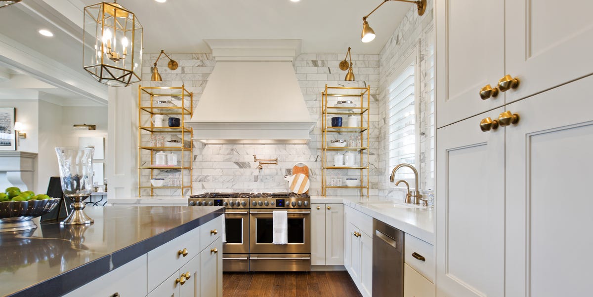
Mixed metals are the new grown-up move. Polished nickel with antique brass, bronze with stainless, or brushed finishes paired with wood details create more character. The goal is not chaos. It is controlled variety. A kitchen should look collected, not like every item came from the same page of the same catalog on the same Tuesday.
4. Distressed, Faux-Antique, and Heavily Glazed Cabinet Finishes
Why designers want them retired
Distressed cabinetry, decorative glazing, faux aging, and heavily antiqued paint treatments were once used to add “old-world charm.” In reality, they often add a very specific kind of drama that can age a kitchen almost instantly. When the rest of the home is straightforward and contemporary, faux-antique cabinets can feel like the kitchen is acting in a period costume.
This is one of those finish categories that tends to look more themed than timeless. The more obviously artificial the aging effect, the less authentic the room feels. Designers are generally favoring finishes that patina naturally instead of pretending they have already lived a hundred years.
What looks better now
Simple painted cabinetry, lightly textured wood, and clean profiles give a kitchen longevity. If you love vintage character, bring it in through lighting, furniture, art, or hardware rather than through fake distressing on every cabinet door.
5. Busy Mosaic Backsplashes Paired With Speckled Granite
Why this combination looks dated
This pairing is the kitchen equivalent of several people trying to tell different stories at the same dinner table. Tiny mosaic glass tile, dramatic granite movement, decorative edging, and contrasting cabinet tones can create visual noise very quickly. Designers often call out this look because it makes the room feel crowded even when the kitchen itself is spacious.
The trouble is scale and competition. When the backsplash is busy and the countertop is busy, neither element gets to shine. Instead, the eye bounces around the room like it drank espresso.
What looks better now
Larger-format tile, subtle handcrafted tile, slab backsplashes, or quieter stone surfaces create a calmer backdrop. That does not mean a kitchen should be bland. Texture is welcome. Variation is welcome. But designers are leaning toward materials that work together instead of elbowing each other for attention.
6. Concrete Counters and Other Overly Industrial Finishes
Why the look can feel tired
Concrete counters once signaled modern cool. Now, many designers feel they can read as harsh, raw, or too DIY for the average kitchen. Industrial finishes work best when they are balanced carefully, but in many homes they end up feeling cold or unfinished rather than refined.
The same goes for kitchens that pile on commercial-style details without enough softness. Stainless can look amazing, but when it is paired with raw concrete, hard black accents, and zero warmth, the room can start to feel more like a concept restaurant than a home.
What looks better now
Designers are gravitating toward counters with softer edges, more natural texture, and a more grounded presence. Quartzite, soapstone-inspired looks, subtle composite surfaces, or even mixed countertop materials can feel warmer and more livable. The finish direction is clear: refined, not rough.
7. Cool Gray Floors and Glossy Small-Format Tile
Why flooring can date the whole room
Flooring is one of the most underrated ways a kitchen gets stuck in a trend cycle. Gray-washed planks, icy undertones, and glossy small tiles had a huge moment, especially in builder-grade renovations. Now, they tend to make kitchens feel colder and less inviting.
Glossy small tiles can also create visual busyness, especially in open-plan homes where kitchens need to connect naturally with adjoining spaces. Designers increasingly prefer floors that disappear into the overall mood of the room instead of announcing themselves with every reflective inch.
What looks better now
Wide planks, matte finishes, natural oak tones, stone with gentle variation, and flooring that reads warm rather than chilly are all stronger choices. The best kitchen floors today feel easy, grounded, and pleasantly un-fussy.
8. Ornate Hardware, T-Shaped Pulls, and Clunky Faux-Tuscan Details
Why these small finishes make a big difference
Hardware might be small, but it can age a kitchen faster than almost anything else. T-shaped pulls, ornate faucet designs, heavy decorative corbels, faux-hearth vent hoods, and elaborate old-world trim details can turn a decent kitchen into a period piece in record time.
This is where many kitchens get into trouble. The cabinets may be fine. The layout may be functional. But then the room gets layered with overly decorative hardware and giant theatrical details that make it feel clunky. Designers increasingly want kitchens to breathe.
What looks better now
Streamlined pulls, more sculptural knobs, simple unlacquered or brushed metals, and hoods with cleaner silhouettes tend to age better. Even in traditional kitchens, the fresh version is usually edited rather than ornate.
9. Faux Materials and Overly Polished Surfaces
Why authenticity matters more now
One broader finish trend designers keep talking about is authenticity. Faux marble with exaggerated veining, fake-aged surfaces, imitation rustic finishes, and overly glossy cabinetry can all make a kitchen look less convincing. Homeowners are getting better at spotting materials that feel performative instead of honest.
That does not mean every kitchen needs expensive natural stone in every direction. Budget matters. Durability matters. But designers are recommending materials and finishes that feel believable, tactile, and appropriate to the home rather than surfaces trying very hard to impersonate something they are not.
What looks better now
Matte or brushed finishes, subtle patterns, real wood accents, well-chosen composite surfaces, and fewer “look at me” treatments create a kitchen that feels calmer and more lasting. Authentic does not have to mean precious. It just has to feel intentional.
How to Update a Dated Kitchen Without Gutting the Entire Room
The good news is that not every dated kitchen needs a full demolition crew and a support group. Designers often recommend starting with the easiest visual wins. Swap the hardware. Change the faucet finish. Repaint the walls in a warmer neutral. Replace a fussy backsplash. Refinish orange cabinets instead of tearing them out. Even changing the lighting temperature can help a kitchen feel less stark and more inviting.
Another smart move is editing the room instead of adding more to it. If the kitchen already has dramatic counters, do not introduce a louder backsplash. If the cabinetry has strong wood grain, keep surrounding finishes quieter. The most updated kitchens tend to look balanced, not busy.
And finally, do not chase trends so aggressively that your kitchen becomes a time capsule for 2026. A timeless kitchen is not trend-proof, but it is flexible. It leaves room for personality while avoiding finishes that scream one era, one style, and one influencer mood board.
Final Thoughts
The kitchen finishes designers now call dated have one thing in common: they usually feel either too theme-heavy, too polished, too cold, or too overdone. Kitchens today are moving in a warmer, more personal direction. Homeowners want texture, softness, authenticity, and details that feel thoughtfully layered instead of perfectly matched.
So if your kitchen still has glossy orange cabinets, a noisy mosaic backsplash, cool gray floors, black-everything hardware, and a faux-Tuscan hood the size of a parade float, do not panic. You are not doomed. You are simply standing in an excellent before photo.
Real-Life Experiences Homeowners and Designers Keep Talking About
One of the most revealing things about dated kitchen finishes is that people usually do not notice the problem all at once. It sneaks up on them. A homeowner may love the kitchen for years, then suddenly realize the room feels darker, fussier, or somehow more exhausting than the rest of the house. Designers hear this constantly. Clients often say, “Nothing is technically wrong with it, but I do not enjoy being in here anymore.” That sentence alone tells you a lot about the power of finishes.
Take glossy orange cabinets. Many homeowners say they lived with them for a long time because the cabinets were solid wood and still in great shape. The turning point came when they updated other parts of the home and the kitchen started feeling visually louder than everything around it. Once the cabinets were sanded down or toned to a softer matte stain, the room immediately felt calmer. Same layout, same doors, entirely different mood. That is a powerful reminder that finish changes can do more than cosmetic work. They can change how a room behaves emotionally.
Then there is the backsplash problem. Plenty of people fall for intricate mosaic tile in the showroom because it looks exciting in a small sample. But after installation, they discover it competes with the counters, the hardware, the lighting, and maybe their will to live. Designers often say the best kitchens are not necessarily the ones with the most detail. They are the ones where the details know when to be quiet. Homeowners usually notice this after the fact, especially when they replace a busy backsplash with a simpler handmade tile or a slab extension and suddenly the whole kitchen exhales.
Hardware is another area where experience matters. Matte black and trendy pulls may look sharp on day one, but many people eventually decide they want something with more depth and less predictability. Aged brass, brushed nickel, bronze, or mixed metals often feel richer over time because they are less rigid. Designers love that these finishes can evolve with the room instead of locking it into a single look.
Flooring tells a similar story. Gray floors were once the shortcut to making a kitchen feel updated, but lived experience has changed the conversation. Many homeowners say the floors eventually made the space feel chilly, especially in homes where they wanted warmth and comfort. Swapping to a natural wood tone or matte stone look often makes the kitchen feel more welcoming without changing anything else. That is why so many designers now push for finishes that feel grounded, soft, and believable in daily life.
In the end, the best kitchen lessons do not come from trend lists alone. They come from living with a room long enough to know what still feels good after the novelty wears off. And that is exactly why designers keep steering people toward finishes with warmth, restraint, and a little soul.