
Modern architecture is often introduced as a kingdom of white walls, gray concrete, and furniture that looks mildly offended when you sit on it. Le Corbusier’s Polychromie architecturale tells a much richer story. For the Swiss-French architect, painter, writer, and designer, color was not frosting applied after the building was baked. It was an architectural instrument capable of changing how a wall advanced, how a ceiling floated, how daylight traveled, and how a person understood a room.
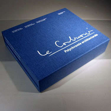
Developed in two collections for the Swiss wallpaper manufacturer Salubra, the system eventually contained 63 shades: 43 introduced in 1931 and 20 added in 1959. Together, they formed a practical language for composing interiors and façades with harmony, contrast, emotional character, and spatial claritywithout staring helplessly at 900 nearly identical beiges.
What Is Polychromie Architecturale?
Polychromie architecturale, usually translated as “architectural polychromy,” is Le Corbusier’s systematic approach to using color as part of architecture. The system includes carefully selected hues, instructions for combining them, and visual “keyboards” that help users isolate small groups of compatible colors.
The crucial word is architectural. Le Corbusier was not simply assembling fashionable shades for curtains, cushions, or a heroic accent wall behind the television. He considered color alongside the plan, section, structure, circulation, light, and material. A colored surface could clarify a volume, disguise an awkward boundary, mark a route, emphasize an object, or make one plane appear farther away than another.
Color as a Building Material
In this theory, color behaves almost like concrete, glass, or wood. Deep red may feel dense and close; pale blue can seem atmospheric and distant; a dark plane may retreat into shadow. These are not mechanical lawshuman perception is more interesting than a spreadsheetbut they provide a disciplined starting point. White remains valuable for reflecting light and clarifying form, yet it is one voice in the choir, not the entire concert.
How Le Corbusier Developed His Color System
A Painter’s Education Shaped the Palette
Born Charles-Édouard Jeanneret in 1887, Le Corbusier trained in the decorative arts, painted throughout his career, and helped develop Purism with Amédée Ozenfant. Polychromie architecturale grew from painting, historical art, natural pigments, interior design, and experiments with colored planes in three-dimensional space. It feels less like a marketing trend than a condensed studio education.
The 1931 Collection: 43 Colors and a Practical Keyboard
The first Salubra collection, issued in 1931, contained 43 shades and 12 color keyboards. Movable masking cards helped users isolate limited combinations instead of comparing every color at once. The palette emphasized mineral and natural-pigment familiesochres, umbers, siennas, subdued greens, ultramarine blues, restrained reds, grays, and creams. Quiet colors could cover broad fields, while stronger shades supplied focus and tension.
The keyboard concept was particularly clever. Rather than presenting color selection as a test of mysterious artistic genius, it made the process systematic. Users could compare a background tone with several supporting shades and accents, narrowing the composition until the relationship felt balanced.
The 1959 Collection: 20 Additional Shades and Greater Intensity
In 1959, a second Salubra collection added 20 colors, bringing the total to 63. More vivid reds, yellows, blues, greens, and pinks could stand confidently against raw concrete, timber, and metal. Subtle wallpaper patterns and textures also showed an expanded interest in surface, repetition, material character, and changing light.
How the 63 Colors Change Architectural Space
Color Can Make Planes Advance or Retreat
One of the most useful ideas in Le Corbusier’s color theory is that hue and value can alter the apparent position of a surface. Cool, pale, or low-contrast colors often seem to recede, which can make a compact room feel more open. Warm, saturated, or dark colors may advance, creating intimacy or visual emphasis. Used selectively, this allows a designer to “correct” space without moving a single wall.
Color Organizes Circulation and Function
Le Corbusier used color to help people read buildings. A bright plane could point toward a stair, door, balcony, or communal area, while different tones distinguished zones without partitions. The same method still supports wayfinding in schools, hospitals, offices, and public buildings. It can say “the stairs are here” more gracefully than a forest of signs yelling at everyone.
Color Works With Light, Not Against It
A Le Corbusier palette should never be judged only from a tiny sample under showroom lighting. The same blue may feel cool in northern daylight, luminous near a south-facing window, or unexpectedly gray under a weak bulb. Matte plaster softens light, while enamel, metal, and glass reflect it. Morning, noon, and evening can produce three versions of the same wall.
This relationship between color and light is central to architectural polychromy. A shade is not selected in isolation; it is selected for a particular plane, orientation, finish, and sequence of views. The building effectively becomes a changing color composition rather than a static painted object.
Where Le Corbusier Put Architectural Polychromy to Work
Maison La Roche: Color Guides the Architectural Promenade
Designed with Pierre Jeanneret between 1923 and 1925, Maison La Roche in Paris predates the published 1931 palette but demonstrates the ideas that led to it. Created for art collector Raoul La Roche, the house combines living quarters with a gallery and unfolds through ramps, stairs, double-height spaces, and shifting viewpoints.
Its colored surfaces help separate planes and choreograph movement. Pale tones loosen boundaries, while darker or warmer areas anchor the composition. Color does not compete with the art collection; it helps frame the journey around it. The result is an architectural promenade in which the visitor’s body, changing perspective, and painted surfaces all participate.
Maison Guiette and the Purist Houses
At Maison Guiette in Antwerp, Le Corbusier advised on the interior polychromy of a narrow home and studio for artist René Guiette. Related experiments at Cité Frugès and the Weissenhof houses challenged the myth of early modernism as a parade of blank white boxes. Their color was purposeful and often changed the apparent geometry of standardized forms.
Unité d’Habitation: Color Humanizes Concrete
The Unité d’Habitation in Marseille, completed in the early 1950s, is one of the strongest examples of color working with raw concrete. The monumental residential block was conceived as a “vertical city,” combining apartments with shared facilities and rooftop spaces. Polychrome loggias, doors, internal details, and panels introduce rhythm across the massive structure.
Without these accents, the building could read as one enormous gray object. With them, individual units become legible, the façade gains movement, and the concrete acquires a surprisingly playful companion. It is Brutalism wearing a colorful scarfand somehow pulling it off.
La Tourette, Chandigarh, and the Carpenter Center
In later works, concentrated color counters sculptural concrete and dramatic daylight. At La Tourette and Chandigarh, painted elements, art, and light intensify selected moments. The Carpenter Center at Harvard, Le Corbusier’s only building in North America, uses pigment more sparingly, directing attention toward movement, glazing, and form. The restraint is instructive: not every surface must audition for a musical.
The Main Color Families in Polychromie Architecturale
Although the complete system contains 63 individual shades, its logic becomes easier to understand when the colors are considered as related families.
Earth and Mineral Tones
Ochres, siennas, umbers, browns, and muted reds give the palette an architectural foundation. These shades relate naturally to brick, stone, leather, soil, timber, and clay. They can make interiors feel grounded without becoming dull or rustic.
Atmospheric Blues and Greens
Ultramarine, gray-blue, pale blue, and restrained green tones can visually open space or connect an interior to sky and vegetation. Darker blues create depth, while lighter versions can make ceilings or distant planes appear less solid.
Powerful Accent Colors
Strong reds, yellows, greens, pinks, and saturated blues provide punctuation. In Le Corbusier’s work, these colors are most convincing when they identify a specific architectural moment: a door, recess, panel, balcony, cabinet, or circulation point.
Whites, Grays, and Dark Neutrals
Neutral colors create visual pauses and allow stronger hues to operate effectively. White can intensify daylight, gray can mediate between colored and raw surfaces, and near-black tones can visually erase boundaries or give openings greater depth.
Why Polychromie Architecturale Still Matters
The system endures because it balances freedom with control. It offers variety while limiting choices to colors selected for architectural relationshipsuseful when digital tools provide millions of options and still leave people debating “Fog Whisper” versus “Fog With Feelings.” More importantly, it asks better questions: What should recede? Where should the eye pause? Which surface receives morning light? How will a hue interact with concrete, oak, terrazzo, brick, or steel?
Contemporary interest in the palette also reflects a broader reassessment of modernism. Designers increasingly recognize that twentieth-century architecture was not universally white, sterile, or emotionally cool. Color, texture, art, natural materials, and human perception were often essential parts of the modern project.
How to Use Le Corbusier’s Color Principles Today
- Begin with the space, not the swatch. Record the room’s orientation, daylight, ceiling height, circulation, fixed materials, and major views before choosing a hue.
- Select one dominant architectural field. A quiet neutral, mineral tone, soft blue, or earthy shade can unify the largest surfaces.
- Assign color a job. Use it to expand, anchor, identify, connect, hide, or emphasize. “It looked cheerful online” is not a complete job description.
- Build a small hierarchy. Combine a dominant color with one or two supporting tones and a controlled accent rather than distributing equal visual volume everywhere.
- Test large samples. Observe them beside flooring, cabinetry, fabrics, and structural materials in morning and evening light.
- Include ceilings, doors, and built-ins. Polychromy becomes architectural when color crosses the usual boundaries of the feature wall.
- Respect negative space. White, gray, shadow, and unpainted material provide pauses that make stronger colors effective.
The goal is not to copy a historic interior color for color. The more faithful lesson is to treat color as a spatial decision. A modern apartment, restaurant, gallery, or office can use the method without becoming a Le Corbusier theme park.
Common Mistakes When Applying Architectural Polychromy
Choosing Colors Without Studying the Light
A paint color selected under fluorescent store lighting may behave very differently at home. Large samples should be tested on every wall that will receive the color because orientation, shadow, and reflected light can significantly alter its appearance.
Using Too Many Strong Colors
Architectural polychromy is not an invitation to make every surface compete for attention. Le Corbusier’s strongest compositions usually contain hierarchy: broad quiet fields, supporting tones, and carefully located accents.
Ignoring Material Relationships
Paint is only one participant. Wood grain, concrete texture, metal finishes, stone, upholstery, and flooring all contribute color. A successful palette recognizes these existing materials instead of covering the room with unrelated shades.
Treating Color as a Final Cosmetic Decision
Waiting until construction is finished to think about color can limit its architectural role. Color planning should begin while circulation, built-in furniture, lighting, openings, and sightlines can still be coordinated.
Experiencing Polychromie Architecturale in Real Life
Understanding Le Corbusier’s color system from photographs is useful, but it is also incomplete. Architectural color is stubbornly physical. Screens flatten depth, alter saturation, and freeze light at one convenient instant. Real spaces refuse to behave so politely. You move, daylight shifts, surfaces reflect one another, and a color that looked calm from the doorway may become intense when it fills your peripheral vision.
Experience the Room From Several Distances
A practical first exercise is to view a colored plane from the threshold, the center of the room, and directly beside it. From far away, the wall reads as part of a composition. At middle distance, it begins to influence surrounding materials. Up close, texture and finish become dominant. This is why a tiny chip cannot predict a full wall. A muted ultramarine may seem almost neutral on a card yet become a deep visual field across twelve feet of plaster.
Walk the Color Instead of Merely Looking at It
Le Corbusier’s best interiors reveal color through movement. Imagineor testa sequence in which a cool entry leads toward a warmer living area, a dark door frames a bright room, or a colored ceiling appears only after turning a corner. The effect resembles editing in film. Each space prepares the next, and contrast gives the journey rhythm.
In a corridor or open plan, stand where a visitor enters, move toward the next room, then turn around. The composition may be completely different in reverse. A successful palette works through the route, not only in one glamorous photograph.
Observe a Full Day of Changing Light
Another revealing experience is to watch the same sample from morning to night. Early daylight may cool a gray-green; midday sun can reveal yellow or red undertones; evening lamps may make the color denser and more intimate. Beside concrete, the hue might appear saturated. Beside warm oak, it may become cooler. Next to a bright white ceiling, it may seem darker than expected.
Use these changes as part of the design. A room need not maintain one fixed mood for twenty-four hours; it can be crisp at breakfast and enveloping after sunset.
Live With a Limited Palette Before Expanding It
A final hands-on lesson is to begin with fewer colors than you think you need. Paint large temporary boards and place them around the room for several days. Move them near windows, into shadow, behind furniture, and beside fixed finishes. Add one accent only after the dominant relationships feel stable.
This process often reveals that the strongest design is not the one with the most colors. A pale mineral background, a deep blue built-in, a reddish-brown door, and exposed concrete may create a richer experience than eight unrelated “statement” shades. The limitation encourages attention to proportion: how much color appears, where it appears, and when it becomes visible.
The most memorable experience of Polychromie architecturale is therefore not recognition“Ah yes, that is a Le Corbusier blue”but awareness. You notice that a ceiling can lift, a doorway can become an event, a wall can dissolve into shadow, and raw concrete can feel unexpectedly warm. Color stops behaving like a cosmetic finish and starts behaving like architecture.
Conclusion
Le Corbusier’s Polychromie architecturale remains one of modern design’s most practical color theories because it connects visual pleasure with spatial purpose. The 63-color system, developed in 1931 and 1959, offered more than a collection of attractive pigments. It provided a way to compose depth, light, movement, material, function, and emotion.
Its larger lesson is refreshingly simple: color should do something. It can enlarge a room, compress a passage, mark a destination, reveal a structure, soften concrete, or create a memorable pause. Used with discipline, it turns walls into active participants in architectural experience. Used without discipline, well, at least the repainting industry will remain economically healthy.